
It looks like you're new here. If you want to get involved, click one of these buttons!
 Source: NovelInvestor.com
 Source: novelinvestor.com
 Source: novelinvestor.com
 Source: Novel Investor
 © 2015 Mutual Fund Observer. All rights reserved.
© 2015 Mutual Fund Observer. All rights reserved. Powered by Vanilla
Comments
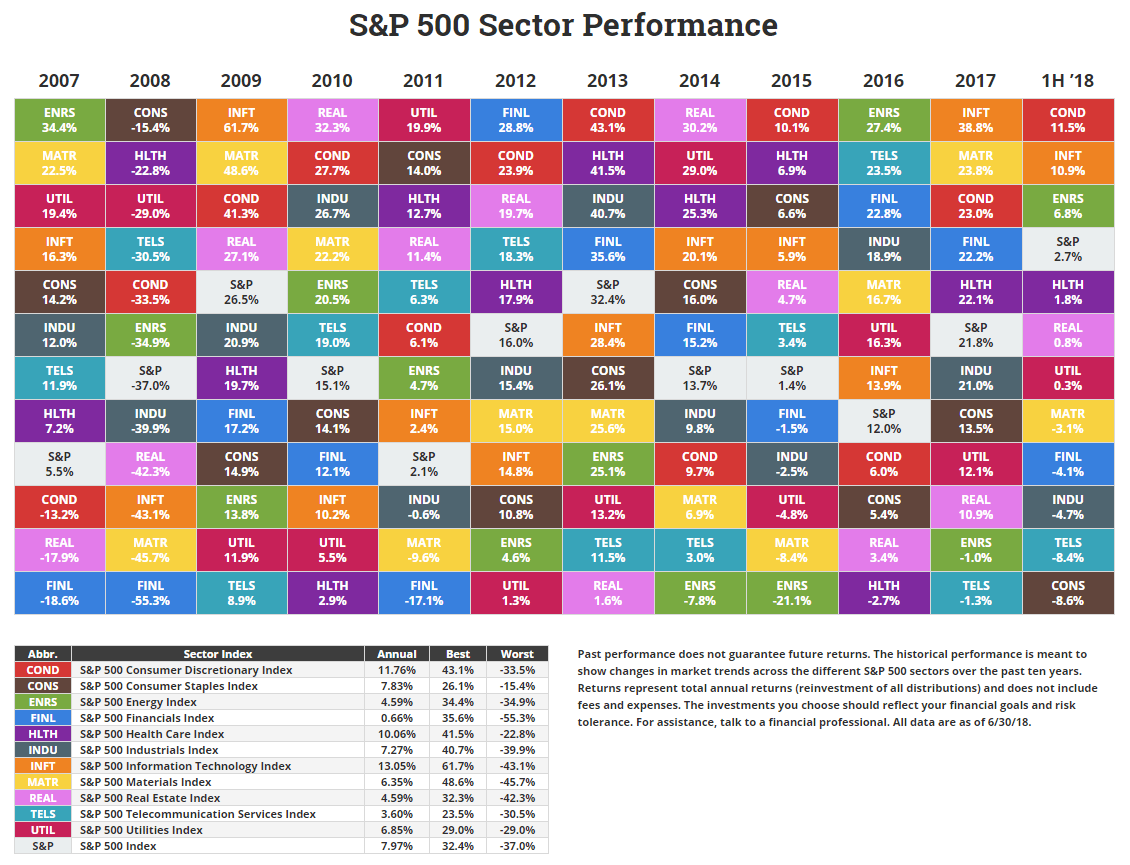
But when there's coloring outside the lines, I take a closer look. The S&P 500 sector performance table shows eleven rows of sectors (plus a row for the S&P 500). The problem is that until 2016 there were only ten sectors.
This is how the chart looked through 2015.
http://www.usfunds.com/media/files/pdfs/researchreports/2016/Periodic-Table-of-Sector-Returns-2016.pdf
Here's State Street Global Advisors (SPDRs) current chart, with 10 sectors through 2015, and eleven sectors since.
http://www.sectorspdr.com/sectorspdr/Pdf/All Funds Documents/Document Resources/10 Year Sector Returns
I don't know where NovelInvestor got its figures or how it retrofitted the new Real Estate sector into earlier years. That should have been easy to do - Real Estate was simply carved out of Financials, so the other sectors' figures for the past decade should not have been changed. But looking at the NovelInvestor table, it seems they were.
https://www.reit.com/investing/investor-resources/gics-classification-real-estate
Just wait until the latest sector reorg hits these tables. With IT being split, Media being expanded, and other companies being moved around, it will be difficult to extend these new sectors back in time to create a "virtual" table of how these sectors might have done over the past ten years. (That's because there's ambiguity in how each of the companies would have been classified over the past decade as their businesses matured.)