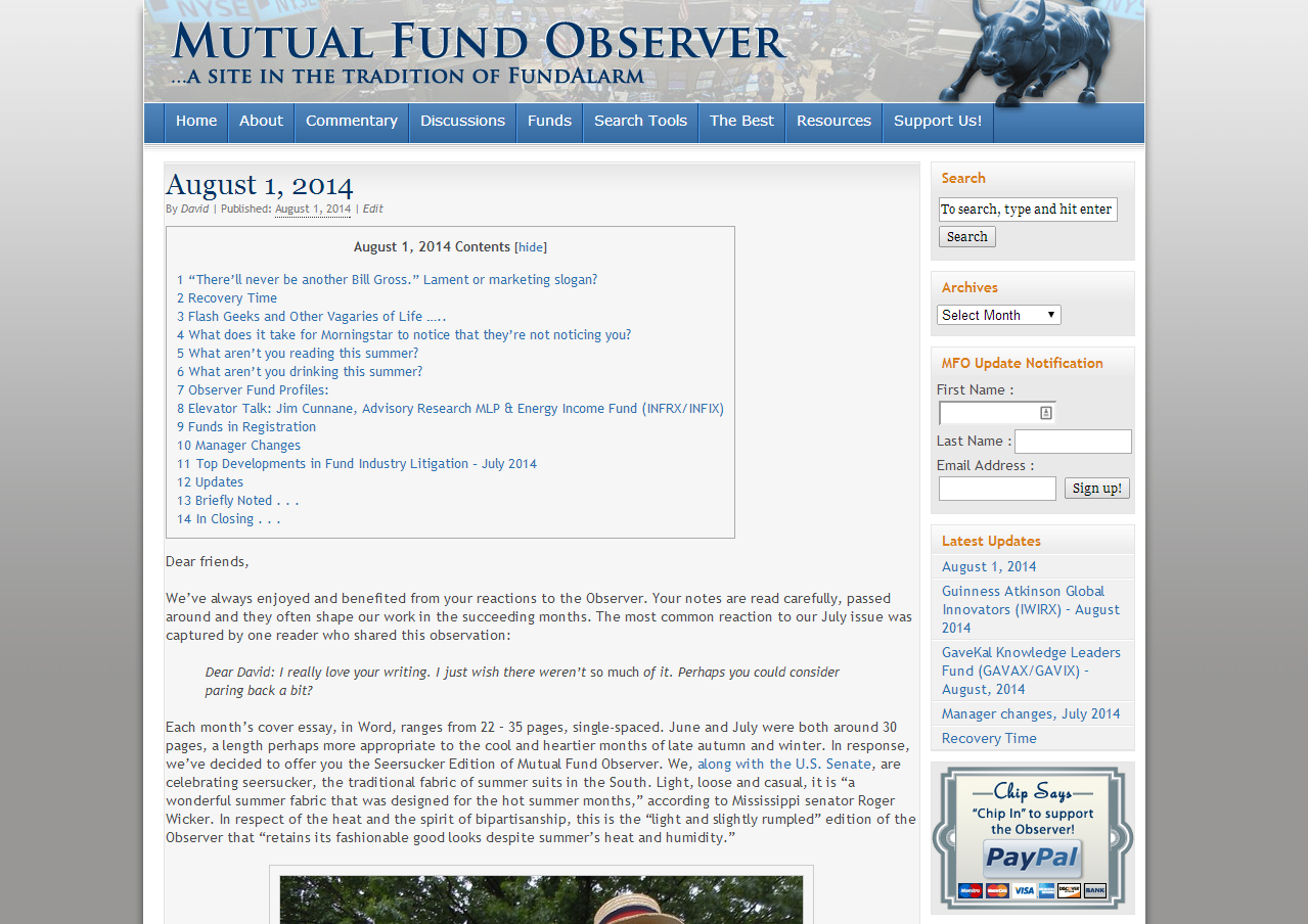
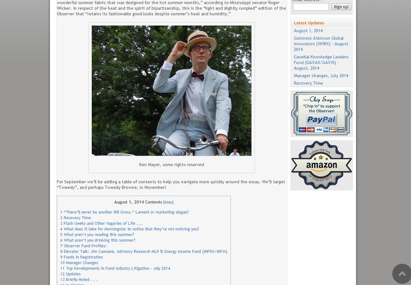
I spent the morning adding and testing a Table of Contents plugin. I also added a "scroll to top" button that you should see in the lower right portion of your browser. You can see the live version if you look at one of the commentary pages. It's not quite what I would call beautiful, but it is functional. There are a few options for how we can display the table of contents, and I thought it might be most helpful if you all could help decide.
Here are the options:
Option A - ToC shows at the top right of each article.
Pros: It's easily accessible; the scroll to top takes you right to it; you can start reading right away.
Cons: It looks terrible when long headings wrap to a second line; we'll have to be careful when we lay out each article (e.g. make sure the pictures line up appropriately).
 Option B
 - ToC shows at the top of each article, without wrapping text.
Pros: It's easy to read the ToC; the scroll to top takes you right to it.
Cons: You can't immediately see as much of the content; the picture might be "below the fold."
 Option C
 - ToC shows after the introduction and before the first story.
Pros: You can start reading right away; the leading picture should show.
Cons: The "scroll to top" feature will take you up past the ToC, necessitating a scroll down to find the ToC again.

Please let me know your preferences in the comments. We could probably set a schedule and try each option on the live site, too.
Thanks for the help!


Comments
I like Option A best.
Old_Skeet
David
see css comment below to indent...
the jump to top image would look better if it was changed in the forum to match or changed in wordpress to match.
And both on similar sides.
<div id="wpfront-scroll-top-container" style="left: 20px; bottom: 20px; display: block; opacity: 0.8;">
<img alt="" src="http://www.mutualfundobserver.com/wp-content/plugins/wpfront-scroll-top/images/icons/1.png"; style="width: auto; height: auto;">
left:20px instead of right:20px;
will look a bit better IMHO
@Maurice, I tend to agree with you as far as the first read. I do and will read every word regardless. It will have an influence on my life because I usually go back to the commentary several times for various reasons and the ToC will make it quicker to go straight to whatever I want to read again.
A is fine. OJ
The "hide" button would make the TOC collapse to a single line: "Table of Contents - show". Chip could set the default so that it either hid until you clicked or was visible until you clicked. It's live on the commentaries now so you have the option of playing with it.
David
Works great.
I like how when you click on an item in the Table of Contents, it takes you right there.
Great.
But I'd prefer you not use the "go to the top" floating button. It obscures the text, forcing me to 'arrow' down instead of using the 'page down' button. (Unless I want to just guess at what's hidden under it...)
The "go to the top" button just duplicates the functionality of the 'Home' key on the standard keyboards.