The mutual fund industry may be strangled by its own success. Many of the most senior fund managers and investment officers at June’s Morningstar Investment Conference sang the same refrain: “As fund companies have grown to manage hundreds of billions, and sometimes trillions of dollars, something precious has been lost. We talk more now about ‘accumulating assets’ than we do about ‘serving our funds’ shareholders.’” George Gatch’s poorly received defense of JP Morgan came down to this: “We’re not a massive financial behemoth (despite our $1.3 trillion in AUM). We’re lots of agile little companies that just happen to get paid by the same guy. Really.”
Oddly, when JP Morgan lost $9 billion on the botched “London Whale” trades, the explanation boiled down to this: “in a firm our size, it’s not possible to keep close tabs on every munchkin who has authority to execute multi-billion dollar trades.”
It took a year after the Lehman Brothers collapse for investigators to finally determine that Lehman was actually 3,000+ legally distinct entities. And these are, by definition, the folks who control most of our money.
But there is an alternative, if only investors come to notice it. There are small fund firms that are intensely focused on service, performance and shareholders. Those funds face two special challenges: (1) getting noticed and building a client base and (2) keeping those clients when markets turn ugly.
Knowledge and trust are crucial to addressing both of those challenges. Lack of trust in your financial advisor or portfolio manager may cause you to terminate the relationship, sell at the wrong moment, and rush into some other ill-conceived relationship. This in turn may cause you to surrender some or all of your investments’ potential gains.
A good website is an important channel for trust-building. It might help you to understand the manager, the fund’s portfolio and strategy, and the larger universe within which the fund operates. It is an essential communication tool that can help to humanize a financial entity, and go some way towards leveling the playing field for the little guy.
Since small fund firms face especially great challenges in getting noticed and building a client base, we wanted to start by identifying who does the best job in creating a partnership or relationship between the individual investor and the professional manager.
For this month’s “Best Of” feature we are highlighting small fund company websites. We identified three dozen top-flight small mutual fund companies using the following criteria:
- Three or fewer funds or under $1 billion in assets and
- At least one of their funds had already been reviewed by the Observer or is scheduled for an upcoming review.
We turned to Anya Zolotusky and Nina Eisenman, two experts on web design and, in particular, fund web design, for guidance.

Nina Eisenman, guest expert.
Nina Eisenman
Eisenman Associates, [email protected]
Nina is the founder of FundSites, (fund-sites.com) a total website solution for small to med-sized mutual fund companies, and President of Eisenman Associates, a top graphic and web design agency for investment firms. Nina has been a featured presenter of The Small Funds Network, NYU’s Stern School of Business, the Harvard Club, and numerous professional seminars. She is a member of the Mutual Fund Education Alliance (MFEA), The Small Funds Network (SFN), The National Investment Company Service Association (NICSA), Investment Management Consultants Association (IMCA), Nation Investor Relations Institute (NIRI), and Women Presidents’ Organization. Nina has a Bachelor of Science degree from Barnard College.


Anya Zolotusky, guest expert
Anya Zolotusky
Darn Good Web Design, [email protected]
Anya designs, builds, and maintains websites for businesses and individuals of all kinds from mountain guides to do-gooder lawyers to mutual fund smartypants (David prefers curmudgeons). She began working on the web after getting mixed up with the wrong crowd at a start-up called MountainZone.com where she helped pioneer live cybercasts from uncomfortable places like Mt. Everest. With a bit of high altitude experience and a startling set of immunizations, she’s trekked Nepal several times and worked in Everest base camp with a NASA-like assortment of solar-powered satellite gear helping sponsored climbers stay in touch with their friends at CNN. She has climbed peaks in the Cascades, Russian Caucasus Range, and Peruvian Andes, most notably to the tops of Rainier and McKinley. Aside from her duties as a Web Ranger, she enjoys raising beef cattle, a few dilettante dairy goats and a handful of chickens near Seattle, WA. She spends a lot of time trying to outsmart her German Shepherd.
Anya and Nina generated a list of 14 characteristics of highly effective fund sites, which we were able to organize into three broad categories:
- Design and presentation
- Quality of content
- Ease of navigation
We reviewed all of the sites. Two websites stood out as exemplary while three others warranted honorable mentions. As is always the case we encourage and look forward to your feedback, let us know if you have a website that we missed and we will include it in an update.
Best Small Fund Website: Seafarer Funds
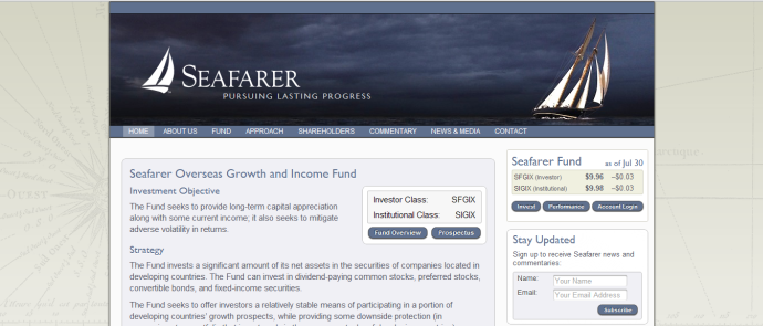
Seafarer Overseas Growth and Income Investor is a diversified emerging markets fund that was established February 15 2012. The portfolio manager is Andrew Foster.
Design and Presentation
Seafarer takes the going back to basics approach with a website that is straightforward and efficient. The site “feels” safe. The company banner and logo with the picture of the boat sailing peacefully under dark skies go well with the soft colored fonts and the muted background. The site does not shout, it puts an arm around you and says don’t worry, we have it covered. The san serif font is clean and easy to read. Overall the design is solid and effective if unspectacular. The presentation is simple, straightforward and professional.
Content
There is a wealth of information at your fingertips and only a click or two away. We’ll note in particular that the analysis of the fund’s portfolio and performance is, by far, the most extensive and informative that we’re seen. It’s complemented by Mr. Foster’s thoughtful, wide-ranging shareholder letters and, especially, his “Field Notes” which detail research findings from some of his international trips. Content seems to be updated at least monthly. There is even a video interview of the portfolio manager.
Navigation
The website navigation is fast and easy and you never get lost. Mousing over one of the eight main navigation tabs (About Us) activates clear dropdown menus. Each content page has helpful “resources” on the side.
Bottom Line
Seafarer offers near-flawless execution and a manageable wealth of information. The manager’s “voice” comes through clearly.
Pros: Solid effective design and presentation, wide range of relevant content.
Cons: The muted simple design means that you are not likely to stay on the page for much longer than is necessary.
Best Small Fund Website: Cook and Bynum Fund
The Cook and Bynum Fund is a very concentrated stock fund that was established July 1 2009. The portfolio managers are Dowe Bynum and Richard Cook.
Design and Presentation
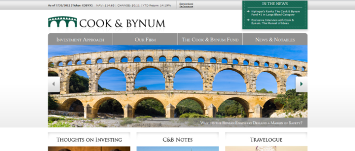
The Cook and Bynum Fund is perhaps the most visually appealing of all the websites we looked at this month. Bright and colorful photographs on a white background and the smart company logo get your attention initially. The professional layout maintains it. The feel of the homepage is both relaxing and corporate. It is a good mix that has a very humanizing effect.
The most striking feature of Cook and Bynum’s site are the striking photographs. There’s a panoramic photo in a slideshow about the top third of the page and three sharp images immediately below it. The slideshow links to three interior stories and the other three photos each illustrate the gateway to a major portion of the site (Thoughts on Investing, C&B Notes, Travelogue).
Overall the design and presentation is excellent but there is a tendency to repeat information. For example the slide show is a collection of links that can be found on the drop down menus of the four category headers. The three sub headings below the slide show are also links that can be found in the four main categories. The travelogue is presented as a sub heading, a slide show link and a drop down menu item in Our Firm.
Content
Cook and Bynum’s content stands out. Information about the fund’s performance and portfolio, while not exceptionally substantial, is well organized and readily accessible. The site does an exceptional job of explaining the managers’ thought processes and distinctions, and of talking through the fieldwork that’s so important to their process. Sections such as How We Think, Why Are We Different? and Building our Portfolio are just some examples of a package that is well thought out and professionally compiled.
Navigation
The website’s navigation is simple and intuitive with just about any information you need is reachable in one or two clicks. Very effective use of webpage tabs make it easy to get back to where you were before without the need to open links in a new page or browser tab. As stated above there is a tendency to be repetitive but for the most part the effect is of making content quickly accessible.
Bottom Line
This site has incredible visual appeal and does much more than others to help you get inside your managers’ heads. If you want to understand how they think and why they act, the answer’s here.
Pros: Visually appealing, professionally done website that feels both corporate and social.
Cons: Can be a bit repetitive, Bookshelf is a bit over the top
Honorable mentions: Sites that Really Called to One of Us
Junior’s Pick
 Wintergreen is a very well done site that provides quick easy access to relevant information, and does a good job at communicating the heart and soul of the company to existing customers and potential investors. The site is well designed with efficient navigation and little touches like adjustable font sizes for those who need it. Colors that match the Wintergreen brand and features like video built into the homepage make for a pleasant visual experience, and rounds off a very good offering.
Nina’s pick
Auxier Focus Fund (Auxier is a client of mine but also the sort of fund that the Observer tracks, and I think their site played out particularly well)
 Visitors to the Auxier Focus Fund Website, auxierasset.com, are greeted by the welcoming smile of portfolio manager Jeff Auxier, a smart tactic that humanizes the firm, which counts retail investors among its target audience. Other features Auxier provides for retail investors are the bold “Access Your Account” link for current investors and an “Open an Account” link for prospective investors. The home page content is kept fresh and relevant with Morningstar “Star” Ratings, Daily NAV performance data, “In the News” article headlines and teaser copy from Auxier’s latest Quarterly Letter. The Quarterly Letters are HTML pages, not just PDFS, so they are fully indexible by Google and other search engines. Visitors are invited to “Sign up to Receive our Quarterly Letter” — a powerful call-to-action that is often buried in fund websites. The site’s intuitive navigation and content such as “Differentiation” and “Investment Philosophy” and “Performance” make it easy for investors to do their research and learn what makes the Auxier Focus Fund unique.
Anya’s Pick
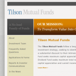 I Love it. What’s not to love here? The clean look is smooth and relaxing. Use of good fonts, harmonious colors, and plenty of white space makes it easy to spend time here. Even the masthead seedling image, which could have gone bad in a number of ways, works great here. The navigation is well organized with everything where you’d expect it to be. They have some nice, techy elements like accordion drop-downs, but generally I like the calm, easy feel of the site. Just well done all around.
The Best of the Rest: The Top One Third of the Sites We Reviewed
| Fund | Score (Design & Presentation/ Ease of Navigation/ Quality of Content) |
Comments (N = Nina’s comments, A = Anya’s comments) |
| Vulcan Value Fund | 4/4/4 | N: Timely fund info and “subscribe” should be on home page, letters could be HTML as well as PDF A: Like it. Really I love it — the minimalist, super clean look works for me, as does the use of fussy fonts and lots of white space. The big problem though is that the drop-down subnav is so bad, at first I was certain this was some kind of technical issue. No design decision could be so deeply misguided, and yet, there it is. There are so many good ways to present the subnav on a target page, I wish Vulcan’s designers had picked just about any of them. Ditto for the weird, floating “Mutual Funds” and “Managed Accounts” buttons on the right. Great looking site, but the navigation feels like it was the idea of a client who really wanted it like that and wouldn’t let the designer talk them out of it. |
| Evermore Global Value Fund | 4/4/3 | N: Video of PM adds flavor. Could use market commentary. A: Like it… don’t love it, but pretty good overall. |
| Bretton Fund | 5/3/3 | N:Minimalistic in a nice kind of way. Could use market commentary and not have links lead you out of site. Sign up call to action A: Like it…The look is super clean, the nav is well organized, the fonts are fussy, and the general feel is great. I’m a huge fan of minimalist design, but this feels a bit like an ultra modern apartment with one black couch and a single chair neither of which are really for sitting. Would it kill them to add a touch of visual interest? Ok fine, to each their own, and really, it’s a great looking site. I just wouldn’t want to live there. |
| Queens Road Funds | 3/4/3 | N: Glossary and firm-specific imagery are nice touches but no fresh, non-performance content. A: Like it… but don’t love it. The nav aesthetics could be better than underlines on mouse-over. The site looks good but not great. Just could be better. Generally pretty good though. |
| Al Frank Funds | 3/3/3 | N: A bit glitzy and hard to read. Reads like an agency wrote it. Could use market commentary. A: Like it… Kind of love the look, though the use of Flash dampens my enthusiasm, and the look might be a little TOO matchy-matchy, By The Design School Rules… |
| RiverPark Funds | 2/3/3 | N: It would be better if quarterly commentaries were offered as HTML as well as PDFs. A: Meh…but the better of the Meh’s — the look is not terrible. It’s just not that good. They could do a lot better with a little more design effort. I say time for a redesign. |
| SteelPath MLP Funds (though SteelPath has been purchased by Oppenheimer so the future of the site is unclear) | 2/3/3 | N: It would be better if quarterly commentaries were offered as HTML as well as PDFs. Good MLP insights and static content. A: Meh. The homepage here feels cluttered to me and a bit like a template. I like the color blocks to divide up information, but really, they couldn’t think of anything for a sixth block in that bottom row? Or, say, stretch out those bottom two blocks so they span the width of the upper row? Someone just wasn’t trying there, but the rest of the site is pretty darn good. |


