


What if you had to build a portfolio now and could not change it for the next five years other than annual rebalancing? The most obvious real-life situation might be preparing in case a spouse who does not know much about investing needs to manage finances; hence the name, “Catastrophe Portfolio”. A different scenario is the Rip Van Winkle scenario where you fall asleep for five to ten years and wake up to see what your portfolio is worth. And of course, there is the K.I.S.S philosophy.
The obvious question would be, “Why not use an investment advisor and/or an independent financial planner?” I have talked with four investment professionals this year and have narrowed consideration down to two. There are eight funds in The Catastrophe Portfolio whose Lipper Categories have a history of performing well following periods when valuations were high or rates were rising. The portfolio is tilted toward international equity and domestic value funds.

My editor, Felix, likes my new desk in the retirement home we bought in Colorado last month. She enjoys working remotely and anxiously awaits my return to get back to work.
In my article last month, I showed seven long term trends for the past twenty to fifty years which are 1) slowing economic growth, 2) stagnant profit growth, 3) massive stimulus which will wear off, 4) end of the bond bull market with associated low interest rates, 5) impact of corporate buybacks on asset inflation and volatility, 6) high leverage which increases instability, and 7) taxes that are will head higher. In this article, I show the Investment Model that I use to determine current market conditions and provide guidance for allocations in Section #1. I summarize Fidelity’s Long Term View of Investments in the coming decade(s) in Section #2. In Section #3, I look at historical time periods to evaluate funds using risk-adjusted returns (Martin Ratio). Section #4 contains the Catastrophe Portfolio.
Table #1 contains ten time periods, some of which represent long periods of time with different market conditions, full-cycle time periods, and time periods with similarities to the current market condition. In particular, I searched for time periods available in the Mutual Fund Observer Multi-Search Tool with rising interest rates, high inflation, or falling valuations. The table shows the starting price to earnings ratio for the year, annual returns for the S&P 500 and ten-year treasuries, and annual inflation. The green shaded cells represent the 16 lowest P/E ratios, lowest inflation rates, highest returns. The red shade represents the opposite (worse) conditions. The twenty years prior to 1991 have very low valuations relative to the following thirty years. For each of these time periods, I extracted all of the no-load mutual funds and exchange traded funds in the Lipper Database using the Mutual Fund Observer Multi-Screen Tool.
Table #1: Ten Evaluation Periods
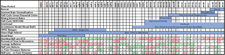
Source: Created By the Author
1. Investment Model
Key Point: I built the Investment Model five to ten years ago to guide me in determining where the Investment Environment is heading over the next six months. I use Benjamin Graham’s guideline of never investing less than 25 percent in stocks nor more than 75 percent.
For the same reason some people enjoy solving a crossword puzzle, I built the Investment Model as a technical challenge. It is based on 32 main indicators which consist of one or more sub-indicators. The goal is to maximize returns by changing stock and bond allocations according to the investment environment and following Benjamin Graham’s guideline of never investing less than 25 percent in stocks nor more than 75 percent. During the COVID pandemic, several sub-indicators were discontinued. These were eliminated in the Model and the weights applied to these indicators were re-calculated. The indicators include leading and coincident indicators, the U.S. and global economic growth, financial risk, interest rates, monetary policy, valuations, inflation, among others.
The main index is the dashed blue line in Figure #1. The Allocation Index is the dark blue line which currently stands at 75% stocks. The red line is the percent of timely indicators that are negative. The economy is currently growing strongly and the investment environment is positive. On the long-term negative side, valuations and margin debt are high. Inflation is also a negative indicator. Construction and Investment have not recovered from the pandemic. There is a partial list of references that I used to build the Investment Model after the closing.
Figure #1: Investment Model
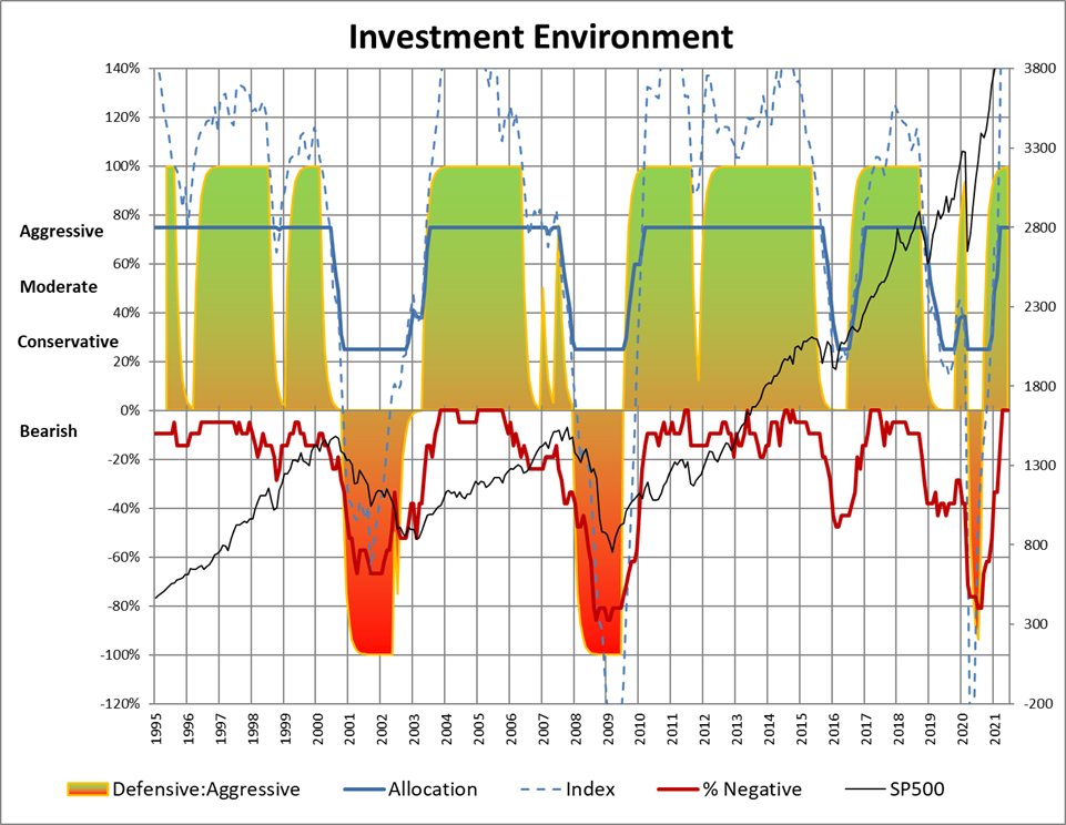
Source: Created By the Author
Figure #2 shows the allocations and performance of the Investment Model compared to the S&P 500. The Investment Model would have averaged 10% returns over the past 36 years. The S&P 500 has just now caught up to the Investment Model Portfolio. The primary benefit is that the Investment Model Portfolio reduces the impact of the major drawdowns. I avoided the majority of the drawdown of the 2020 recession by reducing allocations to stock and being more defensive. I perhaps remained too conservative during the recovery because the Investment Model was not available due to indicators being discontinued and because COVID and the new Delta variant are still large unknowns, and massive stimulus has inflated asset prices.
Figure #2: Investment Model Allocations and Returns
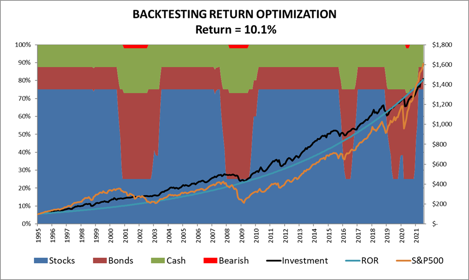
Source: Created By the Author
Table #2 shows the performance of the Lipper Categories since 1996 along with a representative fund chosen as having the highest risk adjusted return (Martin Ratio) during this time period. Growth funds have benefited from stimulus and asset inflation that will likely be a headwind for future performance while conservative funds have low or rising rates that will be a headwind for future performance.
Table #2: Metrics 1996 to 2021
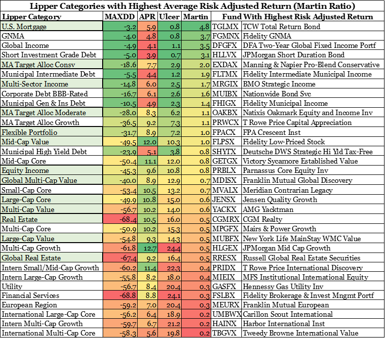
Source: Created By the Author Using Mutual Fund Observer
2. Fidelity’s Long Term View
Key Point: Fidelity’s view is that funds with more international exposure, particularly emerging markets, will outperform in the coming decade(s).
Fidelity published Investing for the Next 20 Years which contains its outlook for international growth over the next twenty years. In summary:
-
- Population and productivity trends may slow global GDP growth over the next 20 years.
- Slower growth could mean lower-than-average interest rates and lower stock market returns than in recent decades.
– Investing for the Next 20 Years, Fidelity, July 2021
Fidelity forecasts that many developing economies will continue to have higher growth than the developed economies as shown in Figure #3.
Figure #3: Long Term Historical and Forecast Growth
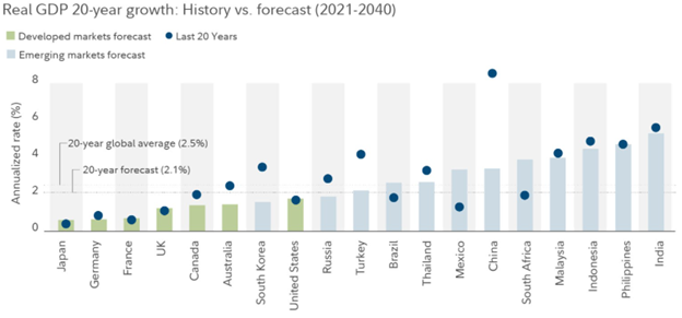
Source: Fidelity
Fidelity also published its view for the shorter term in Q3 2021: Reopening brings growth, but risks too. The highlights are reproduced below:
-
- We expect increased potential for elevated volatility in the coming year, as shifting expectations for monetary policy could push markets toward more inflationary or disinflationary outcomes
- The post-World War II shift to a peacetime economy, which catalyzed a cyclical rebound of growth and inflation, may be the closest historical analog to the upcoming post-COVID era where vaccination and reopening gain steam over the course of 2021 and 2022.
- Global liquidity surged during Q2, and we expect liquidity growth to slow in the coming months, raising the prospect of higher market volatility.
- While technology and other factors have kept inflation in check, we believe greater policy experimentation and “peak globalization” trends will eventually cause long-term inflation to rise faster than expected.
3. Historical Fund Performance
Key Point: Tables are shown for 1) Fixed Income, 2) Mixed-Asset, 3) Global and International Equity, and Domestic Equity for ten time periods based on risk adjusted returns (Martin Ratio).
I extracted all no-load mutual funds with low minimum required investments (excluding money market and target-date funds) and exchange traded funds available during these ten time periods. For the most recent time period, there are over three thousand funds representing 20 trillion dollars. I then calculated a market-weighted, risk-adjusted return (Martin Ratio) for the time period. I eliminated categories that had fewer than ten funds and less than fifteen billion dollars. The remaining thirty-three categories are grouped by 1) Fixed Income, 2) Mixed Asset, 3) Global and International Equity, and 4) Domestic Equity.
Mixed-Asset
Table #3 shows that the best mixed asset mutual funds during these ten time periods, on a risk adjusted basis, are Conservative and Flexible Portfolio Categories. Moderate Mixed Asset Funds also performed well. Total returns of Flexible Portfolios tend to do well when valuations are falling.
Table #3: Mixed Asset Categories with Highest Risk Adjusted Returns
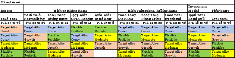
Source: Created By the Author Using Mutual Fund Observer
Fixed Income
Table #4 shows that multi-sector income, Corporate Bond BBB, and US Mortgage are among the most consistent categories for risk adjusted performance during the ten time periods. On a total return basis, multi-sector income and municipal high yield debt are consistently high performers while emerging market and high yield are less consistent.
Table #4: Fixed Income Categories with Highest Risk Adjusted Returns
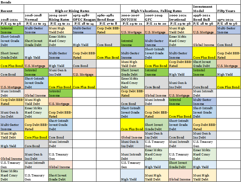
Source: Created By the Author Using Mutual Fund Observer
Global and International Equity
Of the Global and International Equity funds, Global Multi-Cap Value funds outperform on a risk adjusted basis. On a total return basis, global multi-cap value and global real estate funds are strong performers.
Table #5: Global and International Equity Categories with Highest Risk Adjusted Returns
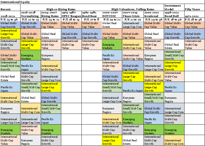
Source: Created By the Author Using Mutual Fund Observer
Domestic Equity
Equity Income, Multi-cap value, large cap value, and large cap core are consistently among the best categories for risk adjusted performance. Multi-cap value also performs well on total return basis while Equity Income is more middle of the road.
Table #6: Domestic Equity Categories with Highest Risk Adjusted Returns
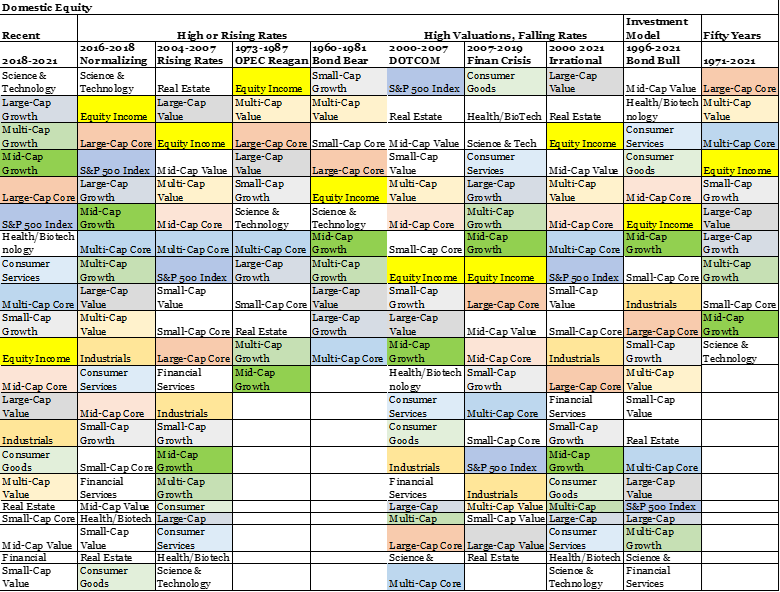
Source: Created By the Author Using Mutual Fund Observer
4. The Catastrophe Portfolio
Key Point: Eight funds are selected to be in the Catastrophe Portfolio from the Lipper Categories that have performed well following periods of high valuations or rising rates.
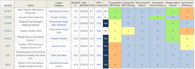
I selected the best performing funds from the funds that I track based on the Lipper Categories that do well in secular bear markets and when rates are rising. The Catastrophe Portfolio had an average annual performance of 12 percent over the past 55 months with a yield of 2.3% (See Table #7). I chose to show MFO/Lipper Category Rankings as opposed to metrics because I expect performance over the coming decade(s) to improve compared to past decade. All of the funds are great funds and five make the MFO Great Owl Classification. Each has outperformed its peer over the past four-year period.
I wrote about CDC in Right Beneath My Nose on MFO and DIVO in Amplify CWP Enhanced Dividend Income ETF With 5% Distribution on Seeking Alpha. Columbia Thermostat (COTZX/CTFAX) and Fidelity Multi-Asset Income (FAYZX/FMSDX) are two Flexible Portfolio funds that I include in many articles. I have identified the WisdomTree International Quality Dividend Growth ETF as a fund to track, but this is the first time that I have taken a serious look at its performance.
River Canyon Total Return Bond (RCTIX) fund has made my radar screen frequently but has a transaction fee at Fidelity. The Fidelity Strategic Income Fund (FSIAX/FADMX) is a fair alternative. Over the past 20 years (since 2001), FSIAX has had an annualized return of 6.5% with a maximum drawdown of 15.8%. The return over twenty years is only 2.3 percentage points less than the S&P 500. Multi-Sector Income Funds invest in high yield, emerging market debt, foreign market debt, and floating rate debt, among others, and is higher risk than investment-grade bonds.
Table #7: Catastrophe Portfolio Fund Metrics and Ratings – Four Years
Source: Created By the Author Using Mutual Fund Observer
Table #8 shows the Catastrophe Portfolio. It had an average annual return of 12 percent over the last 55 months with a maximum drawdown of only 11 percent. I chose to weight the four mixed-asset funds at 15% of the portfolio to increase diversification. COTZX/CTFAX sets its target allocation based on cyclically adjusted price-to-earnings ratios. It currently only has 10% allocated to stocks, but may increase this allocation to 90% depending upon how far the market falls. I included FAYZX/FMSDX because of its higher diversification than a traditional mixed asset fund. I included the Fidelity Freedom 2020 fund because I want the portfolio to get a little more conservative over time.
Table #8: Catastrophe Portfolio with MFO Metrics (4.6 Years)
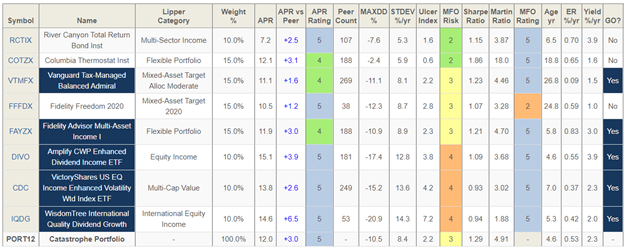
Source: Created By the Author Using Mutual Fund Observer
I selected the funds based on a process of elimination using Portfolio Visualizer, and the link to the last Portfolio Optimization in Portfolio Visualizer is provided here. I chose the Vanguard LifeStrategy Growth Fund (VSMGX) for comparison, because of its international exposure. The link to Backtest Portfolio in Portfolio Visualizer is provided here. Figure #4 shows the performance of the Catastrophe Portfolio without dividends reinvested, and with annual rebalancing. It looks similar to the Vanguard LifeStrategy Moderate Growth Portfolio.
Figure #4: Performance of Million Dollar Catastrophe Portfolio without Dividends Reinvested
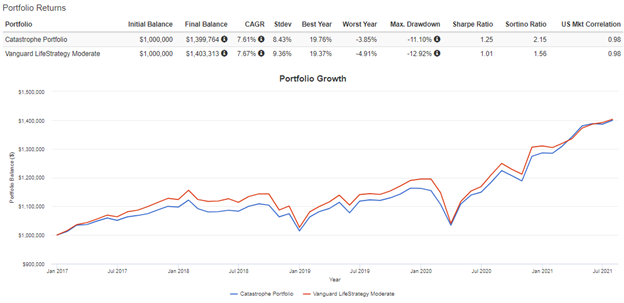
Source: Created By the Author Using Portfolio Visualizer
One of the reasons that these funds were selected is the higher yield, in addition to risk adjusted performance and solid future performance. The average (full year) annual income for the Catastrophe Portfolio has been $46,371 compared to $35,877 for the LifeStrategy Moderate Growth Portfolio.
Table #9: Annual Returns and Income of Catastrophe Portfolio

Source: Created By the Author Using Portfolio Visualizer
Looking under the hood, the Catastrophe Portfolio has 37% in domestic stocks and 17% in international for a total of a 57% allocation to stocks and “Other”. With COTZX/CTFAX, allocations to stocks will vary between about 57 and 69 percent depending upon market conditions. The stocks are multi-cap concentrated in large cap core and value. Bonds are mostly investment quality intermediate bonds. There is a significant allocation to lower quality short duration bonds due to the multi-sector income fund (RCTIX).
Table #10: Asset Allocation of Catastrophe Portfolio
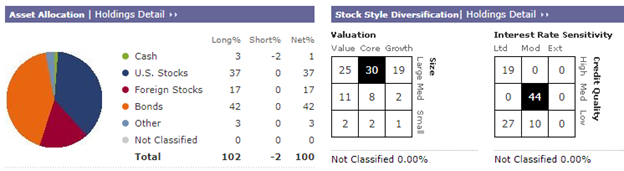
Source: Created By the Author Using Morningstar
Table #11 shows the exposures of the Catastrophe Portfolio from the Morningstar XRay Tool. The Portfolio is overweight Basic Materials, Industrials, Consumer Defensive, and Utilities, and underweight Consumer Cyclical, Communication Services, and Technology. This is a tilt toward the sectors that I believe will outperform over the next decade.
Table #11: Exposure of Catastrophe Portfolio
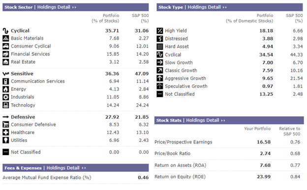
Source: Created By the Author Using Morningstar
Closing
This article is the culmination of a 15-year quest to build a low-risk, low-maintenance portfolio that will do well during a secular bear market. I appreciate the excellent service provided by Mutual Fund Observer that allows the individual investor to cut through the hype and look at both sides of the “Reward to Risk” equation.
As I approach retirement, I have two financial planners that I will talk to in more detail. My bigger concern is on managing risks and taxes, more than squeezing a little return out of a highly valued market. As for the Catastrophe Portfolio, it is a journey. The final Portfolio will be a combination of funds that I own and the funds from my last few articles moving in the direction of the Catastrophe Portfolio in this article.
What will I do in retirement now that I am getting my finances in order? I am going to take five percent of my portfolio and put it in an account to do short-term trend following to satisfy the adventuresome boy in me.
Best Wishes and Stay Safe!
Books and Articles about Business Cycles
Below are some of the books that have been influential to me when building the Investment Model, including essays I’ve published on the significance of business cycles in your success as an investor. I hope you find them provocative and profitable!
Nowcasting The Business Cycle: A Practical Guide For Spotting Business Cycle Peaks, (2014) by James Picerno
Conquering the Divide: How to Use Economic Indicators to Catch Stock Market Trends Hardcover, (2011) by James B. Cornehlsen, Michael J. Carr, and Karris Golden (Editor)
Investing with the Trend: A Rules-based Approach to Money Management, (2013) by Gregory L. Morris
Business Statistics for Competitive Advantage with Excel, (2019) by Cynthia Fraser
Business Cycles: History, Theory and Investment Reality, (2006) by Lars Tvede
Business Cycles (1999) by Francis X. Diebold, Glenn D. Rudebusch
The Age of Deleveraging: Investment Strategies for a Decade of Slow Growth and Deflation, (2011) by A. Gary Shilling
Recessions and Depressions: Understanding Business Cycles (2010) by Todd A. Knoop
Business Cycle: Simple Portfolios by Stage, Charles Lynn Bolin
Business Cycle: Boring Bond Funds, Charles Lynn Bolin
Business Cycle: Slowing Sales with Growing Inventories, Charles Lynn Bolin