


Mark Twain wrote in 1907, “There are three kinds of lies: lies, damned lies, and statistics.” The differences in opinion about soft or hard landings center on how trends are measured, data accuracy, revisions, seasonal adjustments, and which data to follow. I provide Chart #3 of what I am monitoring over the next six months as the story about soft or hard landings unfolds.
This article is divided into the following sections:
- Section 1, Lies, Damned Lies, and Statistics
- Section 2, Frosted Crystal Balls
- Section 3, Balance Between Aggressiveness and Defensiveness
- Section 4, Interest Rate Opportunities Along the Yield Curve
- Section 5, Taking the Long-Term View
Readers who want support that a recession is coming should read Recession Signal As Consumers Struggle To Pay Bills at RIA Advice by Lance Roberts. For those who want to read support for a soft landing, I suggest What recession? Inflation, GDP offer hope for ‘soft landing’ by Tobias Burns at The Hill. Stacey Vaneck Smith at NPR points out the middle ground of a mild recession in Is the Economy Headed for Recession Or a Soft Landing?
Lies, Damned Lies, and Statistics
Chart #1 illustrates various methods of interpreting inflation using the Consumer Price Index. The solid black line is the raw CPI index, and the dashed black line is a trend line from the start in July 2020 through the peak in June 2022. Clearly, the growth of inflation began to peak in June 2022. The year-over-year change in CPI (blue line) shows that inflation is 6.4% compared to a year ago; however, the shortcomings are that it compares inflation today to circumstances a year ago and does not emphasize the short-term trends. The red line is the continuously compounded annual rate of change in the CPI. The markets got the jitters in February because the January reading was higher than expected, in part due to revisions. The fourth quarter trend indicated inflation of 3.3% setting high expectations for disinflation until the January number jumped to 6.2%, impacting fears of higher rate hikes. Lions and tigers and bears, Oh My! The problem is there is too much noise in the data to rely on a single month.
Chart #1: Three Views of the Consumer Price Index
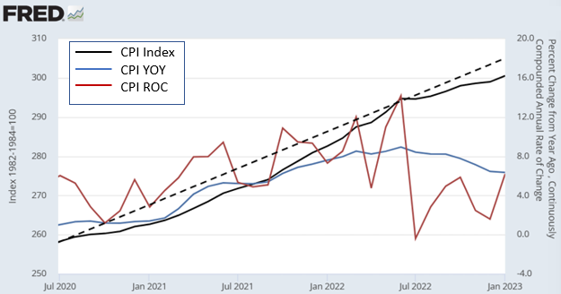
Source: Author Using BLS Data from the St. Louis Federal Reserve (FRED)
The bond market is now aligning more with what the Fed has been saying about inflation, but the stock market is slower to accept. Some prices are “sticky,” and it will take time to realize the lag in the effect of rate hikes as these prices, like labor costs, are slow to fall.
Paul Donavan at UBS gives a good, brief summary of the calculations about seasonal adjustments and their huge impact in “Please Adjust Your Data Set.” He points this out using employment as an example, “In January, the number of jobs in the U.S. fell by more than two and a half million. It was reported as a rise of just over half a million.” Seriously?!
One of the reasons for seasonal impacts on Labor is layoffs and discharges, which tend to be highest during December and January and lowest in February and the summer months, as shown in Chart #2. On average, since 2001, there have been an average of 1.9M layoffs and discharges per month, but 2022 was unusual, with only 1.4M per month. The trend may be changing, though. In December of last year, twenty percent of the layoffs from 2022 occurred compared to a longer historical average of nine percent for December. Is this a one-month aberration or the start of a trend? The U.S. Bureau of Labor Statistics will release the Job Openings and Labor Turnover Survey for January on March 8.
Chart #2: Seasonal Layoffs and Discharges by Month
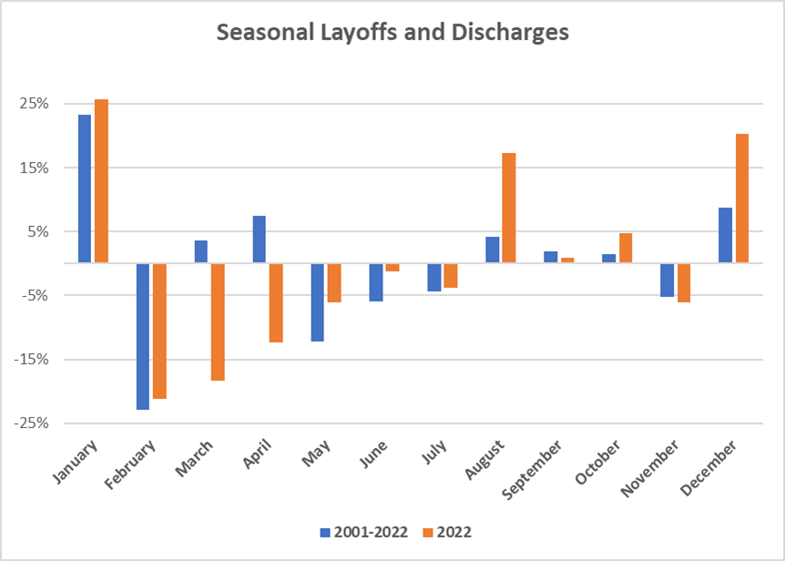
Source: Author Using St. Louis Federal Reserve (FRED) Database
Frosted Crystal Balls
I try to filter out the noise from the media and listen to the more researched and unbiased opinions. The Conference Board is an organization with a long and respectable track record. I quote Ataman Ozyildirim (Ph.D.), Senior Director of Economics at The Conference Board:
“Among the leading indicators, deteriorating manufacturing new orders, consumers’ expectations of business conditions, and credit conditions more than offset strengths in labor markets and stock prices to drive the index lower in the month… While the LEI continues to signal a recession in the near term, indicators related to the labor market—including employment and personal income—remain robust so far. Nonetheless, The Conference Board still expects high inflation, rising interest rates, and contracting consumer spending to tip the U.S. economy into recession in 2023.“
Source: The Conference Board, February 17, 2023
I created Chart #3 of the economy and financial markets to remove some of the frost off my crystal ball. The K.C. Fed Labor Market Conditions Index, Momentum Indicator (double green lines) shows Labor Conditions have peaked and are softening. The Weekly Economic Index (Lewis-Mertens-Stock) (solid red line) shows that economic growth is below historical trends. The S&P 500 Earnings Per Share (solid blue line) peaked in the fourth quarter of 2021 and is declining. The Federal Reserve Bank of New York Yield Curve Leading Indicator (black dotted line) estimates the probability of being in a recession by January 2024 to be 57%. The Smoothed U.S. Recession Probabilities (solid black line) is the Marcelle Chauvet and Jeremy Max Piger model, which is accurate and coincident without much lead time. It is starting to show that recession risk is rising. Finally, there is the dashed black line which is the number of months that the 10-year/1-year spread has been inverted. A Wells Fargo study found that there is an 80% chance that the upcoming recession will be longer than historical if it is inverted for 12 months or longer. It has been inverted for seven months now. The three black lines are the metrics that I will pay the most attention to over the next three to six months to gauge the probability and severity of a recession.
Chart #3: My Short-Term Crystal Ball
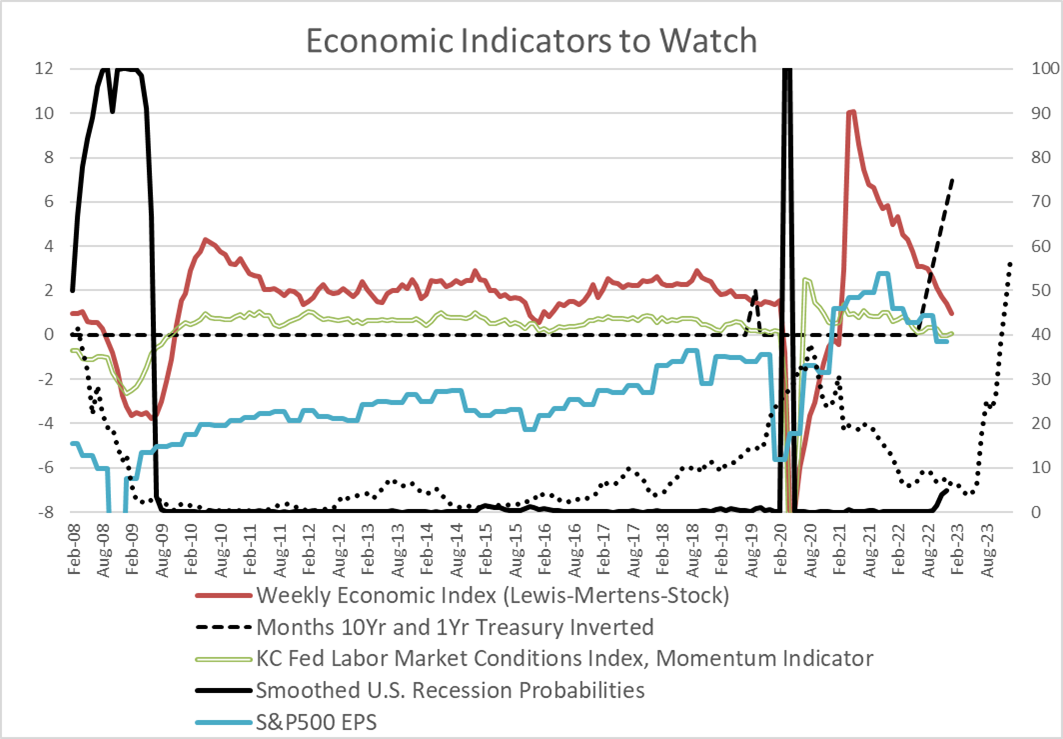
Source: Author Using St. Louis Federal Reserve (FRED)
The Real-Time U.S. Recession Probabilities will be updated by Jeremy Piger, Professor of Economics at the University of Oregon, for January around the end of February.
Okay, so how strong is the consumer? Chart #4 shows the inflation-adjusted Retail Sales, Personal Consumption Expenditures, Merchant Wholesalers Sales, and Total Business Sales, which comprise most of the sub-indicators in my Spending Indicator. They are set to 100 in April of 2022 when Real Retail Spending peaked. Inflation is taking a bite out of spending, and for the past ten months, the consumer is not keeping up with inflation. Pandemic-era savings are being depleted, credit card purchases are rising, and delinquencies are increasing, along with banks tightening consumer loan lending standards. Slowing real sales, softening labor conditions, and falling earnings may result in companies having more layoffs or deferring hiring.
Chart #4: Consumer and Business Spending Trends
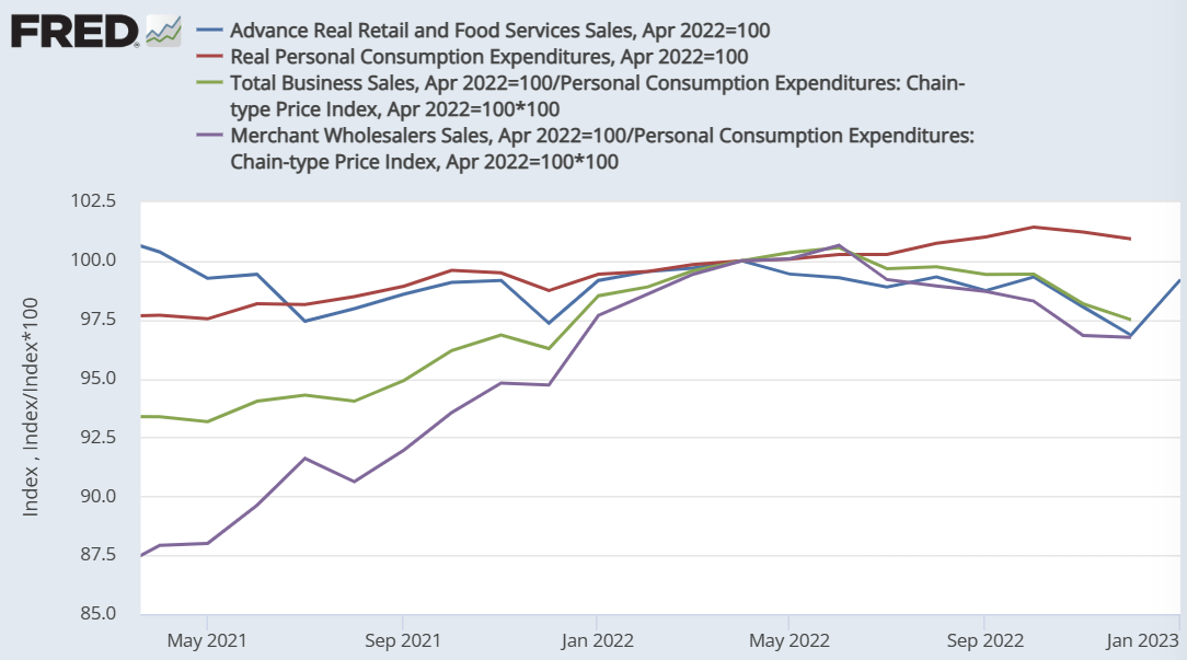
Source: Author Using St. Louis Federal Reserve (FRED) Database
Melissa Repko looks beyond the data trends by reading retailer company reports in “Retailers Could Face Cost Cuts and Slower Sales This Year” on CNBC. She notes that holiday sales were below expectations, retailers are increasing cost-cutting measures, including layoffs, credit card balances have risen, and consumer behavior is becoming more conservative.
Balance Between Aggressiveness and Defensiveness
Howard Marks, the co-founder of Oaktree Capital Management, wrote in Mastering the Market Cycle: Getting the Odds on your Side:
In my view, the greatest way to optimize the positioning of a portfolio at a given point in time is through deciding what balance it should strike between aggressiveness/defensiveness. And I believe the aggressiveness/ defensiveness should be adjusted over time in response to changes in the state of the investment environment and where a number of elements stand in their cycles.
Several years ago, I created Chart #5 of my favorite momentum indicator, the Moving Average Convergence Divergence (MACD), using a spreadsheet linked to the St. Louis Federal Reserve (FRED) database. It is based on exponential moving averages and produces a “Buy and Sell” signal. The MACD generated a “Sell” signal on February 10. I don’t do short-term trades, but the MACD can be useful for entry and exit points as well as a reality check for “Fear of Missing Out (FOMO).”
Chart #5: S&P 500 Momentum
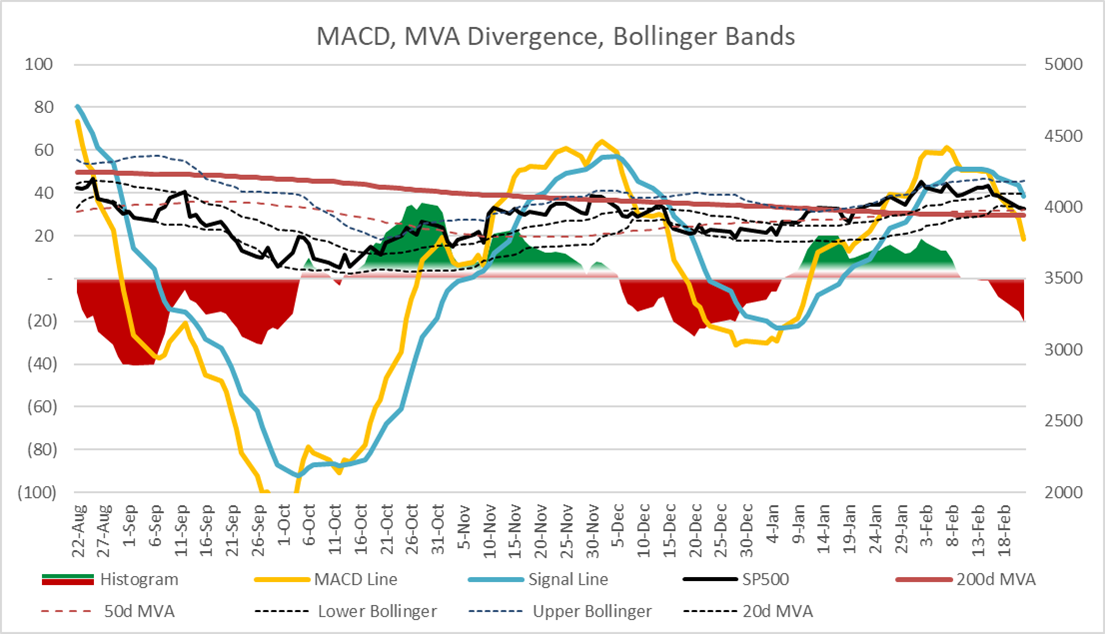
Source: Author Using St. Louis Federal Reserve (FRED)
Doug Noland’s Weekly Commentary on Seeking Alpha is a painfully detailed and highly informative collection of article summaries that dive into the details of the data often before their trends become apparent. He summarizes an article on Bloomberg by Farah Elbahrawy on February 13 that explains why the S&P 500 is losing its momentum. Ms. Elbahrawy states, “U.S. stocks are ripe for a selloff after prematurely pricing in a pause in Federal Reserve rate hikes, according to Morgan Stanley strategists.”
Interest Rate Opportunities Along the Yield Curve
This month, I created MACD momentum charts for Treasuries along the yield curve. Interest rates have risen in response to the “hotter” than expected January CPI data point. Chart #6 shows the changes in the Yield Curve over the past four months. The black line is the latest Yield Curve, along with the MACD buy and sell signals. The red arrows show the volatility around the ten-year Treasury yields. My interpretation is that yields are still increasing, which is hurting bond fund performance. The Fed Funds rate is likely to hit 5.25% by mid-year. I have a screener set up at Fidelity for bullish bond ETFs using indicators such as MACD. Currently, most bullish bond ETFs are short-duration. Cash is king.
Chart #6: Yield Curve Changes with MACD Buy and Sell Signals
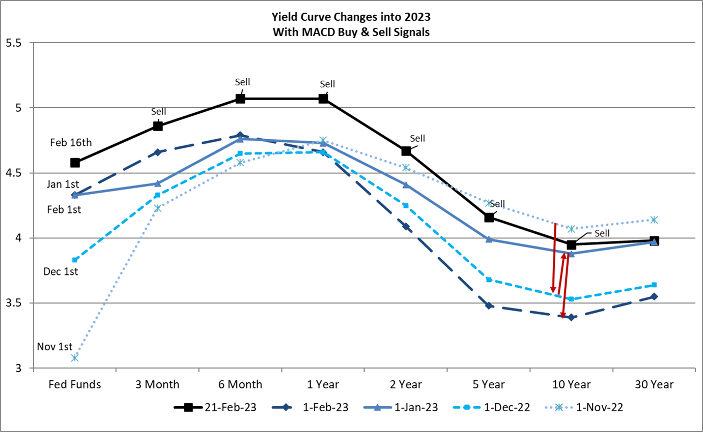
Source: Author Using St. Louis Federal Reserve (FRED)
Let’s not forget that the U.S. could default as early as June if the debt ceiling is not lifted. I believe that neither political party wants that, and it is unlikely but not absolute that it will not happen. On August 5, 2011, S&P downgraded U.S. sovereign debt after issuing warnings. The U.S. did not default. According to Wikipedia, S&P said, “The political brinksmanship of recent months highlights what we see as America’s governance and policymaking becoming less stable, less effective, and less predictable than what we previously believed. The statutory debt ceiling and the threat of default have become political bargaining chips in the debate over fiscal policy.” Sound familiar? Around this time in 2011, the yield on the ten-year Treasury fell from over 3% to less than 2% while the stock market fell over ten percent.
Chart #7: Time Surrounding S&P Downgrade of U.S. Sovereign Debt on August 5, 2011
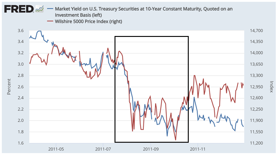
Source: Author Using St. Louis Federal Reserve (FRED)
As a precaution and consistent with my 2023 strategy, I expect to finish extending durations of Treasury bond ladders before mid-year and then add to intermediate bond funds. Falling yields, like in August 2011, would benefit bond prices.
Taking the Long-Term View
Looking beyond the short-term frost over our crystal balls, Christine Benz at Morningstar, wrote “Experts Forecast Stock and Bond Returns: 2023 Edition,” where she provides the following chart of ten-year forecasts. It shows that the risk premium of stocks compared to bonds has diminished since rates have risen. Secondly, it shows that there may be opportunities in developed markets and emerging markets. I expect that at some point after mid-year, to begin reinvesting short-term Treasuries as they mature into equity mutual funds and ETFs.
Chart #8: Forecasts for Long-Term Asset-Class Returns
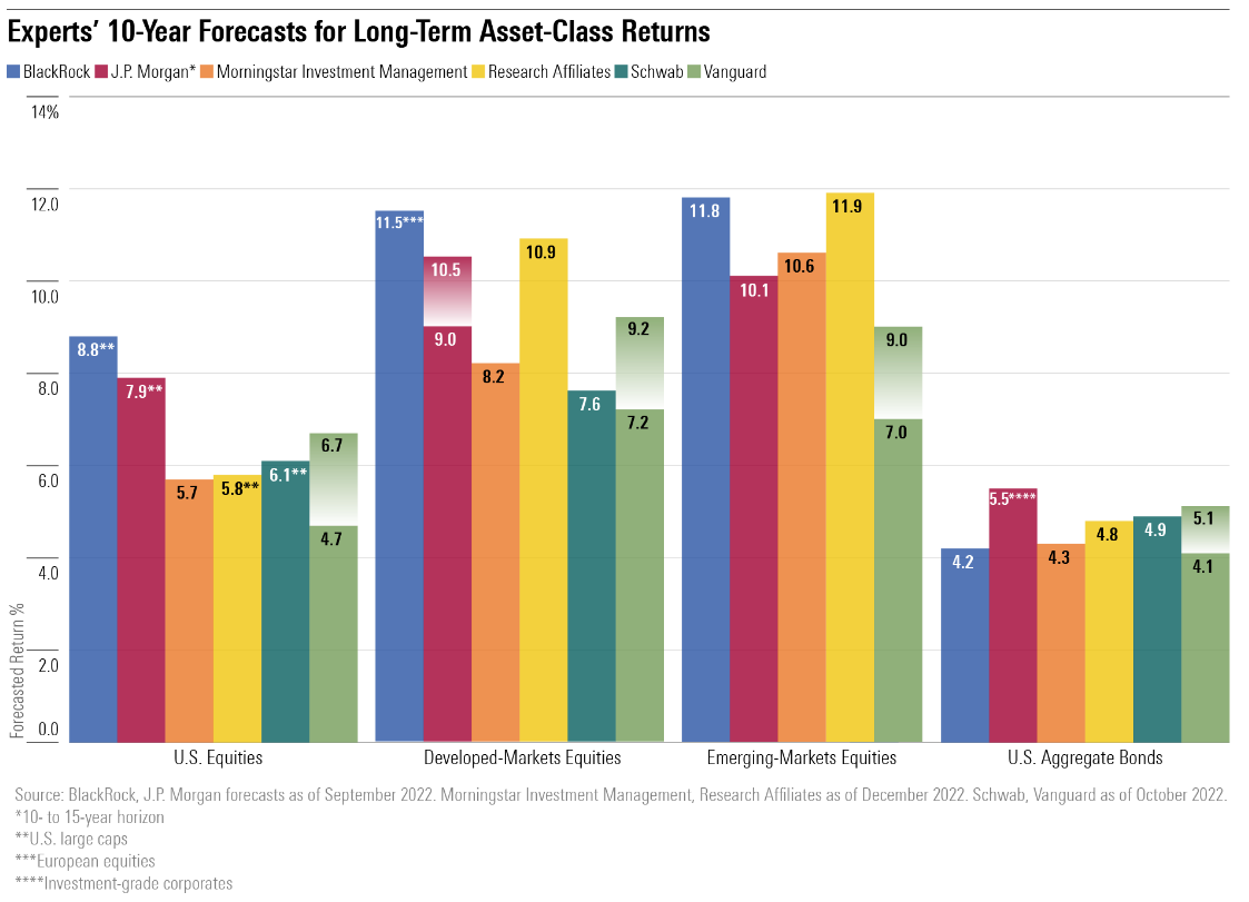
Source: “Experts Forecast Stock and Bond Returns: 2023 Edition” by Christine Benz, Morningstar
Closing Thoughts
It will become clearer in the next few months whether there will be a hard or soft landing or somewhere in between. Regardless, highly rated bonds have become more attractive. Harry Markowitz, Nobel laureate and author of numerous books, including Risk-Return Analysis, said that “Diversification is the only free lunch.” My base case remains unchanged that the Fed will raise rates by a quarter point one or two more times this year, inflation will continue to fall but remain above 2% for longer, the economy will show more weakness in the coming months, and a recession is likely during the latter part of the year.
Special thanks go to my friend, Dave Hogle, who started me on the investing journey by loaning me The Four Pillars of Investing by William Bernstein twenty years ago, for our numerous long-distance Costco runs discussing everything under the sun, and for his insightful suggestions for these articles.
I learned from a Reader and member of MFO (Thank You) in January that the MACD and Bollinger Bands are available on the free version of Stockcharts.com for ten-year Treasury yields, using the symbol $UST10Y. Bond prices move inversely with yields. I followed up, and the Fidelity Active Trader Pro and Stockcharts.com are also capable of running these metrics for mutual funds, which is a useful tool.