


I have often heard that smaller funds are able to outperform larger ones because they can be nimbler. This article started as a search for the best performing “core” funds over the past fifteen years, but I started over several times as I challenged my own search criteria to select only large funds. My assumption was that success builds upon success and investors invest more in funds that are doing well. Funds that don’t perform well are closed or merged into other funds creating a “survivor bias”. Larger funds should reflect better performance over a given time period. It makes sense.
To investigate whether smaller or larger core funds outperform over time, I extracted all of the “actively managed” funds for twenty-six selected Lipper Categories for the full cycle time period from November 2007 through December 2019. I separated the approximately fourteen hundred funds into quintile groups of Assets Under Management (AUM) per Lipper Category. Surely smaller Small Cap and Mid Cap funds can outperform larger funds because they are nimbler? This afterthought is explored in the final section.
This article is divided into the following sections:
- Section 1, Definitions
- Section 2, MFO Rating versus Assets Under Management
- Section 3, Performance Metrics by Size
- Section 4, Competitive Advantage
- Section 5, Comparing Funds of Similar Age and AUM
- Section 6, Great Owls by Size
- Section 7, Selected Funds in Their Prime
- Section 8, Small- and Mid-Cap Fund Performance by Size
Definitions
The definitions for the metrics used in this article are:
- Ulcer Index measures both the magnitude and duration of drawdowns in value. A fund with a high Ulcer Index means it has experienced deep or extended declines, or both. It is calculated as the square root of the mean of the squared percentage drawdowns in value.
- The Martin Ratio measures the excess return relative to Treasury Bill using the Ulcer Index as the denominator. It is a measure of risk-adjusted return.
- MFO Rank divides a fund’s performance based on Martin Ratio (risk-adjusted return) relative to other funds in the same investment category over the same evaluation period. Funds in the top 20 percentile (top quintile) are assigned a 5 for “Best,” while those in the bottom 20 percentile (bottom quintile) are assigned a 1 for “Worst.”
- MFO “Great Owl” distinction is assigned to funds that have earned top performance rank for evaluation periods 3, 5, 10, and 20 years, as applicable.
MFO Rating versus Assets Under Management
Figure #1 shows the summary results of the MFO Rank for quintile groups of Assets Under Management by Lipper Category. The ratings of the Large and Very Large Funds are skewed to higher risk-adjusted performance while “Very Small” and “Small” funds are skewed to lower risk-adjusted performance.
Figure #1: MFO Rating vs Fund Assets Under Management (Full Cycle Nov 2007 to Dec 2019)
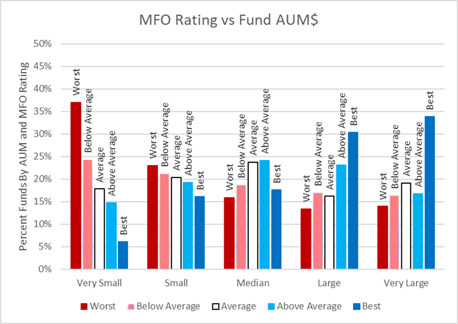
Source: Author Using MFO Premium database and screener
It became apparent that some funds can have high total returns and lower risk-adjusted returns as measured by the Martin Ratio. Figure #2 shows similar results for APR as was shown for risk-adjusted returns.
Figure #2: APR Rating vs Fund Assets Under Management (Full Cycle Nov 2007 to Dec 2019)
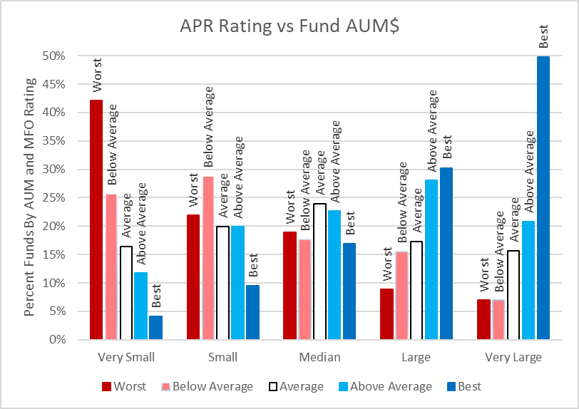
Source: Author Using MFO Premium database and screener
It appears that a fund’s relative size over a long-term period often reflects its performance. Vanguard illustrates how mutual fund cash flows follow performance in Figure #3.
Figure #3: Mutual Fund Cash Flows Often Follow Performance
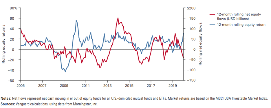
Source: Vanguard’s Principles for Investing Success, corporate.vanguard.com
Performance Metrics by Size
Table #1 breaks Annualized Return down by Lipper Category and AUM. In general, the largest fund quintile within a Lipper Category has a one to three percent APR advantage over the smallest of funds within the same category.
Table #1: Annualized Return by Category and AUM (Full Cycle Nov 2007 to Dec 2019)
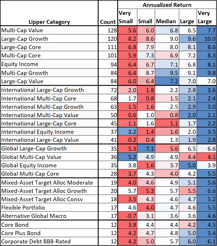
Source: Author Using MFO Premium database and screener
The table for Maximum Drawdown is less clear. Smaller funds often have better downside protection.
Table #2: Maximum Drawdown by Category and AUM (Full Cycle Nov 2007 to Dec 2019)
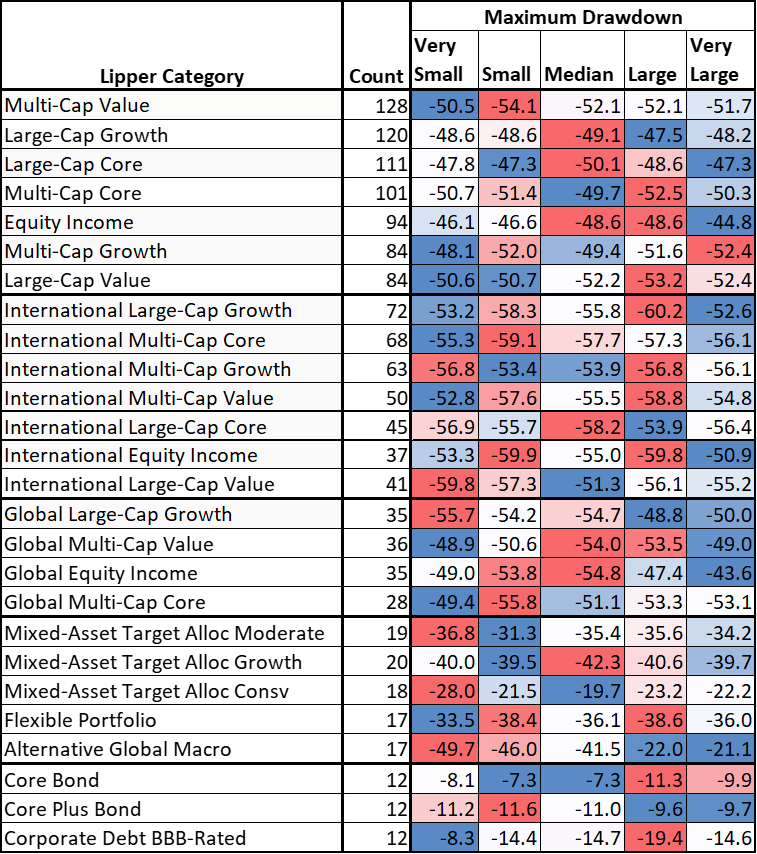
Source: Author Using MFO Premium database and screener
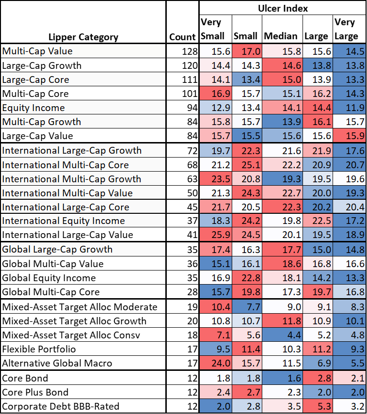
The Ulcer Index which includes the length of drawdown in addition to the depth does show a lower Ulcer Index for larger funds. Larger funds may recover faster from drawdowns than smaller funds.
Table #3: Ulcer Index by Category and AUM (Full Cycle Nov 2007 to Dec 2019)
Source: Author Using MFO Premium database and screener
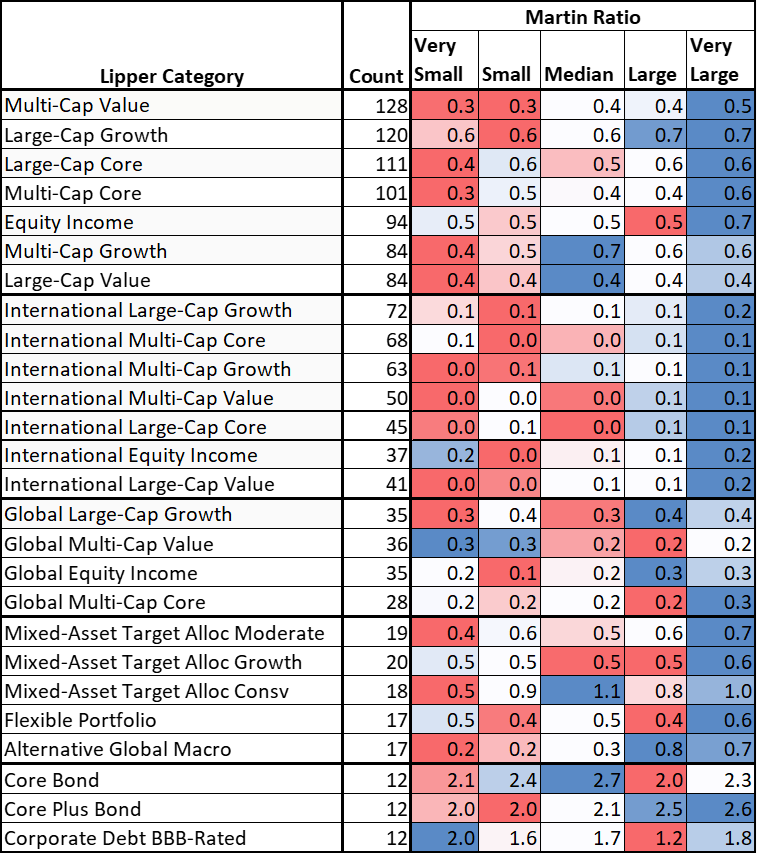
With higher returns and lower Ulcer Index, it makes sense that the Martin Ratio (Risk Adjusted Return) is higher for larger actively managed funds.
Table #4: Matin Ratio by Category and AUM (Full Cycle Nov 2007 to Dec 2019)
Source: Author Using MFO Premium database and screener
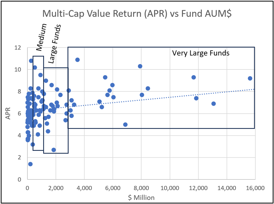
I use the Multi-Cap Value Lipper Category to visually examine the ranges of return and AUM. Outlier high returns for the largest funds are excluded.
Figure #4: Multi-Cap Value Returns vs AUM (Full Cycle Nov 2007 to Dec 2019)
Source: Author Using MFO Premium database and screener
Competitive Advantage
Smaller funds that perform well may not grow into larger funds because of limited access to brokers, or being an institutional share class that is not available to retail investors. Some managers temporarily “close” funds to enhance long-term performance. Larger funds may have advantages such as economies of scale, larger pools of management talent, and research resources. Table #5 shows that expense ratios of the largest funds are about a half percentage point lower than the smallest funds which accounts for some of their outperformance.
Table #5: Expense Ratios vs AUM (Full Cycle Nov 2007 to Dec 2019)
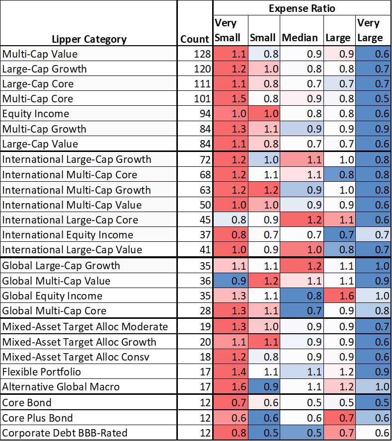
Source: Author Using MFO Premium database and screener
Comparing Funds of Similar Age and AUM
I investigated whether the age of the fund had an impact on the outperformance of larger funds by narrowing the funds for the time period to those 15 to 20 years old. The purpose was to compare funds of a similar age. Figure #5 shows that over the same full cycle, the same pattern of outperformance in larger funds exists for funds with similar ages.
Figure #5: MFO Rating vs AUM for 15- to 20-Year-Old Funds (Full Cycle Nov 2007 to Dec 2019)
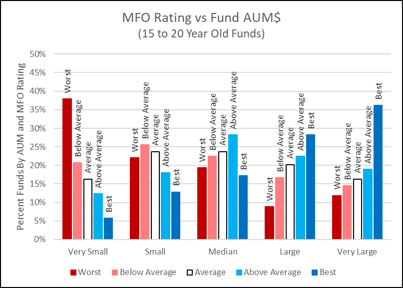
Source: Author Using MFO Premium database and screener
Great Owls by Size
Will fund performance drop off if the fund gets too large or management changes? I extracted all of the MFO Great Owl Funds for this time period to exclude those whose performance declined recently. I excluded funds that are not available at either Fidelity or Vanguard or have high minimum initial investments. “Second Class” refers to funds with a different share class that are available but the expenses are higher. I also filtered the list to exclude funds with low “Family” ratings and those whose performance have declined recently. Most of the Great Owls are larger funds, however, there are several smaller Great Owls available to individual investors. I reviewed the charts of the funds and narrowed the list to those that I favor. These are designated with the names shaded blue.
Table #6: Great Owls Core Funds (Full Cycle Nov 2007 to Dec 2019)
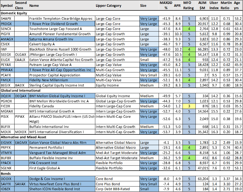
Source: Author Using MFO Premium database and screener
Selected Funds in Their Prime
I reviewed the charts of the Great Owls and selected one per Lipper Category as shown in Table #6 above. I described the Vanguard Tax-Managed Balanced Fund (VTMFX) in “Helping a Friend Get Started with Financial Planning” and the FMILX in “Fidelity Actively Managed New Millennium ETF (FMIL)”.
Figure #6: Author’s Selected Core Great Owl Funds
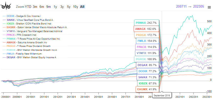
Source: Author Using MFO Premium database and screener
Small- and Mid-Cap Fund Performance by Size
Finally, I looked at small- and mid-cap funds to see if larger funds outperform. I extracted over three hundred actively managed funds in the small- and mid-cap core and growth categories and segregated them by AUM per Lipper Category. Indeed, larger funds in the Lipper Categories outperform as measured by MFO Rating (risk-adjusted return) and APR Rating (Annualized Return).
Figure #7: Small- and Mid-Cap MFO Rating vs Fund Assets Under Management
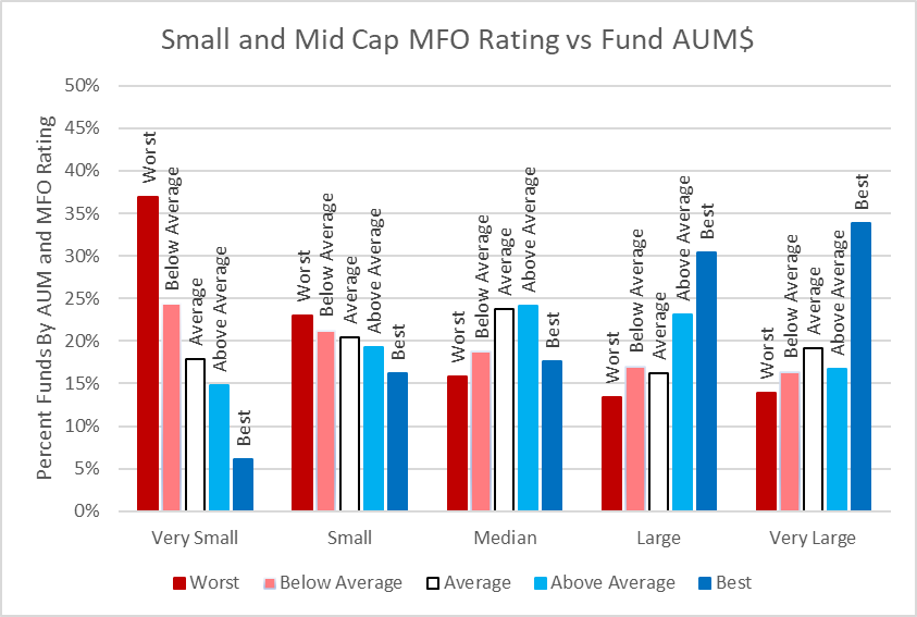
Source: Author Using MFO Premium database and screener
Figure #8: Small- and Mid-Cap APR Rating vs Fund Assets Under Management
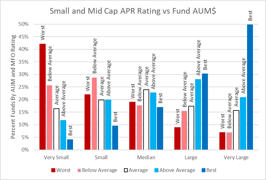
Source: Author Using MFO Premium database and screener
Table #7: Great Owls Small- and Mid-Cap Funds (Full Cycle Nov 2007 to Dec 2019)
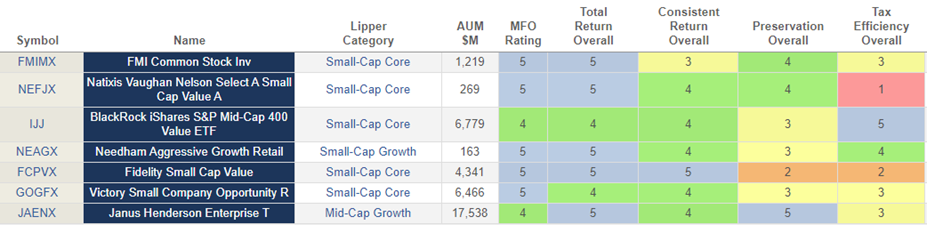
Source: Author Using MFO Premium database and screener
Figure #9: Small- and Mid-Cap Great Owl Core and Growth Funds
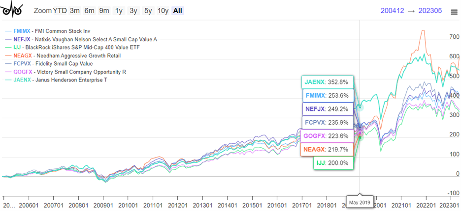
Source: Author Using MFO Premium database and screener
Closing Thoughts
While new funds that are smaller may outperform larger rivals due to new ideas, technology, or fresh management insights, over time if they continue to outperform, I expect them to grow to reflect this success. Keep in mind that in this article fund size is relative to peers in the same Lipper Category. I will continue to favor the larger “Great Owls”.
Having higher risk-adjusted returns often comes at the expense of having higher total returns. This article shows that is not always the case. The funds covered in this article have achieved both.
I greatly appreciate the work done by Charles Boccadoro to improve the MFO MultiScreen tool. Without it, I would not be able to shift through the universe of funds to find these great funds.