


In this fourth of a six-part series on the Six Rules of Investing, I look at investing according to the business cycle. This article is divided into four sections: 1) The Investment Environment, 2) Assets that do well in stages of the business cycle, 3) February Fund Performance, and 4) My Target Portfolios.
How has your portfolio compared to the market or other portfolios? Does it offer sufficient reward for the risk that you are taking? Chart #1 contains the mixed-asset funds from Charles Schwab, Fidelity, and Vanguard grouped by Lipper Category. The horizontal axis is the Ulcer Index (risk) compared to the average return over the past two years ending February on the vertical axis. Notice that for the past two years, higher risk funds have had low or negative incremental returns. Secondly, notice that the Lipper Categories cover a wide range of risks and returns. In other words, some of the conservative funds have a higher risk than some of the moderate funds, and so on. My personal target portfolios are shown as Vanguard Conservative, Fidelity Conservative and Fidelity Moderate Portfolios. This topic is covered in Section 3 and 4 of this article.
Chart #1: Two Year Performance of Mixed Asset Funds and Target Portfolios
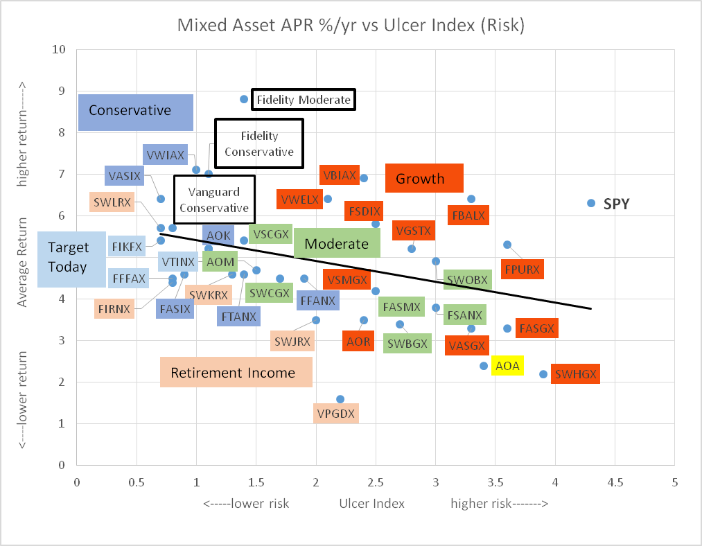
(Source: Author based on data from the MFO Premium screeners)
In 2005, I read Charles Schwab’s New Guide to Financial Independence. Mr. Schwab said something to the effect that you have to take into consideration your spouse’s ability to manage finances in case of your untimely death. As we get older, some of us won’t be as capable of managing our investments. With these two thoughts in mind, I spent the past month simplifying my portfolios for the long run. Section #4 contains my three Target Portfolios for Vanguard and Fidelity. The intent is to have low risk, globally diversified portfolios.
As I write this article in the middle of March, the S&P 500 is going through extreme gyrations. The S&P 500 is down 16% year to date. The coronavirus is serious for the lives lost. There are additional impacts as transportation is restricted, schools closed, sporting events canceled, and tourism curtailed. We won’t know the full impacts of coronavirus and oil price wars, nor the massive monetary easing and fiscal stimulus on the economy and investment environment for several months. At times like these, having a financial plan is critical. Fidelity advises:
- For long-term investors, having a diversified investment plan—and sticking to it through market ups and downs—is better than selling stocks when they drop and locking in short-term losses.
- If the market pullback has shifted your target mix of stocks, bonds, and cash, consider rebalancing your portfolio back to your target asset mix. That can help position you for the eventual rebound.
1) A Brief Review of the Investment Environment
Chart #1 is my Investment Model which is intended to maximize return by adjusting allocations (dark blue line) based on the business cycle. I roughly follow Benjamin Graham’s guidelines of never having less than 25% invested in stocks and never more than 75%. The dashed blue line is the index underlying the Allocation Index before a 20% and 75% cap is applied. It shows improvement in the Investment Environment since September 2019 until the fear of the Coronavirus shook investors. The Allocation Index (blue) is now at 20% stocks recommending conservatism. The red line is the percent of indicators that are negative showing there is some improvement.
Chart #2: Investment Model
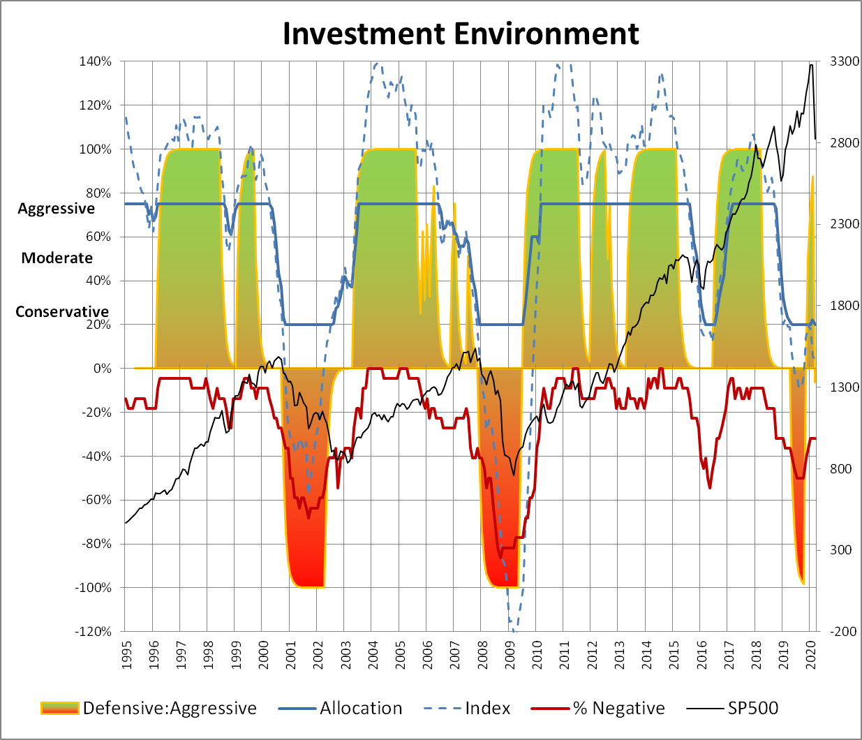
Source: Author
In “Updating Our Recession Probability Model”, Wells Fargo presents three cases for a recession starting in the next six months. The “best case” scenario is that there is a 16% probability of a recession starting in the next six months, the “worst-case” scenario is 99% probability, and the mild case (Chart #3) is 73%. There you have it. Over the next few months, the market can go up a lot because the coronavirus is contained, oil wars resolved, and benefits of monetary and fiscal stimulus or the market can go down a lot because we are in a recession. Hold on to something steady!
Chart #3: Wells Fargo Mild Case Recession Probability
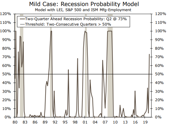
Source: Wells Fargo
2) Assets that Do Well By Stage of the Business Cycle
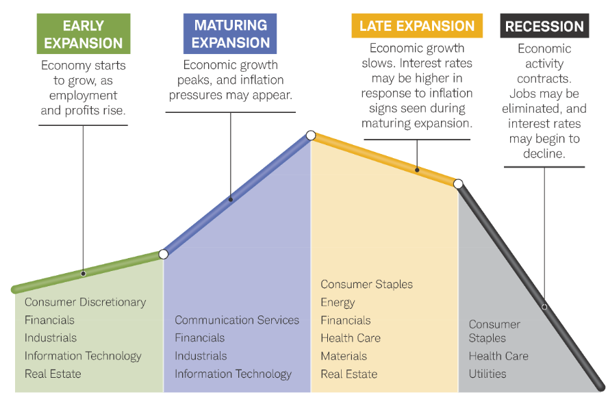
Investing according to the business cycle is more common than many investors realize. Fidelity provides a summary view (Chart #4) of the characteristics of the economy during the stages of the business cycle.
Chart #4: Fidelity Hypothetical Business Cycle
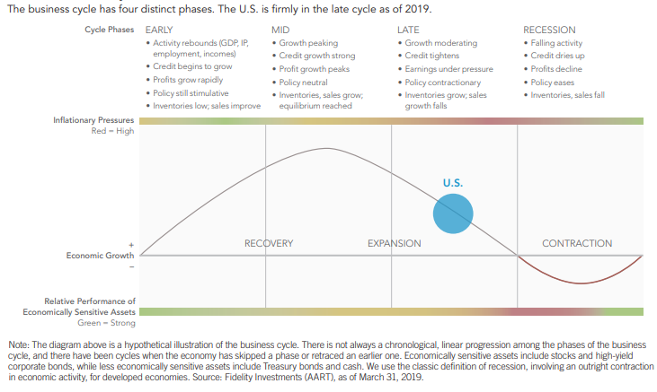
Source: Fidelity
In Chart #5, Fidelity shows the sectors that do well by stage of the business cycle.
Chart #5: Fidelity Sector Performance by Business Cycle Stage
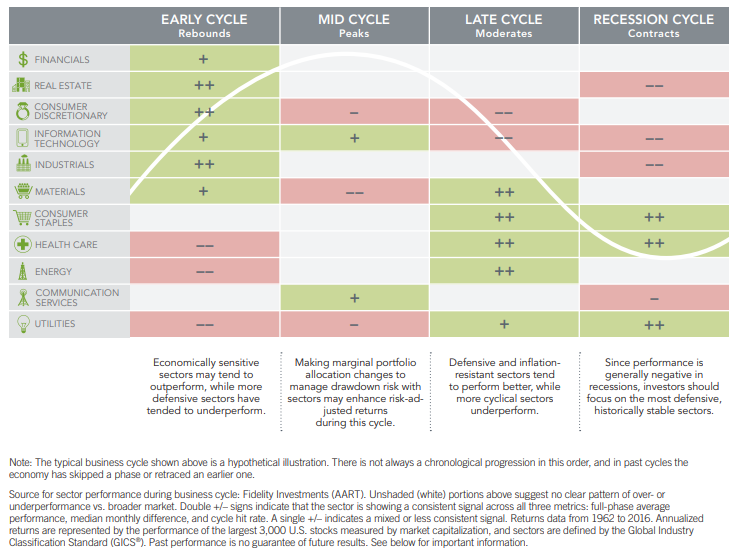
Source: Fidelity
Chart #6 is a comparable view from Charles Schwab showing which sectors do well during stages of the business cycle.
Chart #6: Charles Schwab Sector Performance by Business Cycle Stage
Source: Charles Schwab
Chart #7 shows my breakout of the business cycle by stage (right axis) with “1” being Recovery, “2” is Expansion, “3” is Late Stage, and “4” is Potential Recession. Most of the data is not in for February.
Chart #7: Author’s Delineation of Business Cycle Stages
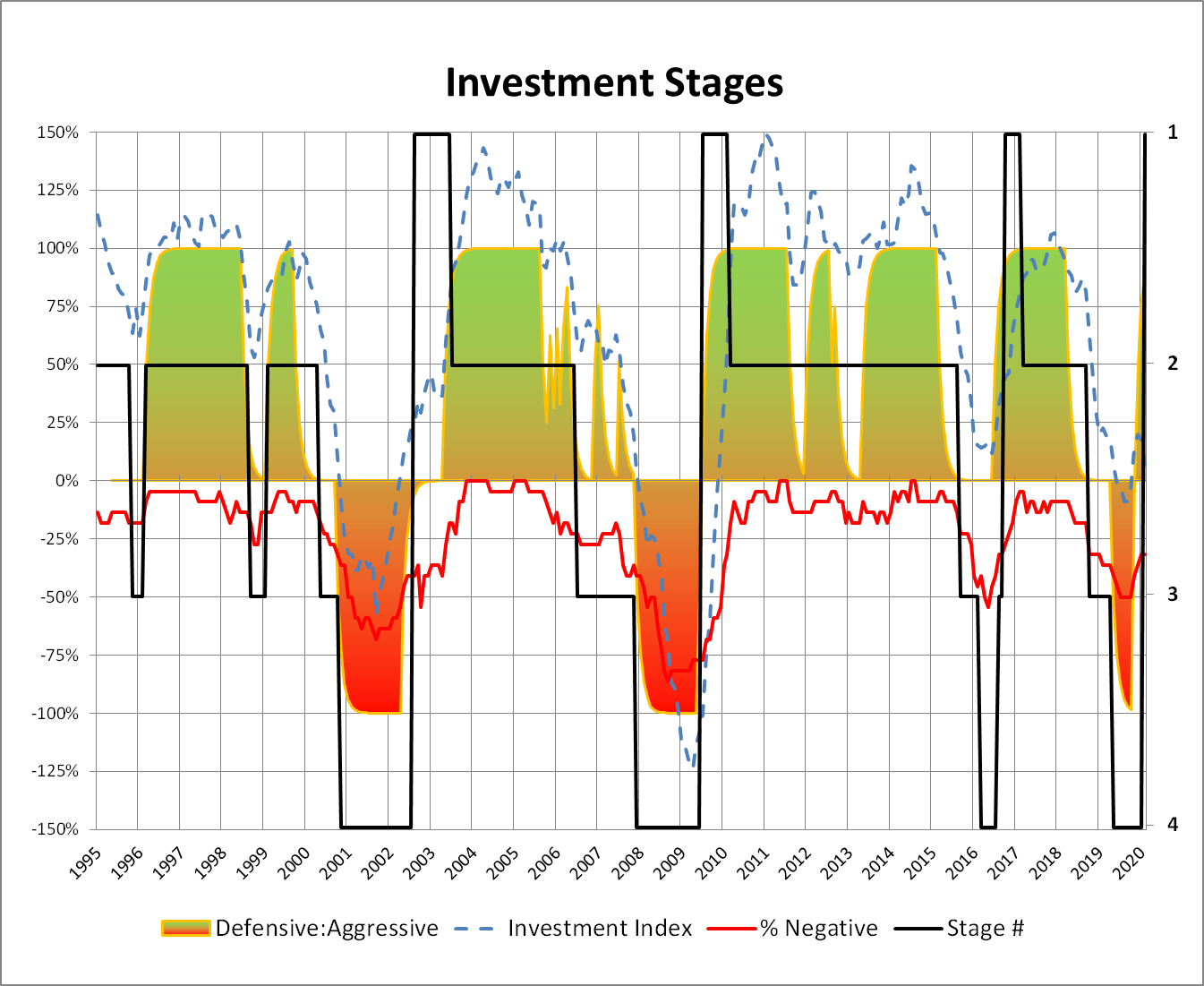
Source: Author
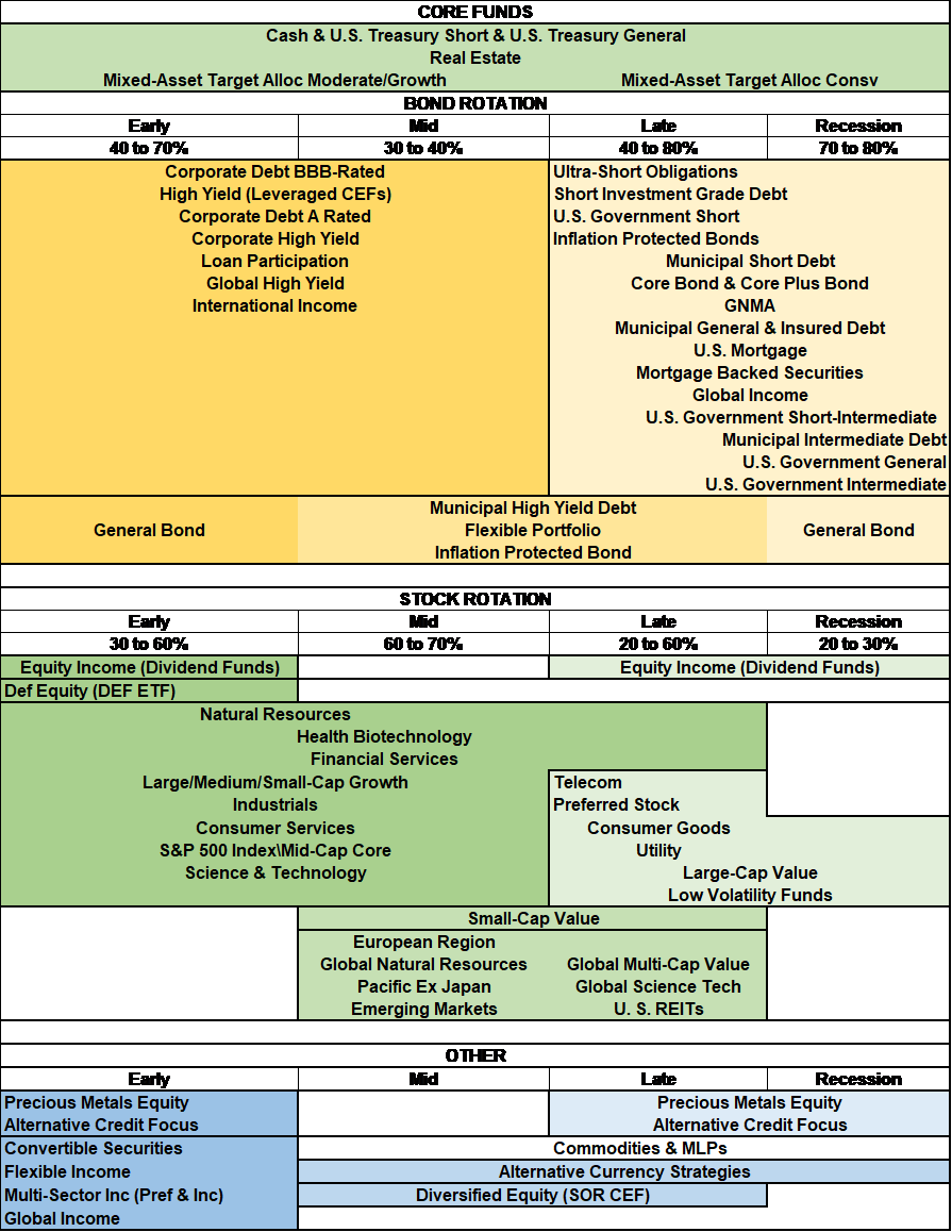
Table #1 shows the funds that do well by business cycle stage. Typically, investors should be invested in growth stocks during the Recovery and Expansion Phase and shift to a value orientation in the Late Stage and Recessions. Real Estate can be good for diversification is all stages. Gold tends to do well in the Late Stage and Recessions.
Table #1: Fund Style Performance by Business Cycle Stage
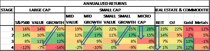
Source: Author
I use the St. Louis Federal Reserve FRED database for bond total return. High yield bonds typically do well during the Recovery and Expansion stages. “CB” stands for corporate bonds and “HY” for high yield.
Table #2: Bond Quality and Duration Performance by Business Cycle Stage
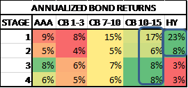
Source: Author
Fidelity reports sector performance as shown in Table #3. Year to date, utilities, real estate, consumer staples, technology, and health care have outperformed industrials, materials, financials, and energy.
Table #3: Sector Performance
| YTD | 1 Year | |
| Utilities | -12% | -1% |
| Real Estate | -9% | -1% |
| Consumer Staples | -10% | 4% |
| Information Technology | -8% | 18% |
| Health Care | -11% | 0% |
| Communication Services | -13% | -1% |
| Consumer Discretionary | -18% | -6% |
| Industrials | -23% | -15% |
| Materials | -25% | -16% |
| Financials | -25% | -12% |
| Energy | -47% | -50% |
| S&P 500 Index | -8% | 7% |
“Schwab Intelligent Portfolios Guide to Asset Classes & ETFs” describes asset classes and when they perform well.
Table #4: Asset Class Description
| Asset Class | Performs Well During: |
| US Large Company Stocks | During economic expansions and when inflation is low or moderate |
| Stocks—Fundamental | Environments that reward value stocks |
| US Small Company Stocks | When the economy is expanding or investors expect such expansion to occur |
| International Developed Large Company Stocks | When international developed countries are growing more rapidly than the U.S. and when their currencies are appreciating against the U.S. dollar. |
| US High Dividend Stocks | High dividend paying stocks perform well in most markets. They have exhibited particularly strong relative performance versus non-dividend paying equities during bear markets. |
| International Developed Small Company Stocks | During the earlier stages of a global economic recovery and when a strong foreign currency relative to the dollar |
| International Emerging Market Stocks | During periods of faster growth when commodities are trading at relatively high levels, local export markets are thriving due to a growing economy, and local governments implement policies more conducive to private sector growth. |
| US Exchange-Traded REITs | In moderate or high inflation environments. |
| International Exchange-Traded REITs | During declining interest rate environments and when banks are expanding their lending portfolios, and against inflationary pressures. |
| Master Limited Partnerships | During periods of high commodity production, especially oil and gas. |
| US Treasuries | When inflation is low and interest rates are falling, like all bonds. But they tend to outperform other types of bonds, on a relative basis, when market volatility is high and when the economy is weakening and stock prices are falling. |
| US Investment Grade Corporate Bonds | When the economy is growing and default rates are low and are expected to stay low. |
| US Securitized Bonds | When interest rates are relatively stable or falling. |
| US Inflation Protected Bonds | When inflation rises, since the principal and coupons would both rise as well. If traditional Treasury yields are falling, inflation protected bonds’ yields may follow suit. |
| US Corporate High Yield Bonds | When the economy is strong and default rates are low and are expected to remain low. |
| International Emerging Market Bonds | When the U.S. dollar and other major currencies like the euro or Japanese yen decline because EM assets look more attractive by comparison. A growing global economy tends to benefit EM country bonds as well. |
| Preferred Securities | When long-term bond yields are stable or falling, and the economic outlook is positive. |
| Bank Loans | When short-term interest rates—specifically 3-month Libor—are rising and default rates remain low. |
| Investment Grade Muni Bonds | When interest rates are falling and inflation is low. |
| Gold and Other Precious Metals | When expectations for future inflation are increasing, the U.S. dollar is falling, geopolitical unrest is rising, or there are widespread concerns about the stability of the financial system. |
Source: Charles Schwab
The following table is from “Small Investors Should Be Conservative Going Into 2020”, where I estimate which funds have done best over the past 25 years. As a note, international fund performance depends on where the rest of the world is in relationship to the U.S. in the business cycle.
Table #5: Asset Class Performance by Business Cycle Stage
Source: Author using MFO Premium and Portfolio Visualizer
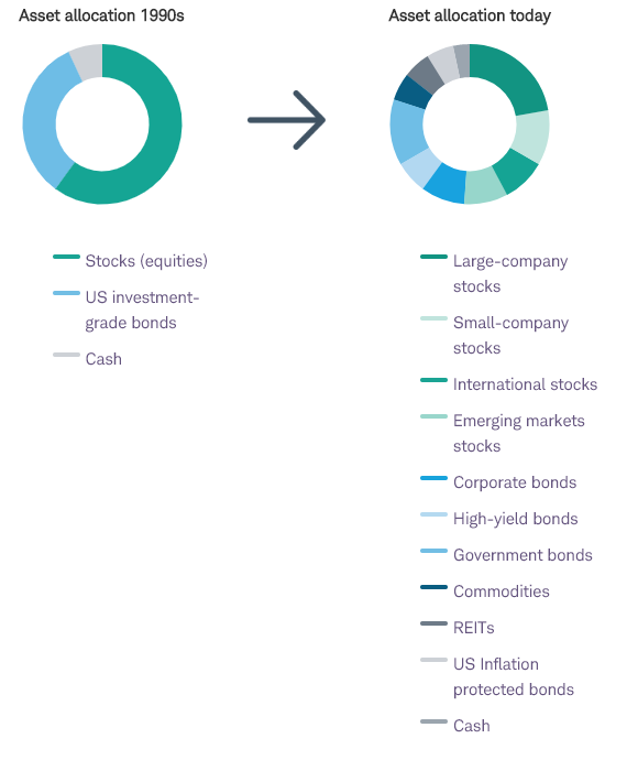
“Schwab Intelligent Portfolios Asset Allocation White Paper” describes evolving theories of asset allocation. Correlations of equities have become much higher over the past 25 years. Allocations across diverse assets can reduce risk in portfolios. In this environment of lower expected stock returns and low-interest rates, asset allocations may be evolving as they show in the hypothetical allocation below.
Chart #8: Charles Schwab Conceptual Changes in Asset Allocation
3) A Review of February Fund Performance
I began writing articles about the business cycle and managing risk several years ago. I built a Ranking System based on Mutual Fund Observer data using factors of Risk, Risk-Adjusted Returns, Momentum, Income, and Quality (Valuation, Bond Ratings, etc) to represent my preferences. Most of the trends that I follow now start January 2018, because that is when many investors began rotating to assets that do well in the late stage of a business cycle. The coronavirus and oil price wars have been catalysts to an already weak and overvalued market.
Chart #9 is intended to answer if the drawdown of the mixed asset funds from Charles Schwab, Fidelity and Vanguard in 2020 (vertical axis) follow the same trends in drawdown for the past two years ending February 2020 (horizontal axis). In other words, can the risk in a fund over the past two years accurately reflect the risk going forward over short time periods? Vanguard Conservative, Fidelity Conservative, and Fidelity Moderate are Personal Target Portfolios that I cover in the next section. There is a good correlation (0.69) between the drawdowns for the two time periods.
Chart #9: Two Year Drawdown (Ending Feb 2020) vs YTD Drawdown
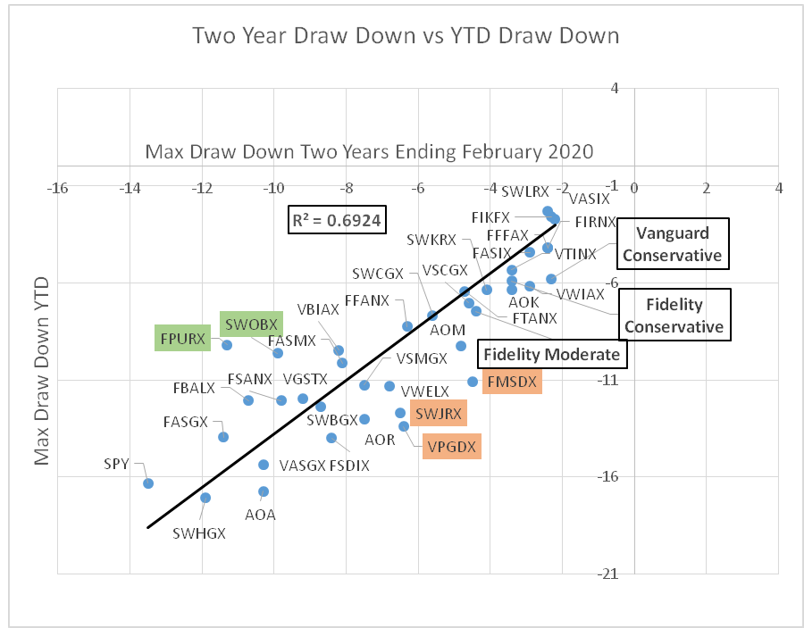
Fidelity Puritan (FPURX) and Schwab Balanced (SWOBX) are two funds that had significantly lower drawdowns in 2020 compared to the last two years. Vanguard Managed Payout (VPGDX), Fidelity Multi-Asset Income (FMSDX), and Schwab Monthly Income – Moderate Payout (SWJRX) had significantly higher drawdowns in 2020 compared to the last two years. The performance of the three Target Portfolios reflected relatively low drawdowns for the past two years and year to date.
Chart #10 is intended to answer the question if the Ulcer Index from the past two years reflects the relative drawdown in 2020? The correlation (0.74) between the Ulcer Index from the previous two years and the drawdowns in 2020 is very good. Again the funds that outperform during the 2020 correction relative to the past two years are shown in green, and the funds that underperformed are shaded tan.
Chart #10: Two Year Ulcer Index (Ending Feb 2020) vs YTD Drawdown
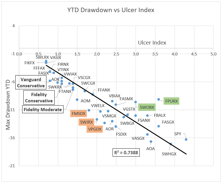
Source: Created by the Author based on Mutual Fund Observer (Ulcer) and Morningstar (DD)
Table #6 shows all of the funds with the maximum drawdown and Ulcer Index from the past two years compared to one month, year to date, and one year returns. The green shaded cells are the top ten performers for the column and the red are the bottom ten. The table is divided into three sections with the top representing the lowest risk, higher-performing funds in 2020, while the bottom section represents the higher risk, lower-performing funds.
Table #6: Mixed Asset and Target Portfolio Past and Present Performance
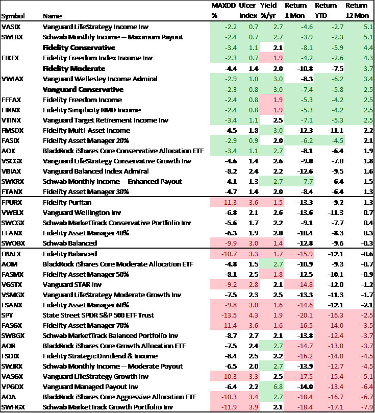
Source: Created by the Author based on Mutual Fund Observer (metrics) and Morningstar (return)
Each month, I extract data for about a thousand funds from the Lipper database using Mutual Fund Observer screens. I rate funds and Lipper Categories based upon risk, risk-adjusted return, income, momentum, and quality factors (including bond quality and stock price to earnings ratio). Table #7 contains the top Lipper Objective along with a representative component of the factors. The “Rank” column is my Ranking System. The way to read the table is that the S&P 500 had an Ulcer Index (Risk) of 4.3 and an average return (APR) of 8.1%, a risk-adjusted return (Martin Ratio) of 1.0% for the past two years ending February. The three-month return is also as of the end of February. I look for funds with lower risk and higher risk-adjusted returns in each of the nine buckets.
Table #7: Top Performing Lipper Objectives – 24 Months Ending February 2020
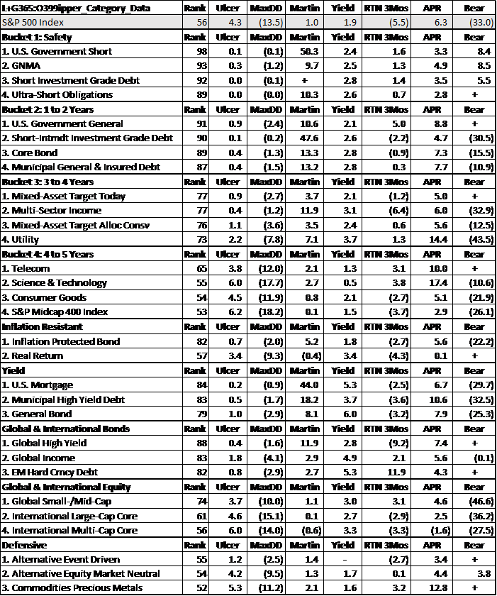
(Source: Author based on data from the MFO Premium screeners)
Table #8 contains the top funds for each of the Top Lipper Categories for Vanguard mutual funds and no-load, no transaction fees at Fidelity and Charles Schwab, along with closed-end funds and exchange-traded funds. (Note: DODIX may have transaction fees at Fidelity.)
Table #8: Top Performing Funds by Top Performing Objectives
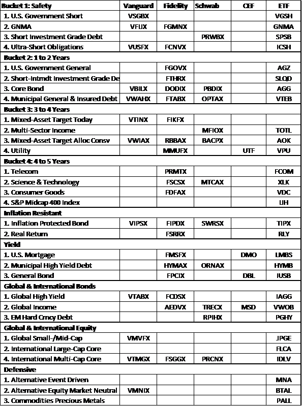
(Source: Author based on data from the MFO Premium screeners)
4) My Portfolio Target Allocations
Chart #11 is the chart that I showed at the top of this article. I have created three target portfolios that I will follow: Vanguard Conservative, Fidelity Conservative, and Fidelity Moderate. The performance was compared in the previous section. My own portfolio contains similar portfolios as these with emergency and specific accounts separate. Overall, I am about 30 to 35% invested in stocks. This section looks at the composition of the three portfolios. All three are globally diversified portfolios. For the last two years, they have done about as well or better than the S&P 500, and with less risk. All three portfolios have a Mutual Fund Observer Risk Rating of Conservative (MFO Risk =2).
Chart #11: Two Year Performance of Mixed Asset Funds and Target Portfolios

(Source: Author based on data from the MFO Premium screeners)
Table #9 contains the risk and risk-adjusted return data from Mutual Fund Observer and the returns from Morningstar as of March 13, 2020, for the S&P 500. It is shown for comparison purposes for the Target Portfolios.
Table #9: S&P 500 for Comparison

Source: Author based on Mutual Fund Observer (metrics) and Morningstar (return)
In February, I wrote an article describing Vanguard Mixed-Asset Funds and an update for a final Target Portfolio which I will be following and adjusting going forward. The portfolio is intended to be a low risk, globally diversified portfolio. It is conservative for the late stage of the business cycle and is based on the belief that the U.S. may have a couple of quarters of slow or negative growth followed by a global recovery. It contains 31% stocks.
Table #10: Vanguard Conservative Target Portfolio
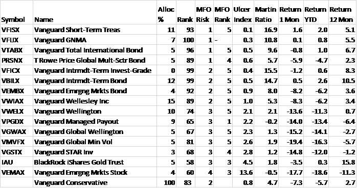
Source: Author based on Mutual Fund Observer (metrics) and Morningstar (return)
In March, I wrote an article describing Fidelity mixed-asset funds. Since then, I have adjusted my portfolios and created two Fidelity Target Portfolios. The Fidelity Conservative Target Portfolio is shown in Table #11. It contains 35% stocks.
Table #11: Fidelity Conservative Target Portfolio
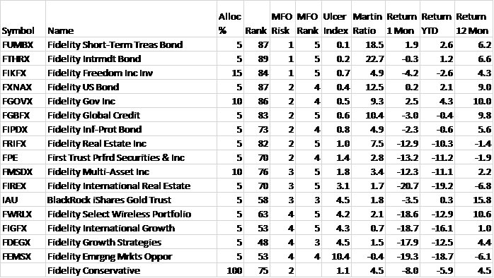
Source: Author based on Mutual Fund Observer (metrics) and Morningstar (return)
The Fidelity Moderate Target Portfolio is shown in Table #12. It is more aggressive than the Fidelity Conservative Target Portfolio and has 50% stocks.
Table #12: Fidelity Moderate Target Portfolio
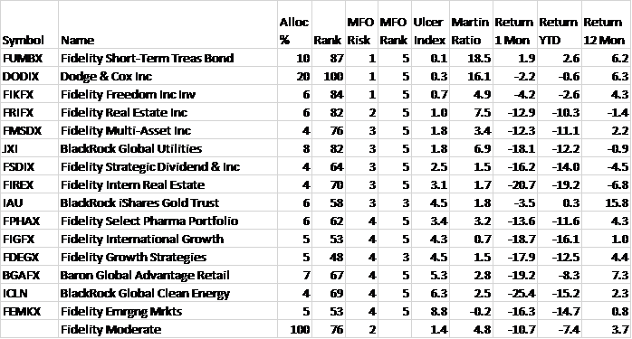
Source: Author based on Mutual Fund Observer (metrics) and Morningstar (return)
The S&P 500 has fallen 16% year to date. Table #6 was created using portfolios that I created at Morningstar with a set number of shares. These are my base case. The tables in this section are based on the target allocation. The difference between the two is the drift due to performance. Is it time to jump in and buy the dip? Or is it time to sell and avoid further losses?
In “Best Practices for Portfolio Rebalancing,” Vanguard advises against trying to time the markets when rebalancing. They study three methods for timing the rebalancing of portfolios. The one that I like is the “Threshold Only” method where limits are set on the portfolio and the portfolio rebalanced when the allocations exceed targets by these thresholds. The new Mutual Fund Observer Portfolio Tool (MFO Premium access required) is a great “keep it simple” tools for the individual investor. One of the criteria for rebalancing my portfolios will be that the portfolio maintains a Conservative Risk Rating from Mutual Fund Observer.
Closing
I have been simplifying and positioning my portfolios optimistically and cautiously for a slow growth, high-risk environment. The dip has been a good laboratory to see how my funds and portfolios will perform in a down market. I was surprised at the rapid changes in the markets, and how some of the funds performed. I was also relatively pleased with the way they performed.
I wish everyone good health and happiness.
Disclaimer
I am neither an economist nor an investment professional. I became interested in economic forecasting and modeling in 2007 when a mortgage loan officer told me that there was a huge financial crisis coming. There were signs of financial stress if you knew where to look. I have read dozens of books on business cycles since then. Discovering the rich database at the St. Louis Federal Reserve (FRED) provides most of the data to create an Investment Model. The tools at Mutual Fund Observer provide the means for implementing and validating the Investment Model.