


I listened to Peter Navarro’s lecture, “The Modern Scholar: Principles of Economics: Business, Banking, Finance, and Your Life” (2005) on a recent return flight to the U.S. The discussion on budget deficits was timely. The planes, airports, and hotels had very few travelers. The hotel shuttle to the airport was not running. Coronavirus cases are increasing with vaccines not expected until early 2021. For reasons described in this article, I reduced my exposure in July for stocks from 25% to 20% by trading higher-risk funds that have risen this year for less popular funds such as value as well as funds to reduce downside risk.
This isFelix. She made numerous edits to this article for me.

Source: Felix
In Conservative Portfolios of Funds for This Bear Market last March, I explained my approach to investing according to the business cycle. This article describes how I am shifting from a “returning to growth” scenario to a more defensive one. My sentiment for the month comes from the investment team at Wealthspire Advisors in Another Ride on the Roller Coaster?, who wrote the following statement:
“…you have enjoyed a ten-year bull market and can now meet your financial goals while taking less market risk… Deciding to de-risk now, after the market rebound, is much more tenable than doing so earlier in the year. If your first trip on the roller coaster was not an enjoyable one, you are not obligated to withstand a second ride.” –
Seeking Safety in Portfolios
As the markets recovered this year and coronavirus cases began increasing, I exchanged riskier funds such as growth, retail, telecommunications, pharmaceuticals, emerging markets, clean energy, and real estate for lower-risk funds such as those shown in the following table.
Table #1: Defensive and Conservative Funds – YTD
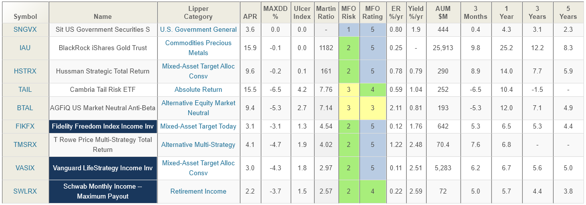
Created by the Author Based On Mutual Fund Observer
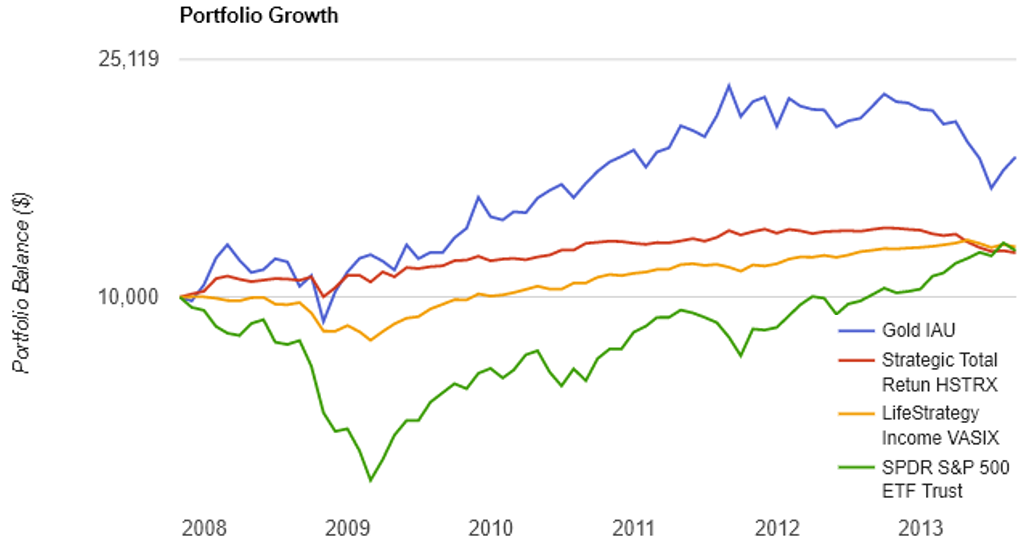
The following chart shows gold, the Vanguard LifeStrategy Income Fund, and Hussman Strategic Total Income Fund compared to the S&P 500 following the start of the 2007 bear market. It took 5 years for an investment in the S&P 500 to get back to even from October 2007, and another year to surpass the conservative funds.
Figure #1: Fund Performance Oct 2007 – Aug 2013
Buy “Low, Sell High” or “Let Your Winners Ride”?
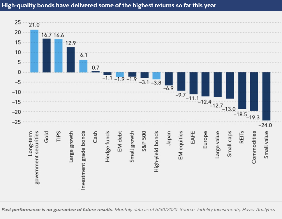
The following figure from Fidelity shows the winners and losers since March. If we are in a growth mode then “Letting Your Winners Ride” may be the best strategy. If the recession is going to be more protracted than many realize then it may be best to “Sell Your Winners” and buy the laggards. The second quarter Gross Domestic Product fell 9 percent compared to a year ago. The latter is my preferred option and I have sold “Large Growth” and added a Europe Fund and more “Value” Funds.
Figure #2: Fund Performance since March
The Bucket System
Investors use the Bucket approach to match market risk with withdrawal needs. I use a four Bucket Approach based on the Ulcer Index with “1” having the risk of money markets and short term treasuries and “4” having the risk of the S&P 500 or higher. Rank in the table refers to my Ranking System where 100 is the best and zero the worst. Rank is based on risk, risk-adjusted return, income, momentum, and quality factors. To reduce risk in July, I shifted funds from Bucket #4 to safer buckets. For diversification purposes, I have a bucket set up for International/Global Bonds and one for International/Global stocks. I have a separate bucket for Income because high-income funds usually come with their own set risks. Finally, I have two buckets set up to track the business cycle as “Inflation” and “Defensive”. The following table shows the automated results of about a thousand funds extracted using Mutual Fund Observer for the top Lipper Category for each of the buckets. By comparison, the Ulcer Index of the S&P 500 is 6.2 and the Martin Ratio is 1.1. As a general observation, the top-rated funds have an Ulcer Index less than the S&P 500 and a Martin Ratio close to 1.0 or higher. The detailed results of my Ranking System can be found in Mutual Fund Observer July 2020 Update at Seeking Alpha and the July update will be posted next week.
Table #2: Top Ranked Lipper Categories since January 2018

Created by the Author Using Mutual Fund Observer
Current Investment Environment
According to an Axios poll, Americans are beginning to realize that coronavirus is going to be around for a while. I think it is a matter of time before this sentiment is reflected in the markets.
This week’s poll findings suggest that Americans are grappling with the reality that the virus isn’t going away anytime soon.
According to the Federal Reserve Bank of Philadelphia’s second-quarter Survey of Professional Forecasters, labor markets and the economy are unlikely to return to 2019 levels until 2022 or later as shown in the table below.
Table #3: Economic Forecasts
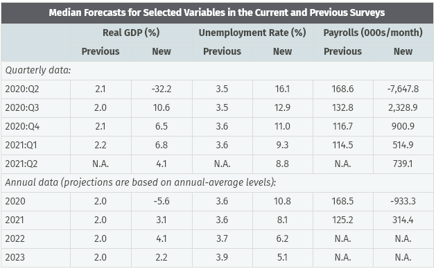
Source: Federal Reserve Bank of Philadelphia
The price that investors are paying for a dollar of earnings (P/E) has increased to 28 as shown in the following figure.
Figure #3: Price to Earnings Ratio
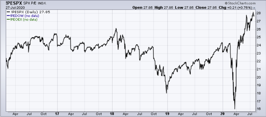
Source: Stockcharts
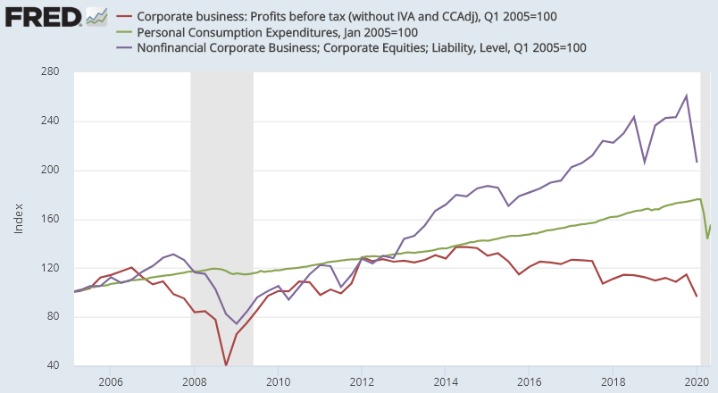
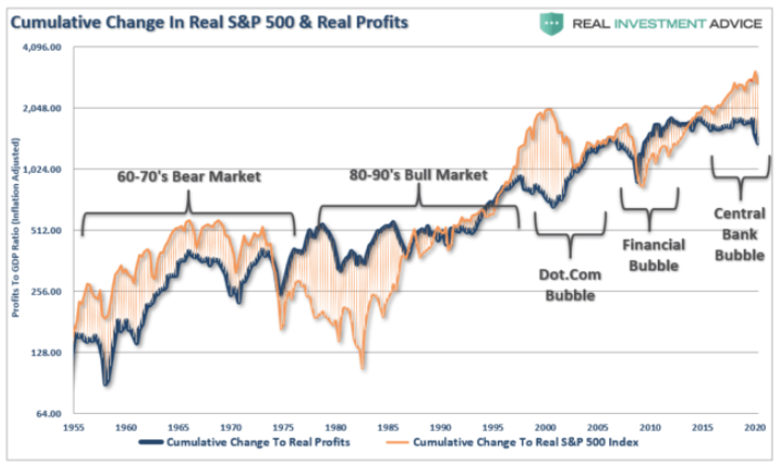
Price to earnings ratios are biased by the effects of the business cycle and share buybacks. In the figure below, I show market capitalization (purple), consumer spending (PCE, green), and corporate profits (red). Quantitative Easing has inflated asset prices since 2012 while profits have been declining.
Figure #4: Profits (red), Consumer Spending (Green), Market Value (Purple)
I created the following chart at the St. Louis Federal Reserve FRED website to measure valuation. The green line is Warren Buffet’s favorite indicator of the stock market capitalization to the gross domestic product which some investors don’t like because companies have become more global. The Orange line is market capitalization divided by profits which the same investors may not like for the same reason. The Blue line is Tobin’s Q Ratio of Capitalization to Replacement Value. These metrics show valuations are high historically.
Figure #5: Stock Market Valuations
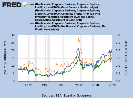
Created by the Author Using St. Louis Federal Reserve FRED
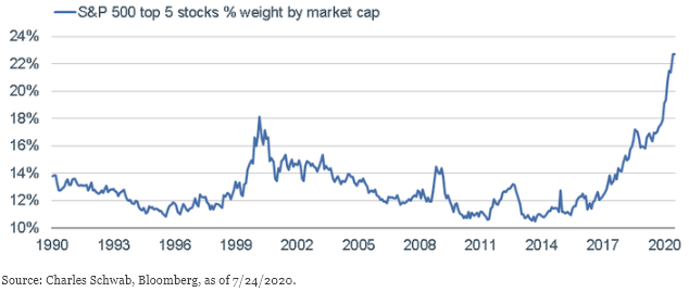
The following chart is from Liz Ann Sonders at Charles Schwab, “Running on Faith: Are Stocks Discounting Too Powerful an Earnings Recovery?” The chart shows that the market capitalization of Apple, Microsoft, Amazon, Google, and Facebook now represent nearly 23% of the S&P 500 market capitalization. Seriously?! One percent of the companies in the S&P 500 has a market capitalization of 23%. Seriously?! I don’t take comfort that the P/E of these 5 companies is only 60% of the 2000 peak.
Figure #6: Market Weight of Top Five Stocks
Insured unemployment is over 16 million people, and more companies filed for bankruptcy in the first half of 2020 than any year since 2012. This includes large companies such as well-known names like Hertz, Latam Airlines, Frontier Communications Corp, Intelsat, McDermott International, JC Penney, and Neiman Marcus.
The following figure shows that banks are tightening lending standards and delinquency rates are rising. Financing by riskier companies and individuals will become more difficult or expensive. Note also the decline in private investments. Credit finances economic growth, and tighter credit will dampen economic growth.
Figure #7: Banks Tightening Lending Standards and Delinquencies
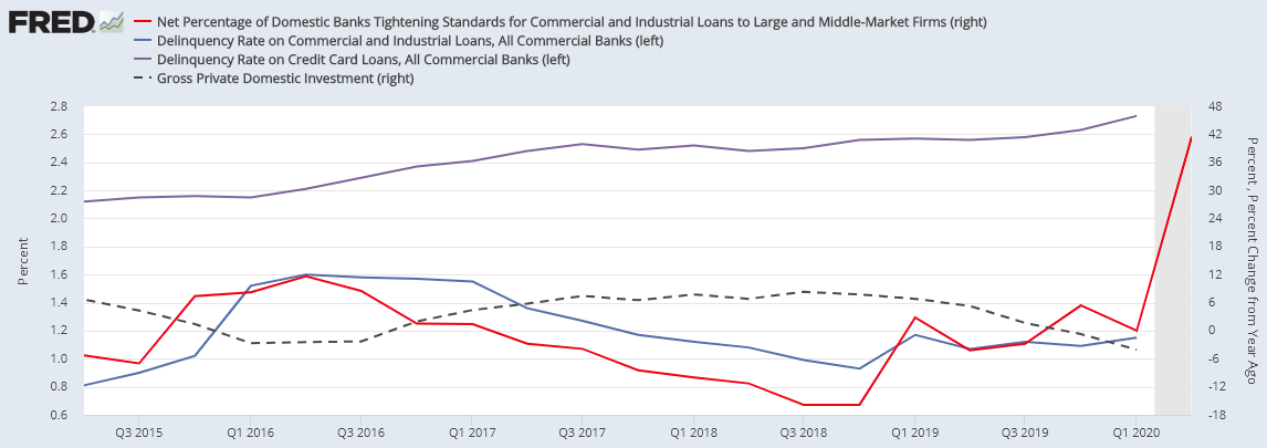
Created by the Author Using St. Louis Federal Reserve FRED
Federal Debt is nearly $24 trillion and the interest payments to finance the debt is nearly 600 billion dollars per year! Interest payments as a percentage of GDP are rising, but not near the levels of the 1980s.
Figure #8: Federal Debt vs Interest Payments
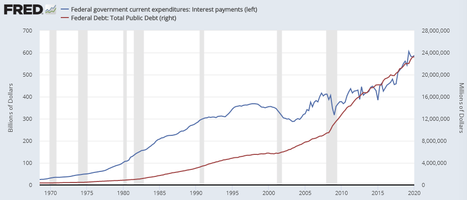
Created by the Author Using St. Louis Federal Reserve FRED
The stimulus is likely to keep interest rates low for years. The velocity of the money supply and price pressures probability indicate that near-term inflation is likely to remain low and deflation is more likely than inflation. The falling value of the dollar and de-globalization may impact this in the longer term, raising concerns of stagflation.
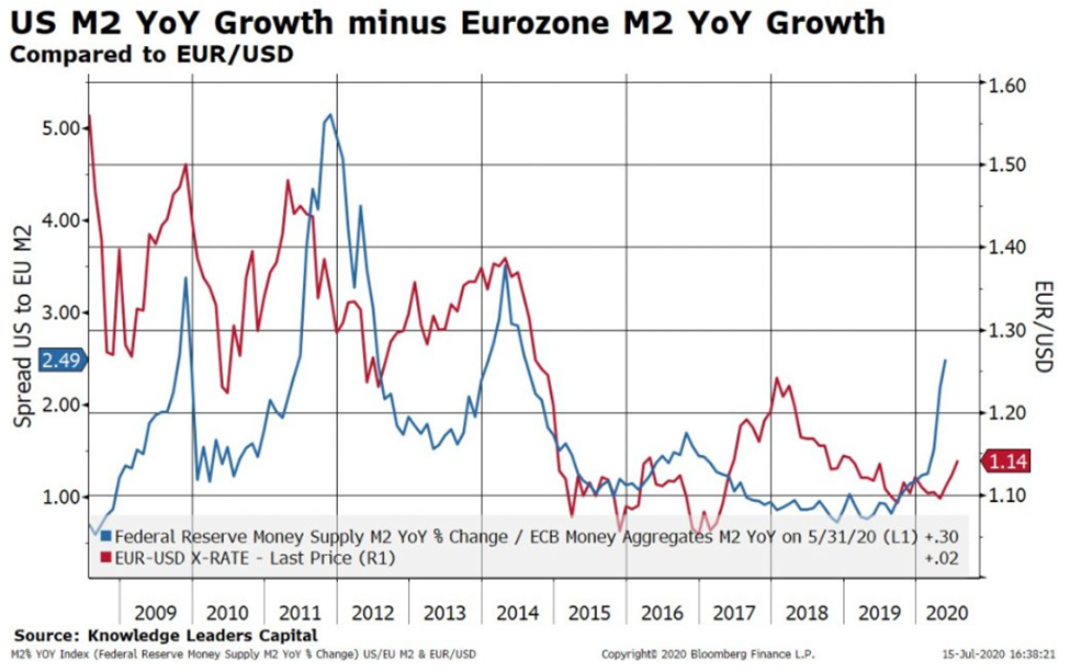
With spare time traveling, I read 10 Major Investment Implications (and 32 charts!) of a Weak US Dollar by Bryce Coward of Knowledge Leaders. He makes a strong case for the dollar weakening further because the federal deficit is increasing as a percent of GDP and the Federal Reserve increasing money supply faster than the European Central Bank, among other reasons.
Figure #9: the US and Eurozone Money Supply Growth
What this implies is a leadership change in markets, and I list Mr. Coward’s key takeaways:
- Technology, which has been THE leadership group over recent years, is highly unlikely to continue to lead if the USD weakens on a secular basis
- Areas of the equity market where investors are most underweight (value, international, smaller companies, EM) tended to do the best in a falling USD environment
- Hard assets outperformed stocks in falling USD periods
- Credit outperformed stocks in falling USD periods
An article from Fidelity points out the falling dollar may reflect investors’ views that international stocks, where coronavirus is more contained, may outperform US equities in the near term.
Secular Trends
Lance Roberts provided the following figure in The Odds Are Stacked Against Investors In A Post-Covid Economy that shows that since 1871, the stock markets have returned a steady history of growth when adjusted for inflation. Using the S&P 500 Return Calculator, stock markets would have had approximate annual returns of 4.5% nominally or 9% with dividends reinvested since 1871, or 2.4% after inflation and 6.9% with dividends reinvested. The decades-long periods where the markets are falling are known as secular bear markets while the long periods when the market is rising are known are secular bull markets. US markets are currently well above the regression trend suggesting a long period of low returns will follow.
Figure #10: Inflation-Adjusted Stock Market
Source: Real Investment Advice, Lance Roberts
Earnings per share are highly dependent upon the business cycle and so they are often adjusted to reflect longer-term trends which are referred to as cyclically adjusted price to earnings (CAPE) ratio. Mr. Roberts shows the inflation-adjusted market prices and the CAPE ratio since 1871. The cyclically adjusted price to earnings ratio is currently at historical highs. Two of the reasons for this are asset price inflation (high valuations) due to quantitative easing and low-interest rates.
Figure #11: Inflation-Adjusted Stock Market, CAPE, and Reversions
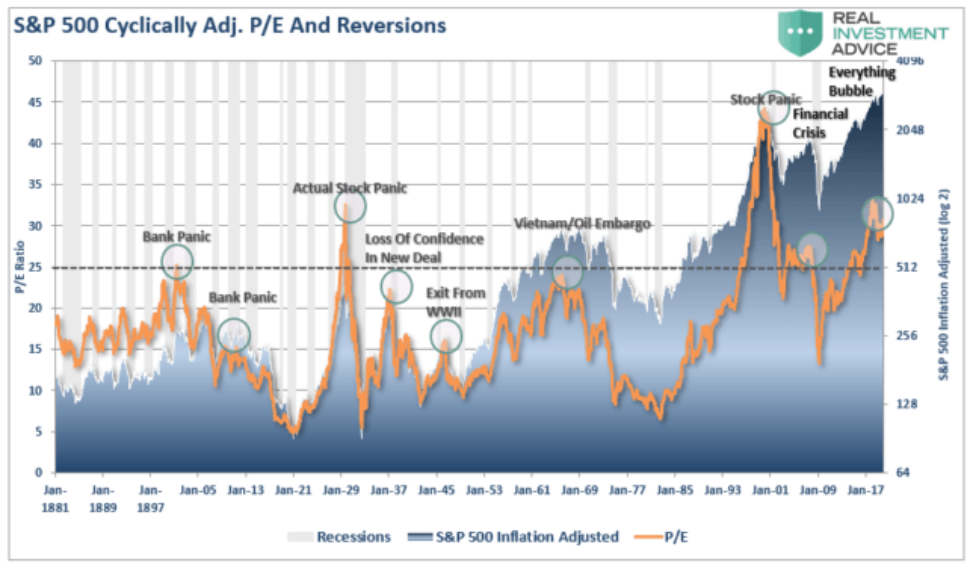
Source: Real Investment Advice, Lance Roberts
Ed Easterling at Crestmont Research shows the expected 10 year returns based on starting valuations at the beginning decade. This decade is starting with a historically high cyclically adjusted price to earnings ratio. The implication is that returns over the coming decade are likely to be in the low single digits or even negative. For more information on Market Valuations by Ed Easterling, I suggest reading Crestmont Market Valuation Update: June 2020.
Figure #12: Rolling 10 Year Stock Returns vs Starting P/E
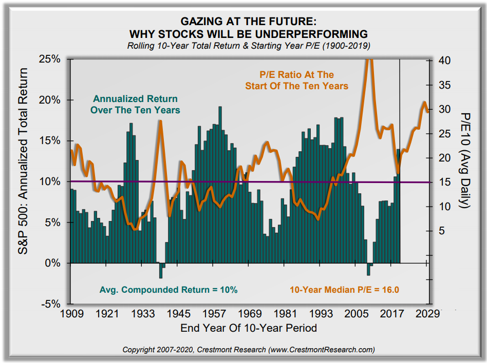
Source: Crestmont Research
John Hussman Ph.D. and President of Hussman Econmetrics Advisors, in Fundamentally Unsound shows that according to the relationship of market capitalization to Gross Value Added that the historical relationship points to negative returns over the next 10 years.
Figure #13: 10 Year Stock Market Returns vs Gross Value Added
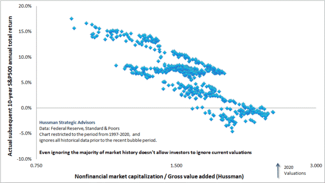
Source: Hussman Strategic Advisors
S&P 500 earnings for the second quarter are estimated to be more than 50% below those one year ago. The price to earnings ratio based on the second quarter is over 30 based on operating earnings. Including the CAPE and P/E, all five valuation methods show the market is highly valued.
Lessons from the Current Secular Bear Market
During the past 25 years since 1995, the Vanguard Wellington with about 60% stock and 40% bonds has performed as well as the S&P 500 (left), but with less volatility. Vanguard Wellesley with about 40% stock has done well. The link to Portfolio Visualizer is provided here. If you change the starting year to 1998 (right) to exclude the run-up to the Technology Bubble then the Vanguard Wellesley performed as well as the S&P 500 due to losing less during the recessions.
Figure #14: 25 Year Vanguard Mixed Asset Returns vs S&P 500
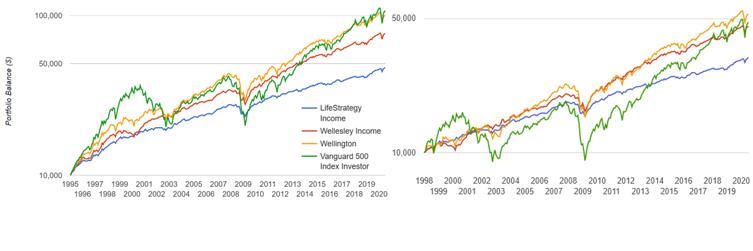
Created by the Author Using Portfolio Visualizer
The next chart shows the S&P 500 compared to international and global funds. For long periods, the S&P 500 has over or underperformed international markets. The US stock market has over-performed international markets for much of the past decade and valuations are higher in the US suggesting that some exposure to international markets may be prudent.
Figure #15: International Returns vs S&P 500
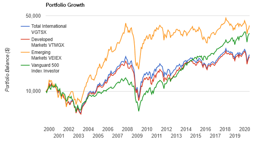
Created by the Author Using Portfolio Visualizer
Portfolio Strategies that Manage Risk
How do you manage risk? Graham suggested in The Intelligent Investor a guiding rule that the investors should never have less than 25% nor more than 75% of their money in stocks. Warren Buffet is a value investor who builds up cash as valuations rise as shown by Lance Roberts. Institutional investors have been increasing cash as well.
Figure #16: Berkshire Cash Holdings
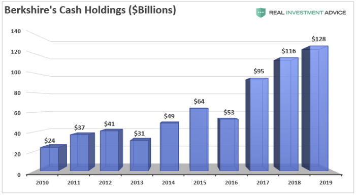
Source: Real Investment Advice, Lance Roberts
As a simple example of managing risk, the chart below is based on switching allocations to Vanguard stock, bond, and mixed asset funds to maximize return for maximum volatility of 10% (red line). Over the past 25 years, it has returned as much as the S&P 500, but without the volatility. The link to Portfolio Visualizer Rolling Portfolio Optimization is provided here. Last month, I celebrated my birthday working internationally. At 65 years of age, the average life expectancy of a male is 84 years. Downturns matter to retirees, but also raise the risk to those who may need access to savings.
Figure #17: Maximum Return of Vanguard Funds @ 10% Volatility
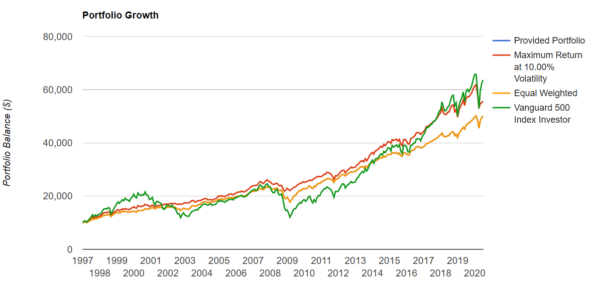
Created by the Author Using Portfolio Visualizer
Figure #18 shows the changes in investments for the same scenario. Allocations don’t change much except during recessions.
Figure #18: Asset Allocation for Maximum Return of Vanguard Funds @ 10% Volatility
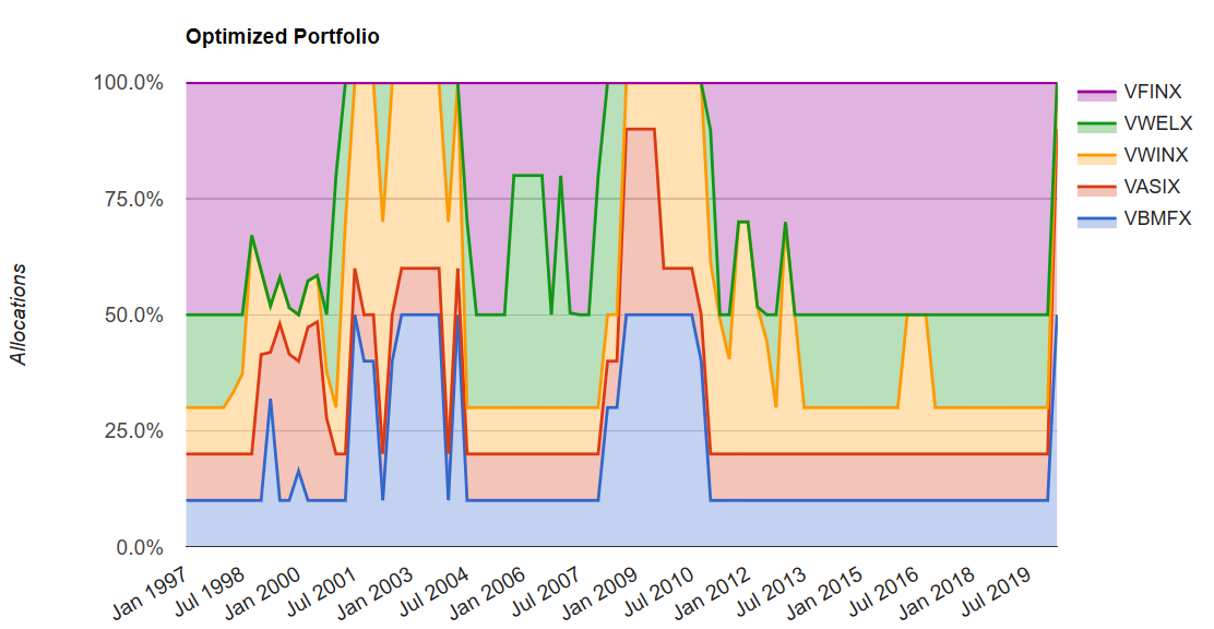
Created by the Author Using Portfolio Visualizer
Table #4 shows the statistics for the above scenario, a buy and hold strategy of equal proportions, and the S&P 500.
Table #4: Managed Volatility Strategy vs S&P 500
| Description | CAGR | Stdev | Max. Drawdown | Sharpe Ratio (ex-post) | Sortino Ratio |
| Maximum Return at 10.00% Volatility | 7.6% | 7.7% | -16.4% | 0.73 | 1.08 |
| Equal Weighted | 7.1% | 6.9% | -24.4% | 0.74 | 1.11 |
| Vanguard 500 Index Investor | 8.2% | 15.3% | -51.0% | 0.46 | 0.66 |
Source: Created by the Author Using Portfolio Visualizer
Investment Model
Over the past ten years, I built an investment model as described in Rules-Based Investing – Rule #4 Pursue Investments Appropriate for the Business Cycle and Long Term Trends. The goal is to change allocations to stocks and bonds based on risks and returns measured in the business environment. One view of the model is shown below which represents allocations to stocks, bonds, and cash. The model began increasing allocations to cash and bonds in early 2018. The model also allocates up to 10% of the portfolio in defensive funds (red). The model is intended to reduce risk while keeping risk-adjusted returns high. It returned 9.9% while the S&P 500 returned 9.8% over the same time period. These funds are listed at the beginning of the article including gold but don’t necessarily include bearish funds such as inverse funds.
Figure #19: Author’s Investment Model Allocations
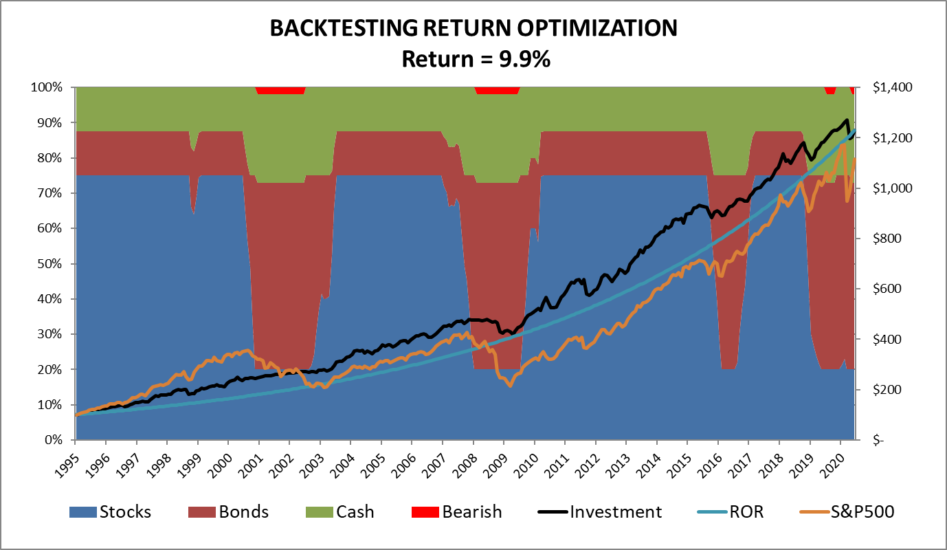
Source: Author
Closing
Stock markets typically go up before presidential elections. My investment strategy at this time is to make modest returns with limited downside exposure until the recession has ended and there is a resolution of coronavirus. I believe there will be more attractive buying opportunities for US stocks in 2021 or 2022.
Disclaimer
I am not an economist nor an investment professional. I became interested in economic forecasting and modeling in 2007 when a mortgage loan officer told me that there was a huge financial crisis coming. There were signs of financial stress if you knew where to look. I have read dozens of books on business cycles since then. Discovering the rich database at the St. Louis Federal Reserve (FRED) provides most of the data to create an Investment Model. The tools at Mutual Fund Observer provide the means for implementing and validating the Investment Model.