
Originally published in February 1, 2014 Commentary
The results for MFO’s fund ratings through quarter ending December 2013, which include the latest Great Owl and Three Alarm funds, can be found on the Search Tools page. The ratings are across 92 fund categories, defined by Morningstar, and include three newly created categories:
Corporate Bond. “The corporate bond category was created to cull funds from the intermediate-term and long-term bond categories that focused on corporate bonds,” reports Cara Esser. Examples are Vanguard Interm-Term Invmt-Grade Inv (VFICX) and T. Rowe Price Corporate Income (PRPIX).
Preferred Stock. “The preferred stock category includes funds with a majority of assets invested in preferred stock over a three-year period. Previously, most preferred share funds were lumped in with long-term bond funds because of their historically high sensitivity to long-term yields.” An example is iShares US Preferred Stock (PFF).
Tactical Allocation. “Tactical Allocation portfolios seek to provide capital appreciation and income by actively shifting allocations between asset classes. These portfolios have material shifts across equity regions and bond sectors on a frequent basis.” Examples here are PIMCO All Asset All Authority Inst (PAUIX) and AQR Risk Parity (AQRIX).
An “all cap” or “all style” category is still not included in the category definitions, as explained by John Rekenthaler in Why Morningstar Lacks an All-Cap Fund Category. The omission frustrates many, including BobC, a seasoned contributor to the MFO board:
Osterweis (OSTFX) is a mid-cap blend fund, according to M*. But don’t say that to John Osterweis. Even looking at the style map, you can see the fund covers all of the style boxes, and it has about 20% in foreign stocks, with 8% in emerging countries. John would tell you that he has never managed the fund to a style box. In truth he is style box agnostic. He is looking for great companies to buy at a discount. Yet M* compares the fund with others that are VERY different.
In fairness, according to the methodology, “for multiple-share-class funds, each share class is rated separately and counted as a fraction of a fund within this scale, which may cause slight variations in the distribution percentages.” Truth is, fund managers or certainly their marketing departments are sensitive to what category their fund lands-in, as it can impact relative ratings for return, risk, and price.
As reported in David’s October commentary, we learned that Whitebox Funds appealed to the Morningstar editorial board to have its Tactical Opportunities Fund (WBMIX) changed from aggressive allocation to long/short equity. WBMIX certainly has the latitude to practice long/short; in fact, the strategy is helping the fund better negotiate the market’s rough start in 2014. But its ratings are higher and price is lower, relatively, in the new category.
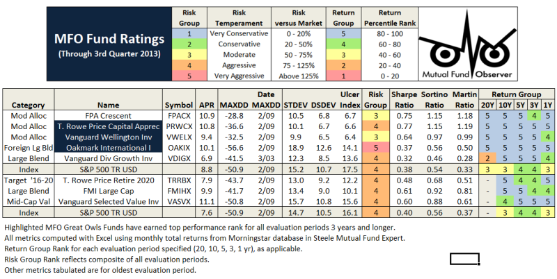
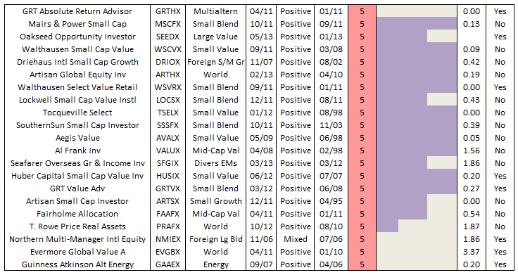
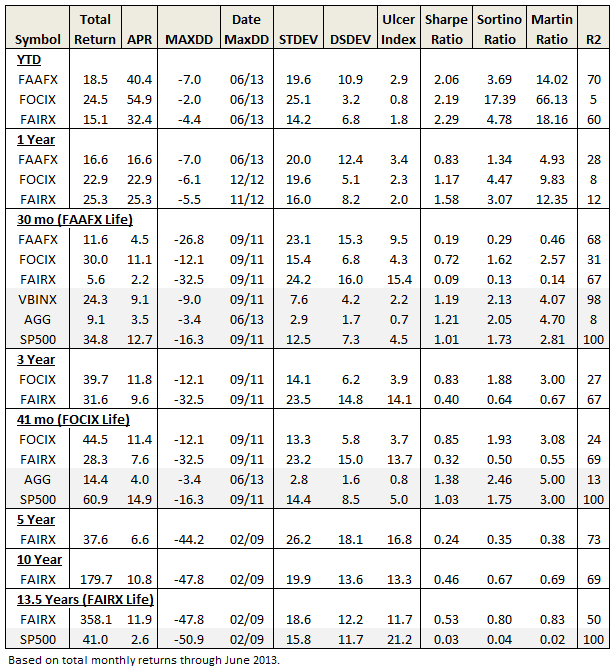
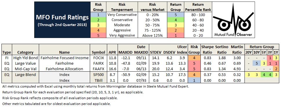
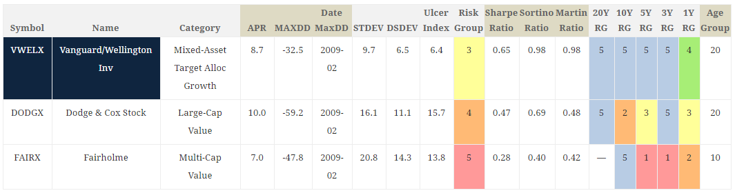
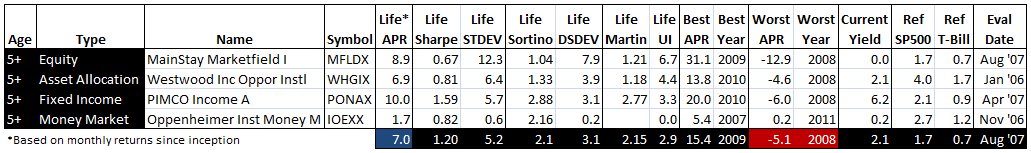
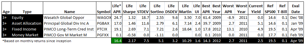
One hotly debated fund on the MFO board, ASTON/River Road Independent Small Value (ARIVX), managed by Eric Cinnamond, would also benefit from a category change. As a small cap, the fund rates a 1 (bottom quintile) for 2013 in the MFO ratings system, but when viewed as a conservative or tactical allocation fund – because of significant shifts to cash – the ratings improve. Here is impact on return group rank for a couple alternative categories:
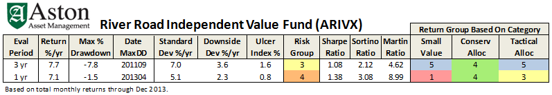
Of course, a conservative tactical allocation category would be a perfect antidote here (just kidding).
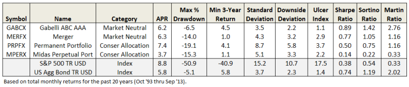
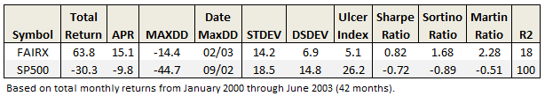
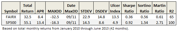
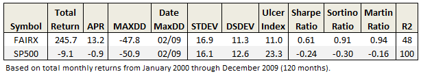
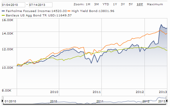
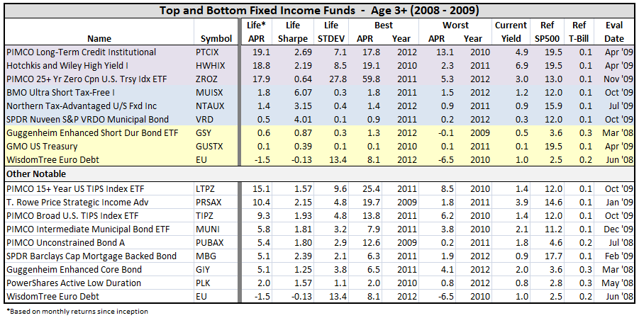
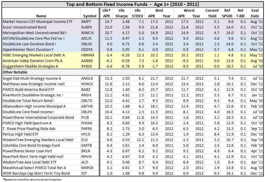
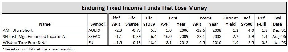
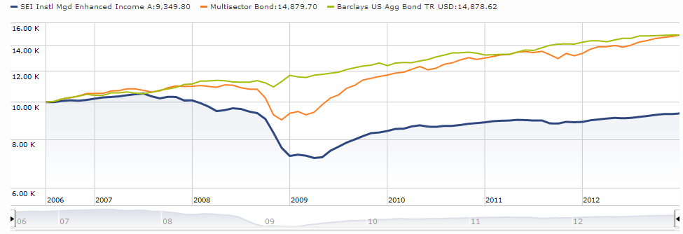
Getting It Wrong. David has commented more than once about the “wildly inappropriate” mis-categorization of Riverpark Short Term High Yield Fund (RPHIX), managed by David Sherman, which debuted with just a single star after its first three years of operation. The MFO community considers the closed fund more of a cash alternative, suited best to the short- or even ultrashort-term bond categories, but Morningstar placed it in the high yield bond category.
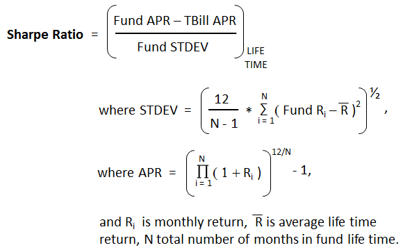
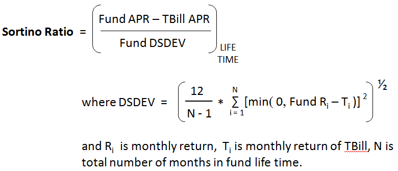
Exacerbating the issue is that the star system appears to rank returns after deducting for a so-called “risk penalty,” based on the variation in month-to-month return during the rating period. This is good. But it also means that funds like RPHIX, which have lower absolute returns with little or no downside, do not get credit for their very high risk-adjusted return ratios, like Sharpe, Sortino, or Martin.
Below is the impact of categorization, as well as return metrics, on its performance ranking. The sweet irony is that its absolute return even beat the US bond aggregate index!
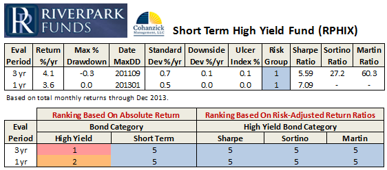
RPHIX is a top tier fund by just about any measure when placed in a more appropriate bond category or when examined with risk-adjusted return ratios. (Even Modigliani’s M2, a genuinely risk-adjusted return, not a ratio, that is often used to compare portfolios with different levels of risk, reinforces that RPHIX should still be top tier even in the high yield bond category.) Since Morningstar states its categorizations are “based strictly on portfolio statistics,” and not fund names, hopefully the editorial board will have opportunity to make things right for this fund at the bi-annual review in May.
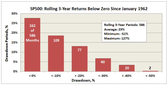
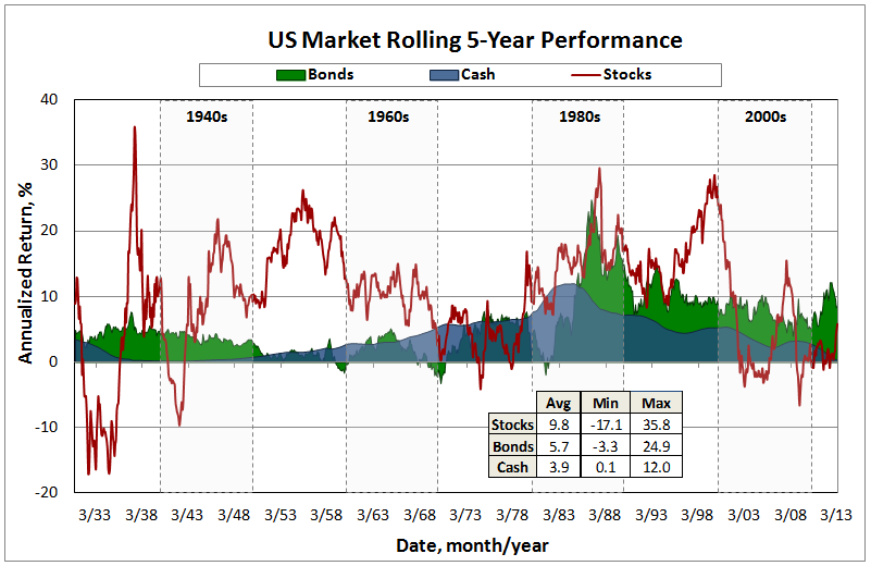
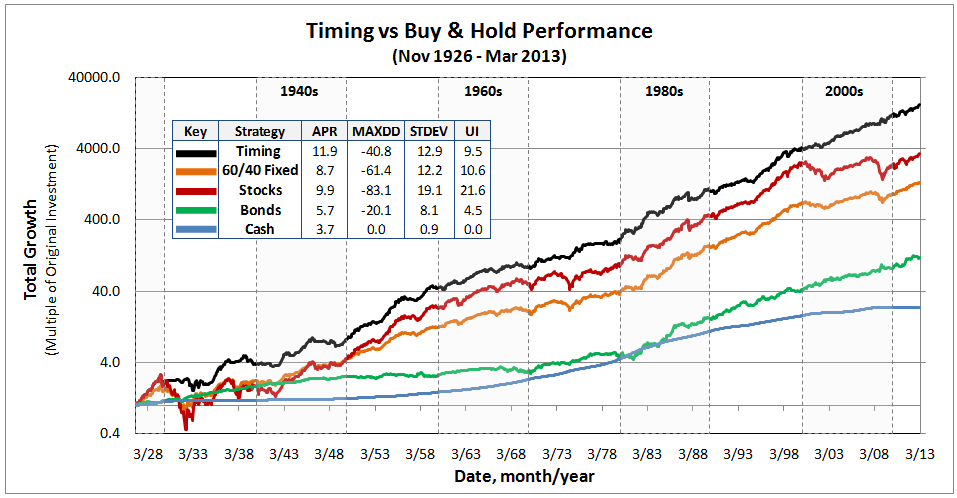
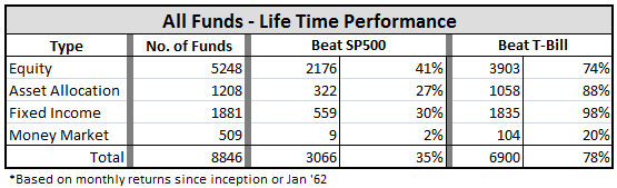
A Broader View. Interestingly, prior to July 2002, Morningstar rated funds using just four broad asset-class-based groups: US stock, international stock, taxable bond, and municipal bonds. It switched to (smaller) categories to neutralize market tends or “tailwinds,” which would cause, for example, persistent outperformance by funds with value strategies.
A consequence of rating funds within smaller categories, however, is more attention goes to more funds, including higher risk funds, even if they have underperformed the broader market on a risk-adjusted basis. And in other cases, the system calls less attention to funds that have outperformed the broader market, but lost an occasional joust in their peer group, resulting in a lower rating.
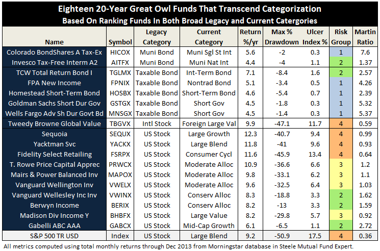
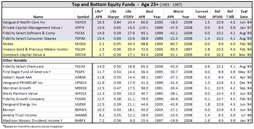
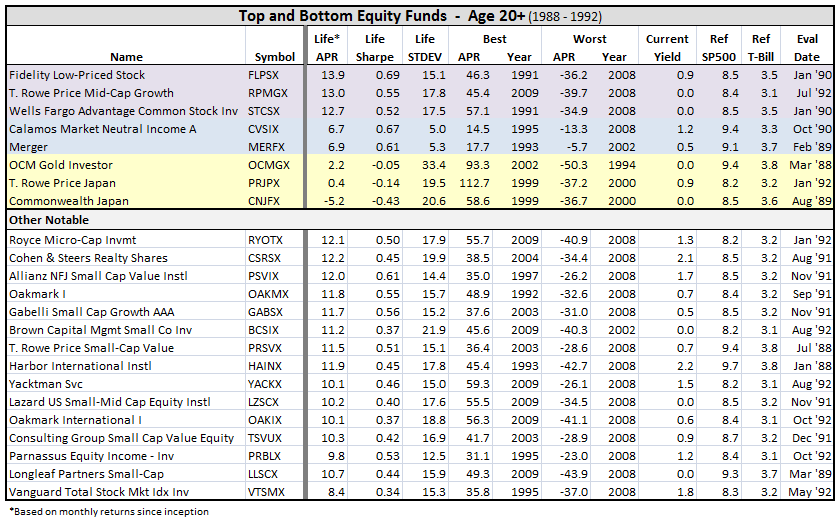
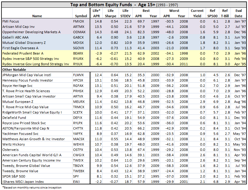
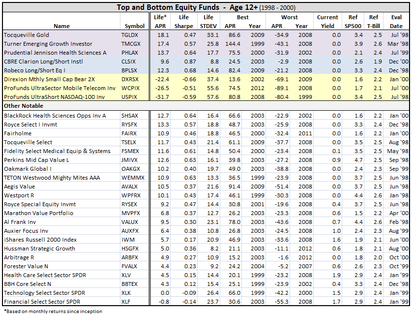
Running the MFO ratings using only the four board legacy categories reveals just how much categorization can alter the ratings. For example, the resulting “US stock” 20-year Great Owl funds are dominated by allocation funds, along with a high number of sector equity funds, particularly health. But rate the same funds with the current categories (Great Owl Funds – 4Q2013), and we find more funds across the 3 x 3 style box, plus some higher risk sector funds, but the absence of health funds.
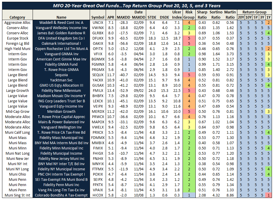
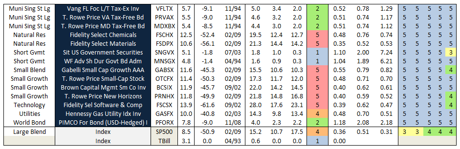
Fortunately, some funds are such strong performers that they appear to transcend categorization. The eighteen funds listed below have consistently delivered high excess return while avoiding large drawdown and end-up in the top return quintile over the past 20, 10, 5, and 3 year evaluation periods using either categorization approach:
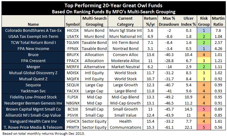
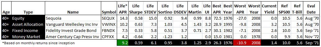
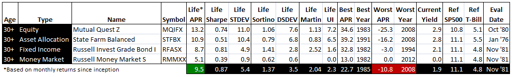
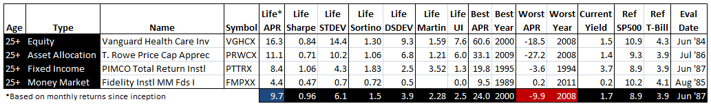
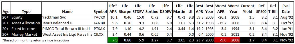
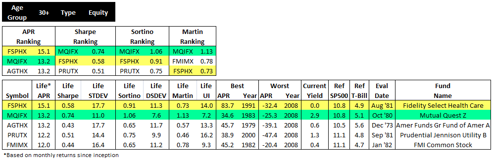
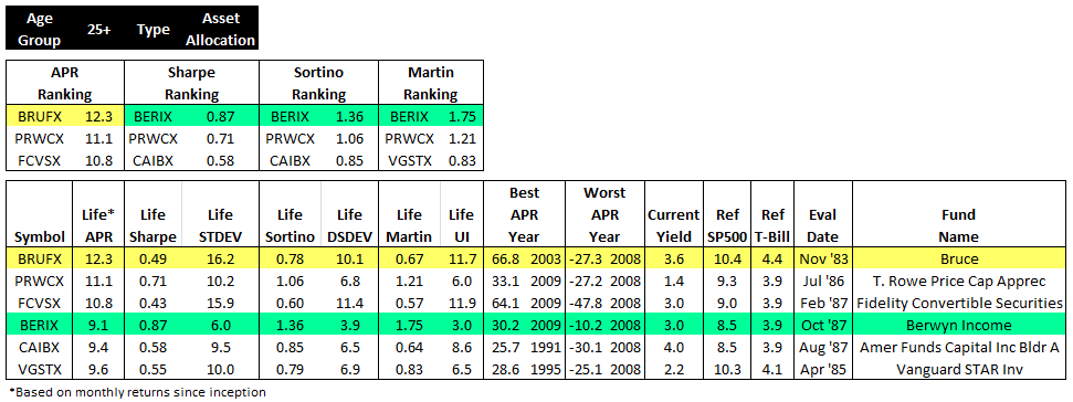
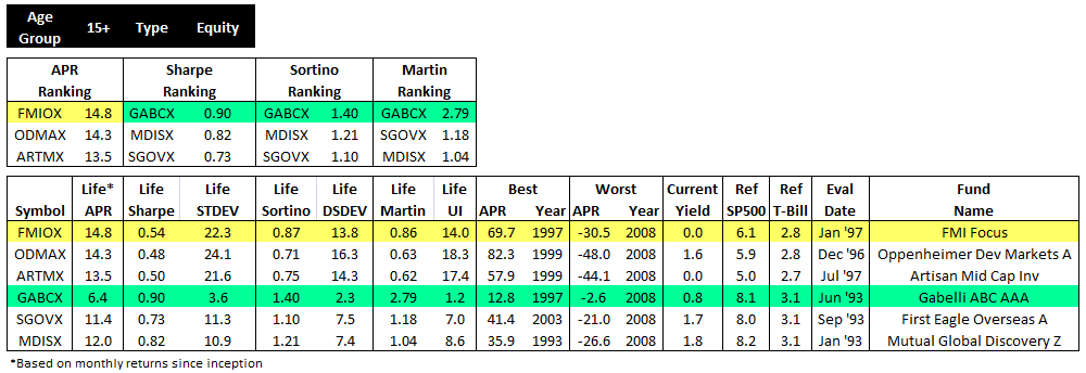
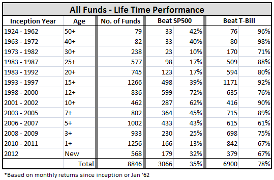
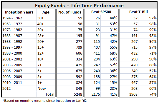
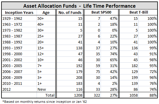
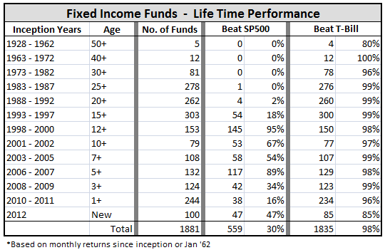
 Roy Weitz grouped funds into only five equity and six specialty “benchmark categories” when he established the legacy Three Alarm Funds list. Similarly, when Accipiter created the MFO Miraculous Multi-Search tool, he organized the 92 categories used in the MFO rating system into 11 groups…not too many, not too few. Running the ratings for these groupings provides some satisfying results:
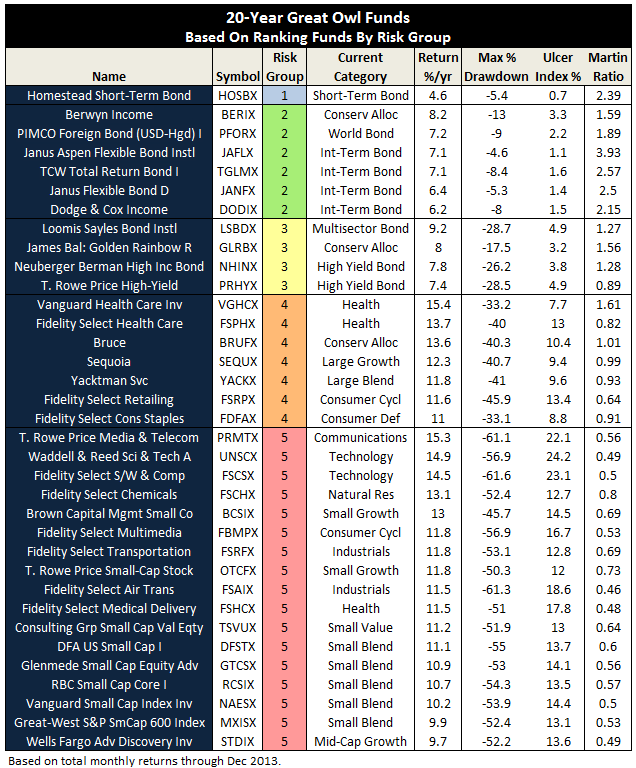
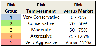
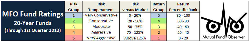
A more radical approach may be to replace traditional style categories altogether! For example, instead of looking for best performing small-cap value funds, one would look for the best performing funds based on a risk level consistent with an investor’s temperament. Implementing this approach, using Risk Group (as defined in ratings system) for category, identifies the following 20-year Great Owls:
Bottom Line. Category placement can be as important to a fund’s commercial success as its people, process, performance, price and parent. Many more categories exist today on which peer groups are established and ratings performed, causing us to pay more attention to more funds. And perhaps that is the point. Like all chambers of commerce, Morningstar is as much a promoter of the fund industry, as it is a provider of helpful information to investors. No one envies the enormous task of defining, maintaining, and defending the rationale for several dozen and ever-evolving fund categories. Investors should be wary, however, that the proliferation may provide a better view of the grove than the forest.
28Jan2014/Charles
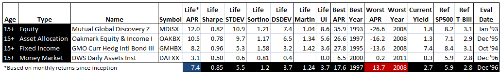
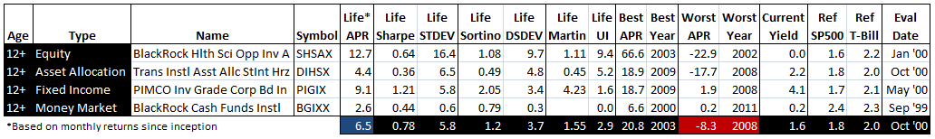
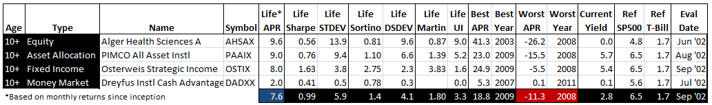
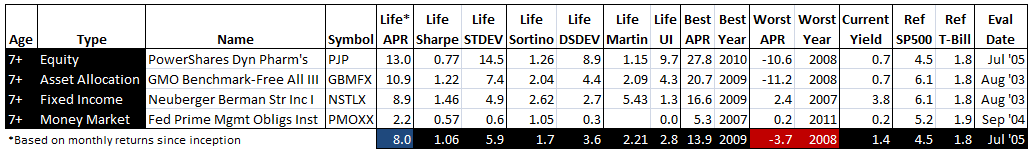
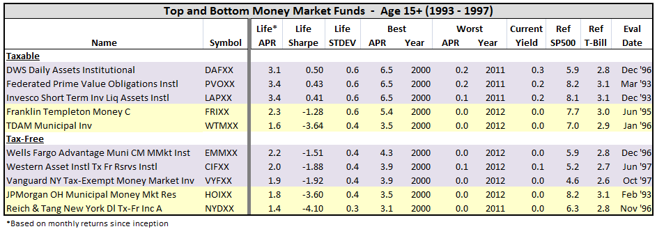
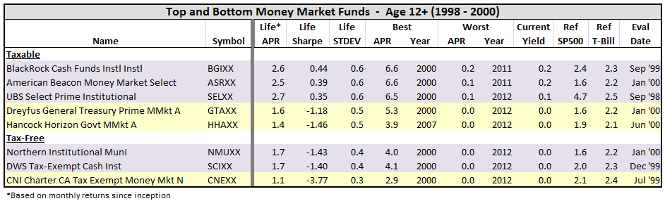
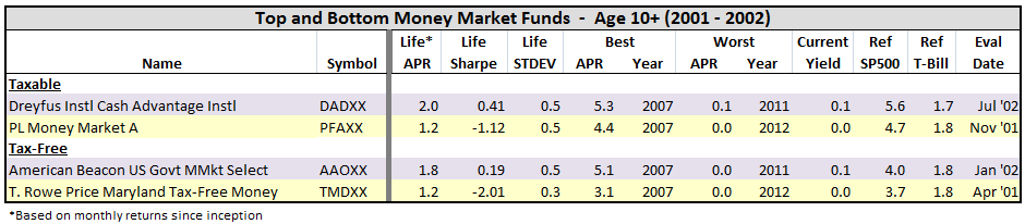
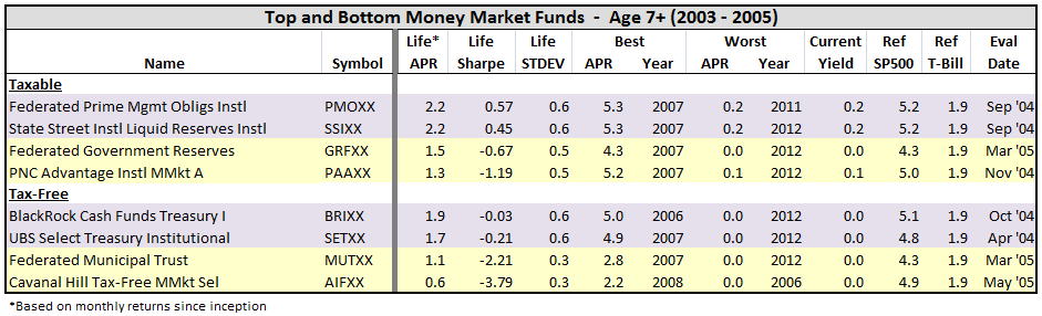
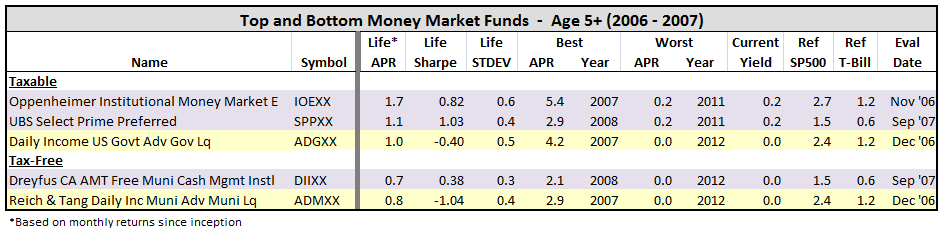
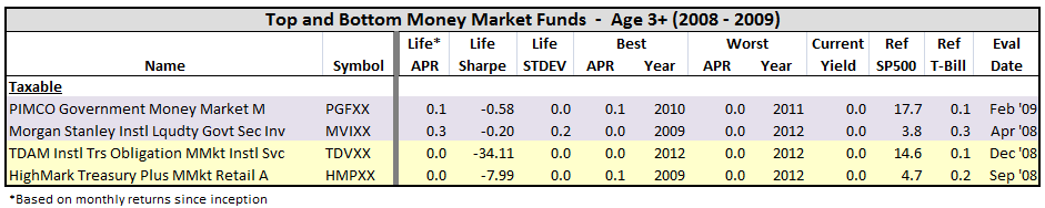
 Roy Weitz first published the legacy Three Alarm fund list in 1996. He wanted to help investors decide when to sell mutual funds. Being on the list was not an automatic sell, but a warning signal to look further and see why.


