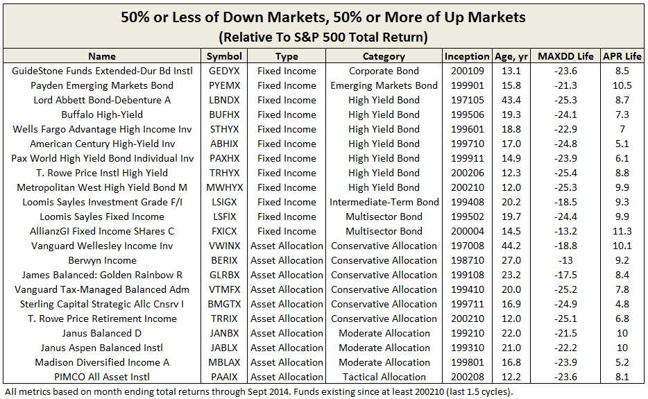
Objective and Strategy
The James Balanced Golden Rainbow Fund (GLRBX/GLRIX) seeks to provide total return through a combination of growth and income and preservation of capital in declining markets.
Under normal circumstances, the diversified James Balanced Golden Rainbow Fund invests primarily in undervalued domestic equities of companies with various market capitalizations and in high-quality (S&P’s rating of BBB or better) fixed income securities of various durations. At end of June 2015, the fund was 55% equity, 42% fixed income, and 3% cash equivalent. Median market cap was $7.6B (mid-cap, but with average about $15B) and average bond duration was 4.3 years.
The fund will normally hold both equity securities and fixed income securities, with at least 25% of its assets in equity and at least 25% of its assets in fixed income. Its broad, go-anywhere (if long only) charter enables it to go to 100% cash equivalents for short periods or even 50% for longer periods, although the adviser usually finds better opportunities than cash. It will hold foreign equities, currently just a couple percent, but probably never more than 10% and usually in form of ETFs or ADRs. Similarly, it can hold sovereign debt.
GLRBX’s allocation closely echoes the simple philosophy championed by Ben Graham in the Intelligent Investor and similarly touted by famed investors Harry Markowitz and John Bogle. Nominally 50/50 equity/fixed allocation, but then tailored based on investor temperament and/or market assessment, but never less than 25% in either. GLRBX targets defensively minded long-term investors.
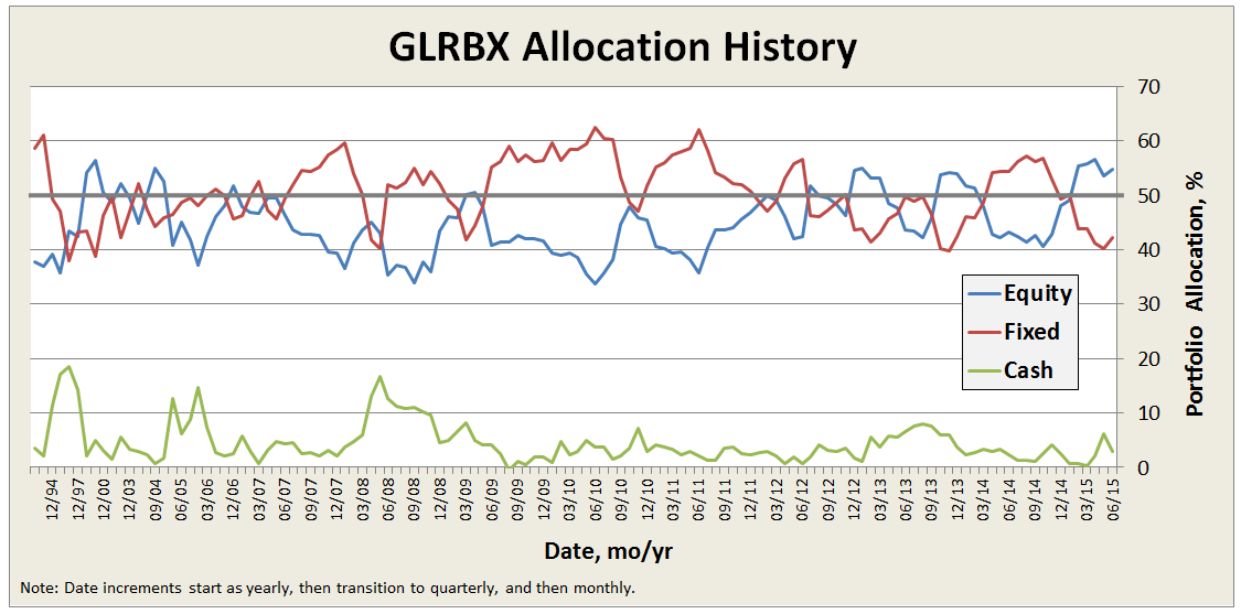
Here’s a look back at the fund’s allocation since inception, which rarely deviates more than about 10% from the 50/50 split:
The fund attempts to provide total return in excess of the rate of inflation over the long term (3 to 5 years).
Adviser
James Investment Research (JIR), Inc. is the fund’s adviser. Dr. Francis E. James is the controlling share-holder. In 1972, he and his wife, Iris, started JIR in the bedroom of their son, David, with only $20K AUM. Their lofty goal was to garner $10M from family, friends and business relationships, which they considered the threshold AUM to enable purchasing a computer.
A spokesman for the firm explains that marketing has never been the main focus: “It has always been doing research, taking care of our clients and managing their funds wisely.” Fortunately, performance of the early fund (a precursor to GLRBX that was a comingled trust fund managed by Dr. James for Citizen’s Federal Savings and Loan) was satisfactory and the conservative nature of the investments attracted investors. It grew to about $100 million in size in 1983. The name “Golden Rainbow” comes from the original S&L’s logo.
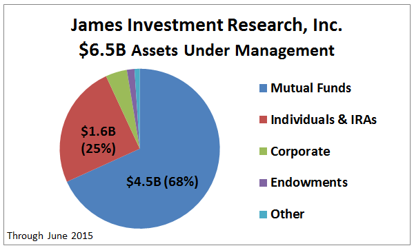
Today the firm manages $6.5B for individuals, businesses, and endowments, as shown below. The preponderance is in GLRBX. It is a conservative allocation fund with $4.2B AUM, established formally in 1991. It is the firm’s oldest fund and flagship. JIR advises five other mutual funds “to provide diversification in our James Advantage Funds (aka James Funds) family.” These other funds appear to be offered to more aggressive investors for at least part of their portfolios, as capital preservation in declining markets is a secondary goal.
The firm has 19 full-time employees and two part-time. Since 1978, JIR practices profit sharing with its employees. “Cash profits shared last year were in excess of 45%, not including pension contributions.”
James maintains a PO Box in Alpha, Ohio, but is actually located in nearby Xenia, which is about 10 miles east of Dayton, near Wright Patterson Air Force Base, Wright Brother’s Memorial, and Wright State University. “It is a quiet place to do research and it is far from Wall Street. We don’t tend to follow the herd and we can keep our independent approach a little easier than in a big city. We operate on 35 acres in the woods, and it helps to keep stress levels lower and hopefully helps us make wiser decisions for our clients.”
Managers
GLRBX is managed by a 9 member investment committee. Average tenure is over 20 years with the firm. Three are James’ family members: founder Dr. Frank James, CEO Barry James, and Head of Research David James. The committee makes the determination of allocation, stocks approved for purchase or sale, and bond duration. Day to day, any member handles implementation of the committee’s guidance. Nominally the fund is managed by a nine-person team, but day-to-day responsibility falls to Brian Culpepper (since 1998), Brian Sheperdson (since 2001), Trent Dysert (since 2014) and Moustapha Mounah (since 2022).
Dr. James is 83 years old. He served in the Air Force for 23 years, achieving the rank of Colonel and headed the Department of Quantitative Studies at the Air Force Institute of Technology. He received his Ph.D. from RPI where his thesis was “The Implications of Trend Persistency in Portfolio Management,” which challenged the idea that stocks move at random and formed the basis for technical analysis still employed by the firm today. Basically, he observed that stock price movements are not random and trends persist. He remains engaged with the firm, does research, and provides mentoring to the team on a regular basis.
Barry James also served as a pilot in the Air Force, receiving degrees from both Air Force Academy and Boston University, returning full time to James in 1986. All other members of the investment team have at least one degree from colleges or universities located in Ohio, except David James who holds no formal degree, but is a CFA.
Strategy capacity and closure
GLRBX has never closed. The firm believes capacity is $10-15B, based on its studies of expected performance and trading limitations. So, plenty of capacity remaining. That said: “We think having controlled growth is the key to being able to sustain performance. We aren’t trying to become the biggest because we don’t want to sacrifice the current client and their results just to add another dollar to the fund. At the same time, we believe we have something that many folks want and need and we don’t want to turn them away if we can help them.”
James admits that it focuses on advisers versus retail investors because it wants long-term relationships and it wants to avoid maintaining a large marketing staff.
To put GLRBX in perspective, its AUM is just 1% of Vanguard Wellington Wellesley (VWINX) fund, which maintains an average market cap of about $90B in its equity portfolio.
Active share
GLRBX reports against a blended index comprising 25% S&P 500, 25% Russell 2000, and 50% Barclays Capital Intermediate Government/Credit Bond indices. In practice, however, it does not follow a benchmark and does not compute the “active share” metric, which measures the degree to which a fund’s portfolio differs from the holdings of its benchmark portfolio. So, the metric is not particularly applicable here.
JIR’s David James, Director of Research, explains: “The fund deviates greatly and on purpose from the sector weightings of both these indexes. Typically this leads us to be better diversified than the benchmark which often overweights technology and finance sectors. Similarly, the fund would show up with a high “active share” as we presently have 141 individual equity holdings compared to close to 2,500 for the combined S&P 500 / Russell 2000 Indexes.”
We asked our friends at Alpha Architect to assess the GLRBX portfolio with their on-line Active Share Calculator (coming soon) and sure enough, they calculated 94.2%.
Management’s Stake in the Fund
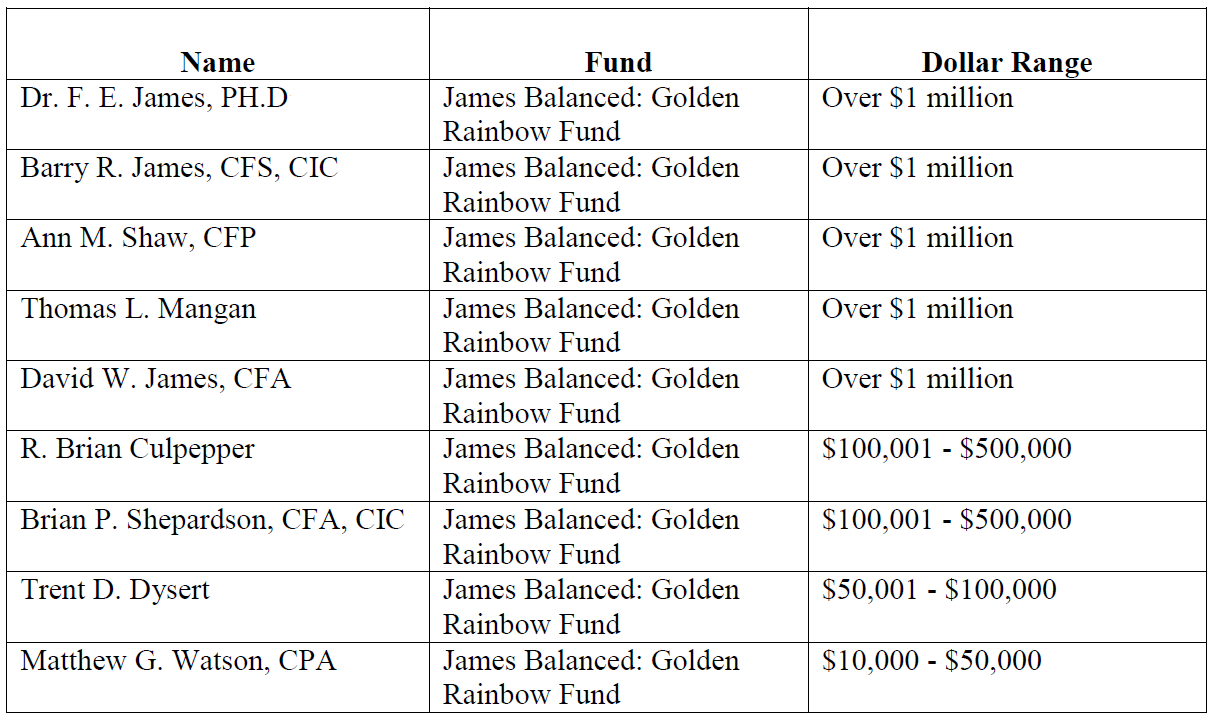
GLRBX represents the model for how fund management should maintain significant “skin in the game” and align its interests with those of shareholders. All long-time trustees and the entire team of 9 portfolio managers (the fund’s investment committee) are invested in the fund, plus the adviser’s retirement plan is invested in the fund. Per the latest SAI, dated November 14, 2014, the four trustees have more the $100K in the fund (two others just elected are expected to hold similar amounts). The table below represents holdings by the investment committee members:
Opening date
July 1, 1991 for investor share class (GLRBX) and March 2, 2009 for institutional share class (GLRIX).
Minimum investment
When investing directly with James, just $2K for a GLRBX individual account, just $500 for a retirement account, and just $50 with an automatic investment plan. Institutional shares also have a friendly $50K minimum by industry standards.
Just as a sample, Schwab offers GLRBX as a No Load/No Fee fund, with slightly higher minimums ($2.5K individual/$1K retirement) but imposes a short-term redemption fee. Similarly, Schwab offers GLRIX but with transaction fee and $100K minimum, but no short-term redemption fee.
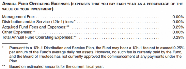
Expense ratio
The retail shares are 1.21% and the Institutional shares are 0.96% on assets of $432.6 million, as of July 2023.
——————————————————————————————————————————————
GLRBX charges a 1.01% expense fee annually, per its latest prospectus dated 11/01/2014, which is about 0.25% below industry average for the conservative allocation category. Its fee for active management is 0.66%.
Unfortunately like most of the industry, James still imposes 0.25% 12b-1 distribution and/or shareholder servicing fee and still maintains two share classes. Most of the 12b-1 fees are paid to the broker-dealers, like Schwab, who sell fund shares. Multiple share classes mean shareholders pay different expenses for the same fund, typically due to initial investment amount, transaction fee, or association of some form.
Institution shares (GLRIX) do not include the 12b-1 fee, resulting in a low 0.76% expense fee annually.
James imposes no loads.
On practice of soft dollars, which is essentially a hidden fee that allows advisers to pay higher commissions to broker-dealers to execute trades in exchange for things like research databases, James’ SAI allows it. Its Chief Compliance Officer, Lesley Ott, explains: “The language in our SAI permits soft dollars; however, it is our policy to not use them. Per advice from counsel, the language in the SAI is intended to be broad in nature even though we may not engage in specific practices.”
On page 19 of the firm’s public disclosure of qualifications and practices (the so-called Part 2A of Form ADV: Firm Brochure) it states: “JIR does not have any soft-dollar arrangements and does not receive any soft-dollar benefits.” In fact, it is James’ practice to not pay for outside research; rather it conducts most of its research in-house.
Comments
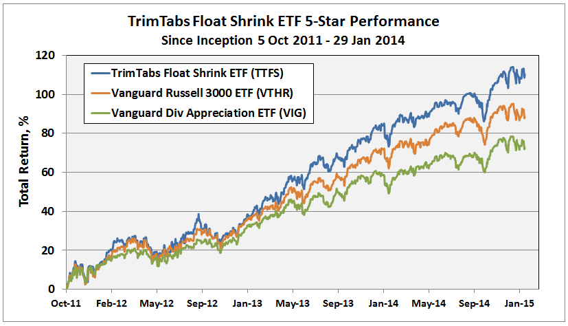
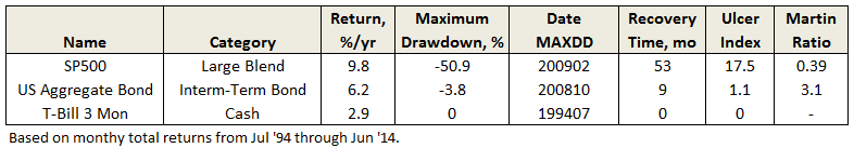
The track record since inception for GLRBX is enviable by any measure and across any time frame.
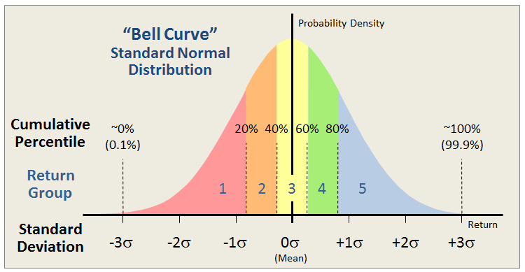
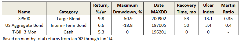
Through June 2015, it is an MFO 20-year Great Owl, which means its shareholders have enjoyed top quintile risk adjusted returns based on Martin Ratio for the past 20, 10, 5, and 3 year periods. It is the only 20-year Great Owl in the conservative allocation category. It is also on the MFO Honor Roll, which means that it has delivered top quintile absolute returns in its category over the past 5, 3, and 1 year periods.
Though it is a Morningstar 5 star fund based on quantitative past performance, the fund is not covered by Morningstar analysts.
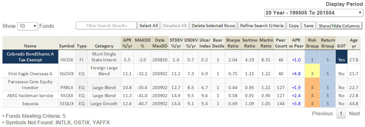
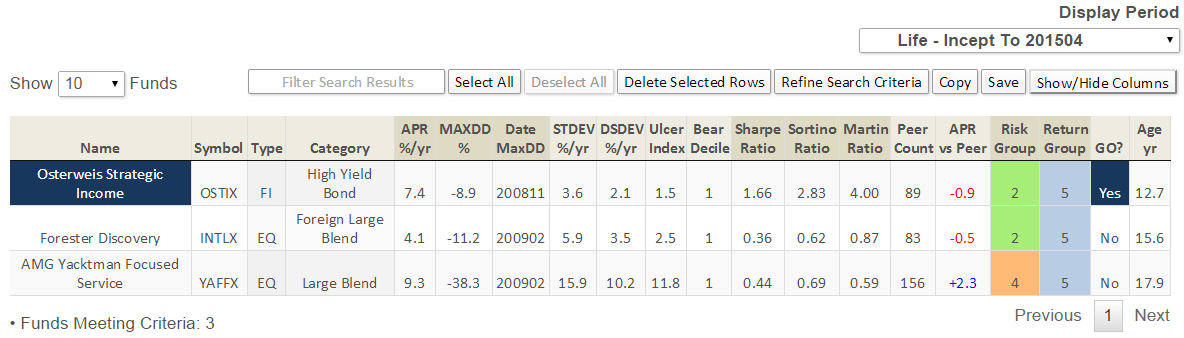
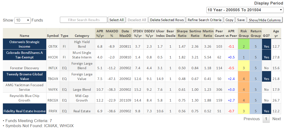
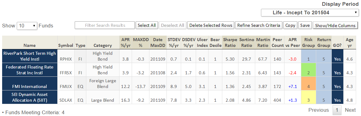
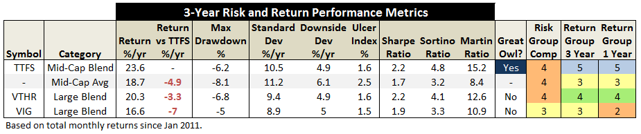
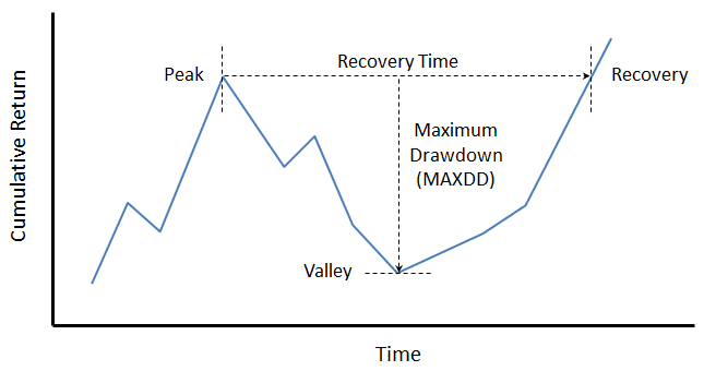
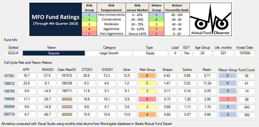
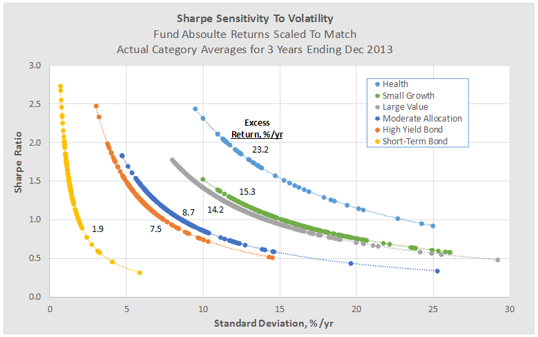
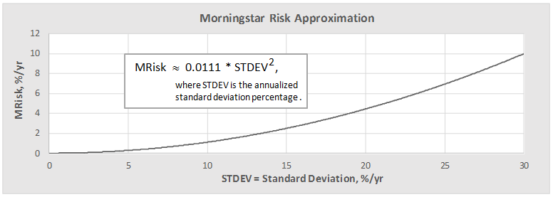
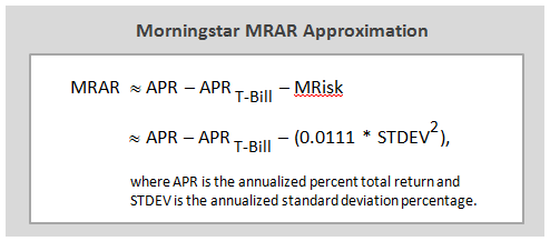
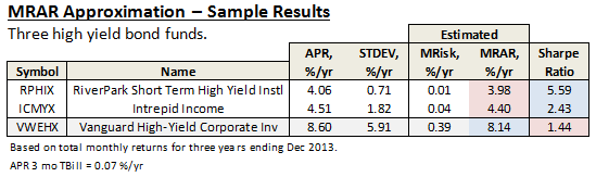
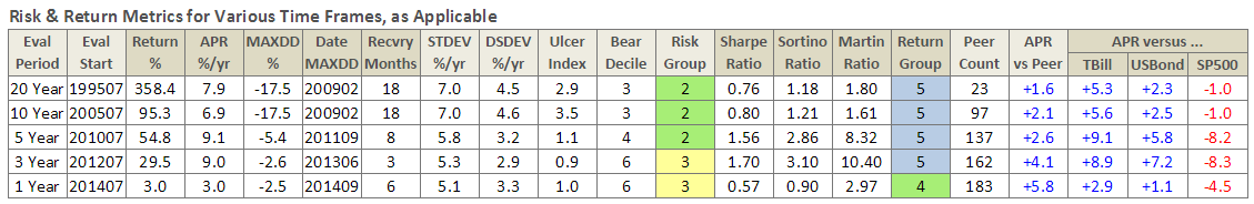
Here are its risk/return metrics across various evaluation periods through June 2015:


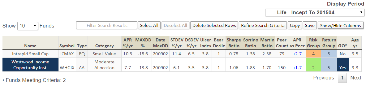
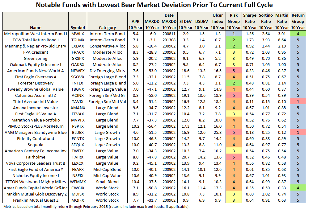
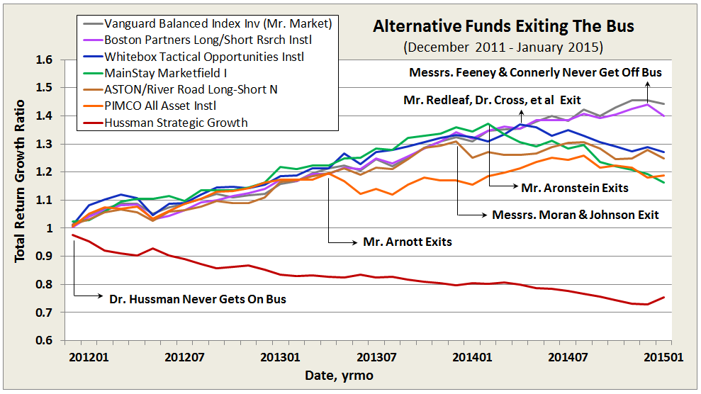
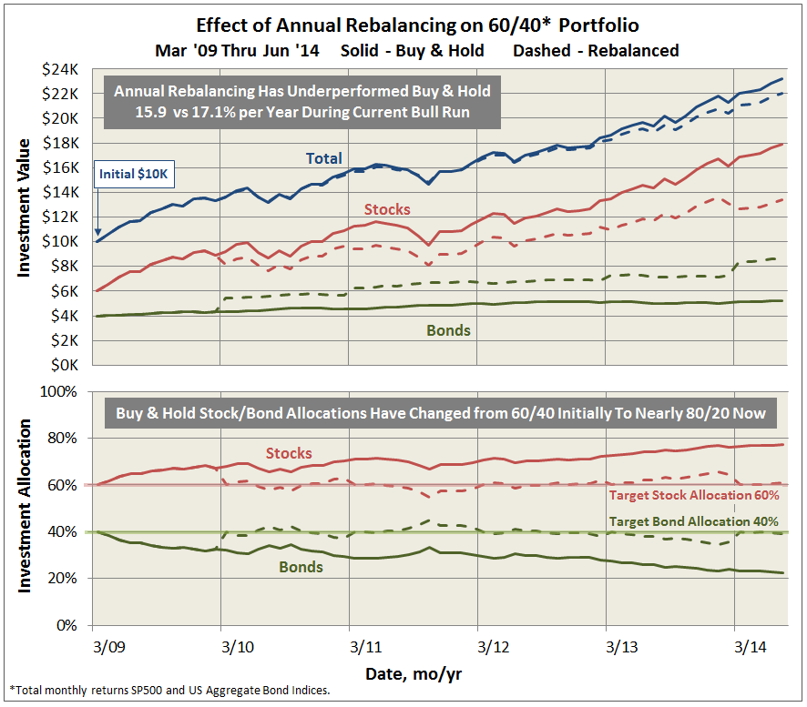
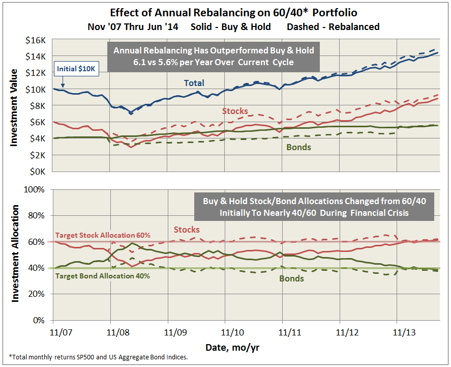
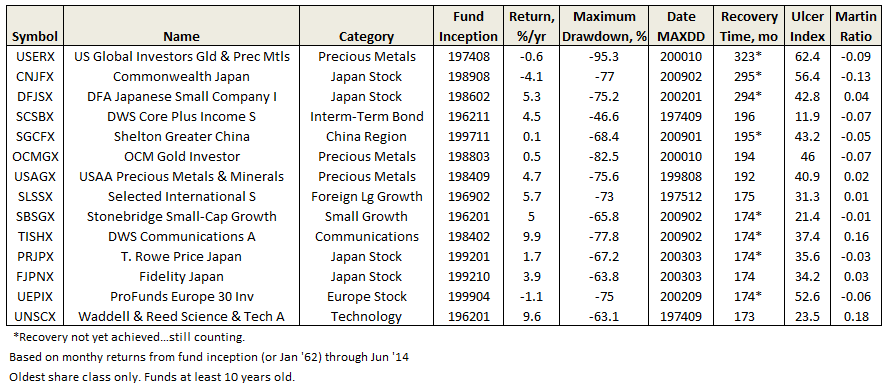
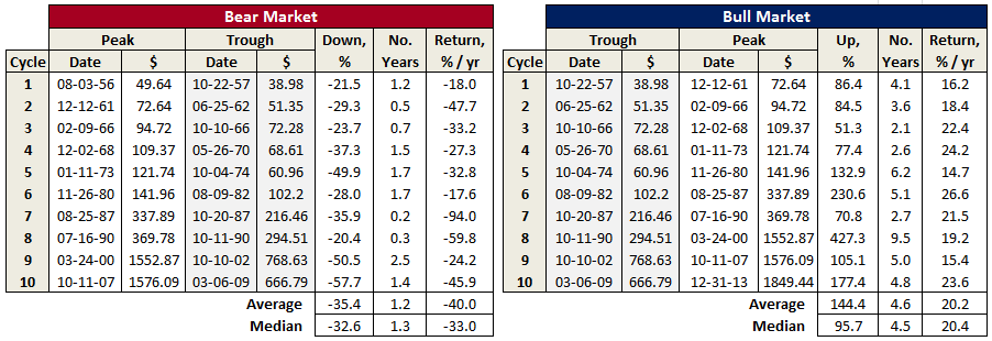
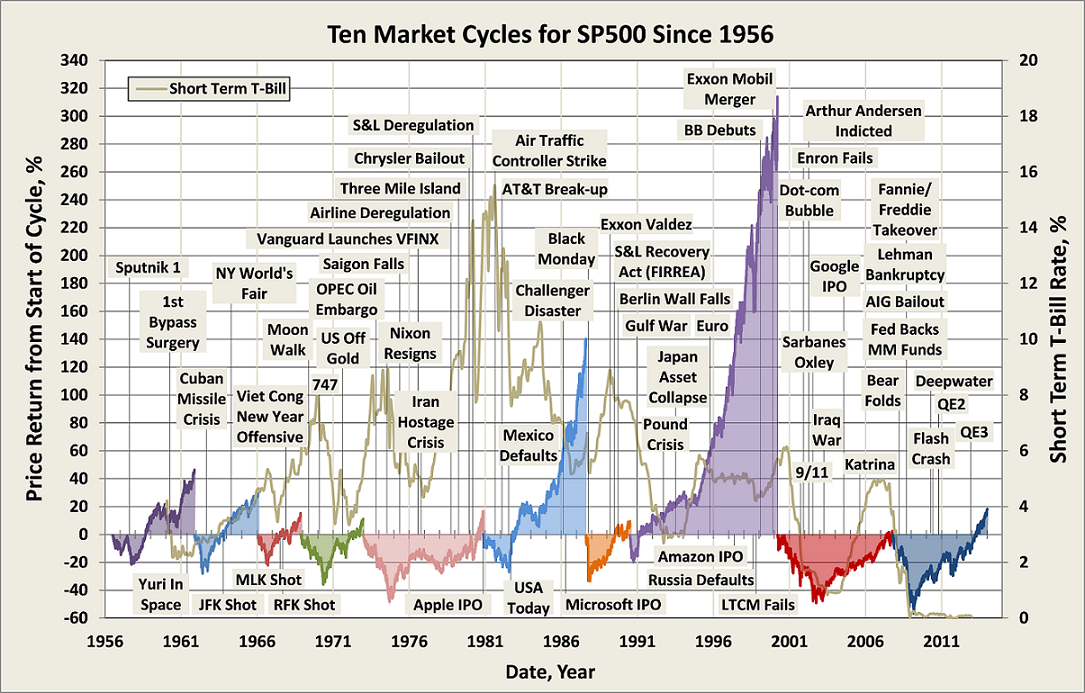
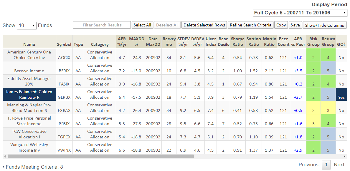
Here’s how it compares with notable peers during the current market cycle (Cycle 5 in table above), beginning November 2007, which includes the housing bubble:
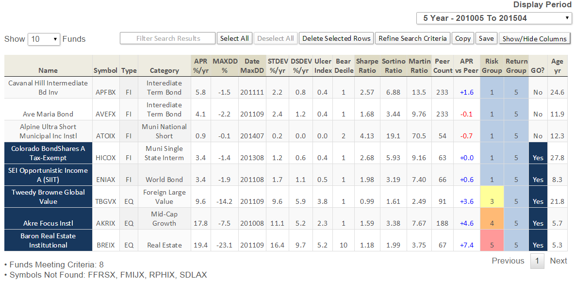
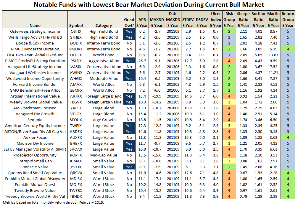
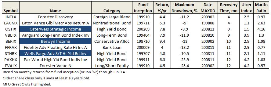
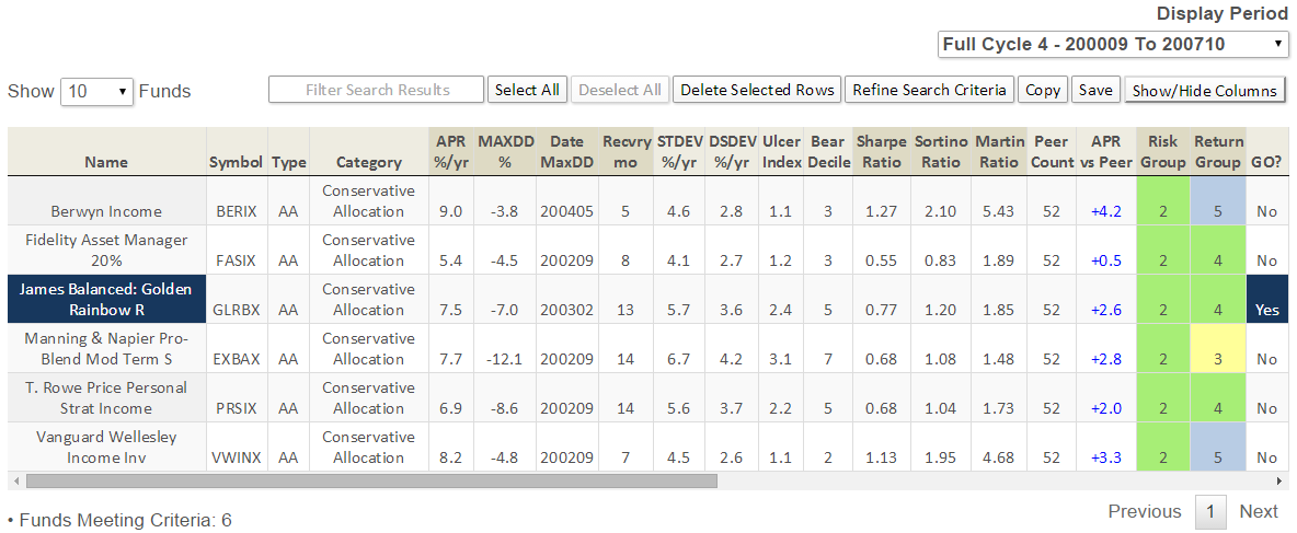
Here’s how it compares with during the market in cycle from September 2000 through October 2007 (Cycle 4 in table above), which includes the tech bubble:
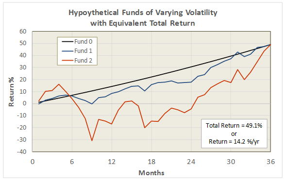
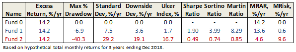
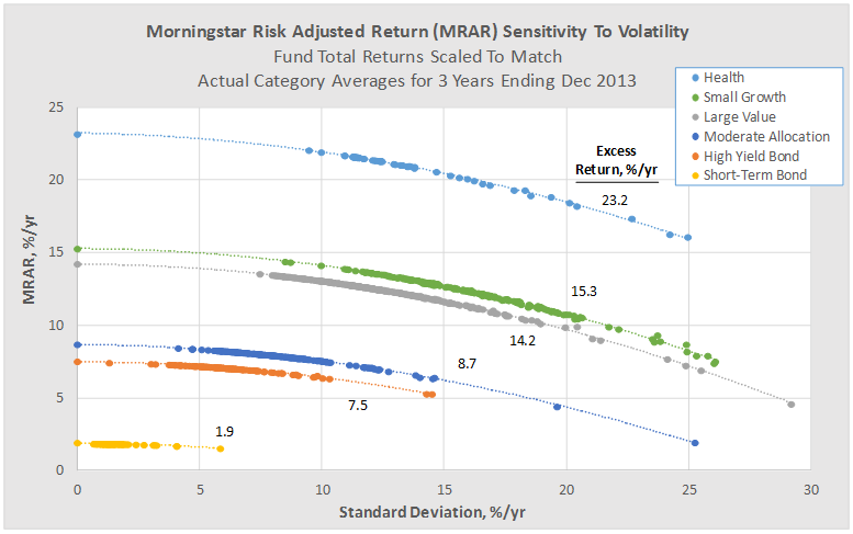
True to its objective across all these evaluation periods, the fund has delivered very satisfactory total returns while minimizing volatility and drawdown.
How does it do it?
James believes it is better to try and anticipate rather than react to the market. In doing so, it has developed a set of risk indicators and stock selection factors to set allocation and portfolio construction. James has quantified these indicators every week since 1972 in disciplined fashion to help reduce 1) emotional moves, and 2) base actions on facts and current data.
When change to the portfolio does occur, it is done gradually. “We don’t jump from one extreme to the other in terms of allocation, we use the salami approach, taking a slice into or out of the market and then watching our indicators and continuing the process if they keep the same level of bullishness or bearishness.”
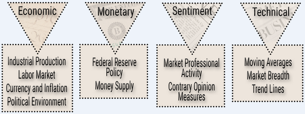
The risk measures and stock selection factors include a combination of macro-economic, sector analysis, company fundamental, and even market and stock technical analysis, like moving averages, as depicted below.
Once the investment committee establishes allocation, capitalization, and sector weightings, the universe of about 8500 stocks tracked in Zack’s database, including those on Russell 2000 and S&P 500, are ranked based on three categories: relative valuation/sentiment (50%), positive and growing earnings (35%), and relative price strength (15%). The top ranked stocks then get reviewed more qualitatively by a team of 3 before being debated and voted on for inclusion by the investment committee. “A simple majority rules, with committee members voting in reverse order of seniority, to avoid undue influence by senior management.”
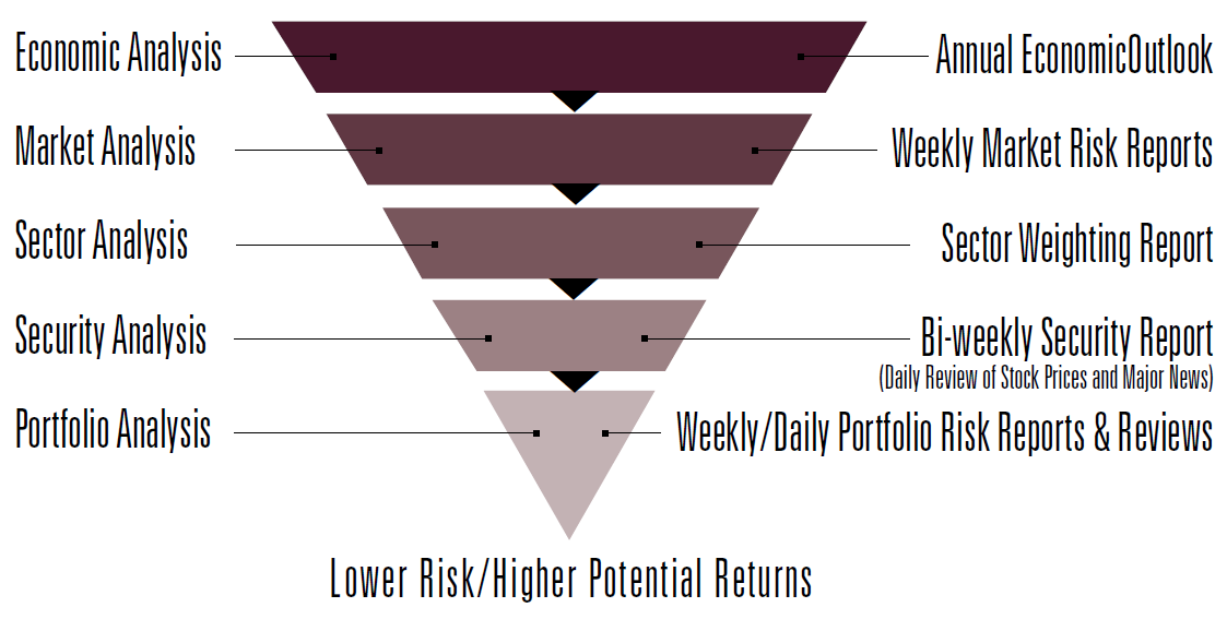
The disciplined risk management process is further depicted here:
In his book, 7 Timeless Principles of Investing, Barry James discusses how the decision to sell is more important than the decision to buy. James never enters a position without having the conviction to hold a stock a minimum of six month. But, more importantly and distinct than say deep-value investors, like Bruce Berkowitz or even Dodge & Cox, James will exit a position based on technical analysis alone. Not drawdown limits per se but technicals none the less.
Barry James explains: “We will sell a stock when it no longer offers good risk/reward return, which could be a change in fundamentals, but also weak price strength. While individual investors may often hang-on to poor performing stocks in hopes of a come-back, we see hanging-on to losers as an opportunity cost … we’ve developed the discipline to simply not do that.” Basically, fundamentals being equal, James would rather dump the losing stock for a stock with stronger price strength.
On share-holder friendliness, the company does a lot right: skin-in-the-game through substantial investment in the fund by all managing principals and directors of the trust, the firm’s employee retirement plan is in the fund, weekly email with updates on allocation decisions, quarterly commentary newsletters, frequent special reports including an annual financial outlook, no loads, relatively low fees, and a published Guiding Principles document.
The Guiding Principles document covers the firm’s mission, ethical standards, focus, and the importance of following the “Golden Rule” of treating others as one would like others to treat oneself. But the firm goes a step further by aligning these principles as “God Honoring” and applies the biblical reference of “Seek First the Kingdom of God.”
The firm’s vision articulated by James Barry, in fact, is “…best investment firm in US by striving to follow God Honoring Principles…we will spearhead a dramatic improvement in reputation of our industry.”
Mr. James’s religious faith clearly informs his investment practice. When asked if the association ever caused potential investors to feel awkward or even alienated, he states, “People will tell me that I don’t believe what you believe but I’m glad you do.”
Unlike socially responsible or so-called ESG funds, James applies no screen to restrict investments to firms practicing similar principles or of any religious association.
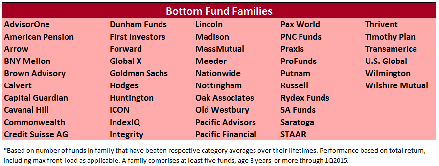
(James does act as a sub-adviser for the Timothy Plan Growth & Income Fund TGIAX, which is part of The Timothy Plan family of mutual funds for “biblically responsible investing”. These funds avoid “investing in companies that are involved in practices contrary to Judeo-Christian principles.” This family ranks in the bottom quintile on MFO’s Fund Family Score Card due in part at least to indefensible front-loads and high expense ratios.)
James is a family business and succession planning is clear and present from Dr. James to Barry and David. Beyond that, a grandson-in-law and a grandson are getting experience at the firm and in the brokerage business. A spokesman explains: “Our intent is for the firm to remain independent in the years ahead and estate planning has been done to keep the business in the family’s hands.”
Bottom Line
At some level, all actively managed funds try to anticipate the future and position accordingly. By studying past results and identifying persistent premiums, like value or small cap stocks. By studying company fundamentals to find under-appreciated stocks of high quality companies. By finding pricing displacements or inefficiencies in the market and attempting to capitalize with say value arbitrage trades. By anticipating macro-economic events or recognizing trends in the market.
James combines several of these approaches with its flagship fund for setting allocations, sector weightings, bond duration targets, equity selection, and portfolio construction in a way that mitigates risk, protects against downside, while still delivering very satisfactory returns. Given its track record, relatively small size, and disciplined implementation, there is no reason to believe it will not keep meeting its investment objective. It definitely deserves to be on the short list of easy mutual funds to own for defensive minded investors.
Fund website
James Advantage Funds maintains a decent website, which includes fund regulatory documentation, past performance, market outlooks, quarterly and special reports. Similarly, more information about the adviser can be found at James Investment Research.


 Originally published in June 1, 2015 Commentary